Re: Selecting Form Checkbox Shows Text Instead of Checkmark
- Subscribe to RSS Feed
- Mark Topic as New
- Mark Topic as Read
- Float this Topic for Current User
- Bookmark
- Subscribe
- Printer Friendly Page
- Mark as New
- Bookmark
- Subscribe
- Mute
- Subscribe to RSS Feed
- Permalink
- Report Inappropriate Content
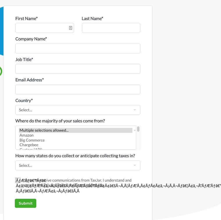
Not sure why this is, but when you select a checkbox on our form, instead of a checkmark, a string of nonsense text appears instead of a checkmark. Sample page: https://go.taxjar.com/2020-WR-ServicePartner-SalesTaxSuccess_LP-01-Request.html
Solved! Go to Solution.
- Mark as New
- Bookmark
- Subscribe
- Mute
- Subscribe to RSS Feed
- Permalink
- Report Inappropriate Content
- Mark as New
- Bookmark
- Subscribe
- Mute
- Subscribe to RSS Feed
- Permalink
- Report Inappropriate Content
- Mark as New
- Bookmark
- Subscribe
- Mute
- Subscribe to RSS Feed
- Permalink
- Report Inappropriate Content
@SanfordWhiteman Removing that jibberish text from the CSS I'm not able to get a checkbox to appear in the form at all now. Is there something I need to put in that content line of the CSS? https://go.taxjar.com/YYYY-WR-Web-Request_LP.html
- Mark as New
- Bookmark
- Subscribe
- Mute
- Subscribe to RSS Feed
- Permalink
- Report Inappropriate Content
You might try:
content:"\2713";willing to bet this'll do the trick 😉
It looks like this might be the intended CSS character ✔ (check mark) that's getting replaced with all the gibberish.
Removing the -webkit-appearance:none; will actually activate the browser defaults for the check mark which is a less predictable approach (b/c it's different for every browser) when you're using customized form styles for your inputs.
- Mark as New
- Bookmark
- Subscribe
- Mute
- Subscribe to RSS Feed
- Permalink
- Report Inappropriate Content
Agreed. Also note -webkit-appearance: none; doesn't apply in iOS Safari nor IE. Not really the right way to build custom form appearances (which can be mobile-inaccessible and offputting enough already).
- Mark as New
- Bookmark
- Subscribe
- Mute
- Subscribe to RSS Feed
- Permalink
- Report Inappropriate Content
Hi,
In the https://go.taxjar.com/rs/806-QBE-674/images/taxjar-lp-flex-styles.css file you have the below code:
form.mktoForm input[type=checkbox] {
-webkit-appearance: none !important;
box-sizing: border-box !important;
}
Please remove the below line from this code:
-webkit-appearance: none !important;
This will resolve the issue.
Thanks
- Mark as New
- Bookmark
- Subscribe
- Mute
- Subscribe to RSS Feed
- Permalink
- Report Inappropriate Content
Thank you @Harish_Gupta6. That did the trick!
- Mark as New
- Bookmark
- Subscribe
- Mute
- Subscribe to RSS Feed
- Permalink
- Report Inappropriate Content
Once again @SanfordWhiteman you save the day! Thank you!
- Copyright © 2025 Adobe. All rights reserved.
- Privacy
- Community Guidelines
- Terms of use
- Do not sell my personal information
Adchoices

