- Marketing Nation
- :
- Products
- :
- Blogs
- :
- Product Blogs
- :
Marketo Success Series: Reporting
- Subscribe to RSS Feed
- Mark as New
- Mark as Read
- Bookmark
- Subscribe
- Printer Friendly Page
- Report Inappropriate Content
- Mark as New
- Bookmark
- Subscribe
- Mute
- Subscribe to RSS Feed
- Permalink
- Report Inappropriate Content
Welcome back to the Marketo Success Series!
In this series, we partner with Marketo Champions and Champion Alumni to fully explore how some of our most celebrated Marketo experts are using Marketo Engage to drive success. In this edition, we teamed up with Champion @Jessica_Kao3 to cover which reports to focus on for your programs, how to get the most value out of Marketo Engage reporting, her 5 common reporting best practices, and more!
Reporting is embodied in everything you do as a marketer. All too often reporting happens as an afterthought instead of being part of what you do every day. As marketers, we can get caught up in the day-to-day execution of endless tradeshows and webinars, creating content, and executing. But only afterward when everything is done do we tend to think about reporting. What was the outcome of our marketing efforts? Do we do that marketing tactic again? By then it’s too late and that’s why I see so many marketers struggle again and again with reporting. Reporting should be brought to the forefront of what we do every day.
Marketers want to replicate that perfect report. The one with the right KPIs, displaying pretty charts, and graphs. That report that is the envy of all marketers is like an Instagram-worthy picture of someone crossing the finish line at a marathon. The hard work is done before race day. Months of training and discipline go into conditioning your body, all in preparation for that final moment of crossing the finish line. Just like training for a marathon is about what you do every day BEFORE the big race, getting those reports is about what you do as a marketer every day BEFORE you hit that button to generate the report. Just like training for a marathon takes discipline so does being a marketer who achieves those winning reports. The great news is this guide has provided you the foundation of exactly what you need to generate those rockstar reports.
Focusing on the right reports
There is an infinite number of reports that we could generate but given the limited amount of time and resources, the real question is which one should we be focusing on and which one should we not be pursuing. The key is to focus on reports that lead to actionable insight. With this data, does this help me determine:
- What will I DO more of?
- What will I DO less of?
- What will I DO differently?
Ask yourself, what will I do with this information? You can save you and your team a lot of time by taking a few minutes to play out different hypothetical scenarios. Many times, I am asked to generate reports that will take a significant amount of effort to set up. But before we dive headfirst into a report that the VP of Marketing is asking for, I will pull up a blank excel sheet and start mocking up a hypothetical report and ask, “If your data looked like X, what will your actionable next step be based on this information?”
Data interpretation
Generating the report is only half of the work. Interpreting what it means and telling the story is the more important part. Many times, I get asked is a 10% open rate good? Is a 1 % unsubscribe rate bad? My answer is “it depends.” It’s never what anyone wants to hear but. . . a 10% email open rate is great for a list of completely cold leads that have never heard of you, but would be considered not that great if it’s a confirmation email or to a group of your most loyal customers. To answer this type of question, you always need something to compare it to. The best thing to compare to is data within your own system. Overall industry trends are ok to benchmark against but the better thing to do is to compare it to how things are performing for you and watch the overall trends and notice if there are any outliers or anomalies. When comparing results, you want to compare to similar situations. For example, if you are looking at engagement and email click-through rates you want to compare webinar invites with something similar and probably not to a blast to your entire database about reading an e-book.
Now onto the reports that you’ve been waiting for.
Here are some of my go-to reports that I have used consistently over my career as a Marketo Engage user. There are an infinite number of reports you can create, but the intent of this is to show you a starting point of the types of reports that you can create. This serves as a springboard to an endless number of possibilities to help you as a marketer.
Reports
Scenario #1
Report Type:
Email performance report
Question:
How many people received my email?
How many opened and engaged with my email?
How many people unsubscribed?
This basic report allows you to look at these metrics for a single email or for as many as you want to compare. Simply select which email or emails you want to include from the tree.
How do I get there:
There are two ways to get to the email performance report:
Directly in the analytics section, or locally within a program in marketing activities.
I go directly to the analytics section when I want to look at overall email performance in the last week, month, quarter, etc. in the entire database.
Analytics
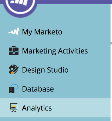
- Go to the Analytics section.
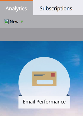
- Click on the Email Performance icon
- Go to the setup tab
- Select the time frame of the activity (I typically use All Time)
- Drag the marketing activities email over to the left
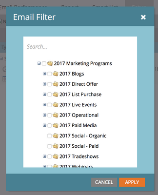
- Select the email you want to include in the report
- Click on the report tab to view your results
If I’m interested in emails pertaining to a specific program such as all the invite and post-event emails pertaining to a specific webinar, I ran last month, I will create the email performance report locally within the program in marketing activities.
- Go to a program in marketing activities.
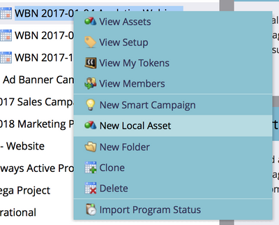
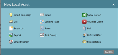
- Right-click and create a new local asset
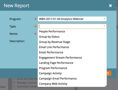
- Select report
- Click on the type drop-down menu and select email performance report
Pro Tip: If you create the email performance report locally within the program, it automatically selects the emails within the program. If you want to add emails from another program, you can manually select them from the tree in the setup tab in the report and check the emails that you want to include.
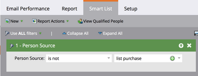
If you want to know how an email performed for a subset of the people that you sent it to, the smart list tab comes in handy.
For example, my email engagement rates were very low. I hypothesized that because we purchased 50,000 cold names and that made up a significant part of my send list, those people were dragging my email engagement numbers down. I can rerun the report and exclude this population from my email performance report and see if I’m right.
Scenario #2
Report type: person performance report
Question:
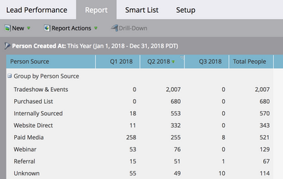
Where do new leads come from?
What is the top source for new leads?
Is this consistent quarter over quarter?
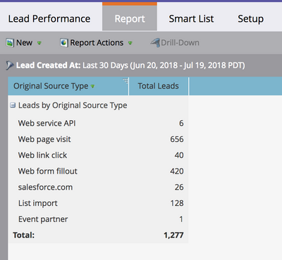
I use a person performance report whenever I want to group people. You can group people by any number of characteristics but for this use case, we will group people by person source.
I use a combination of activity dates and grouping to create many different permutations of this report. This is predicated on the fact that you have person source assignment set up. If you haven’t you can group people using Marketo system fields such as original source type where the data is automatically being set by Marketo.
To create this report, go to the analytics section and click on the people performance tile.
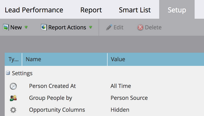
Under set up you can change the time frame and what characteristics you want to group the people by.
What if we wanted to know how the numbers breakdown by quarter? We can add custom columns to this report. These custom columns are driven by smart lists.
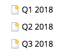
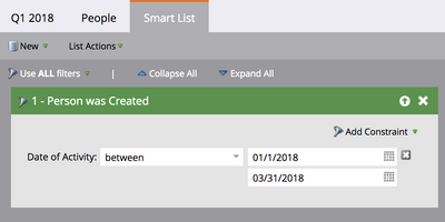
First, create smart lists in the lead database for each desired column. For example, the Q1 2018 smart list uses the filter a person created between Jan 1, 2018, and March 31, 2018, and so on.
Then, return to the report setup and drag the Custom Column parameter and select the desired Smart Lists.
That’s it!
Scenario #3
Program Type:
Program summary
Question:
How did my program perform?
How many new names did this program acquire?
How many people achieved a certain status in a program?
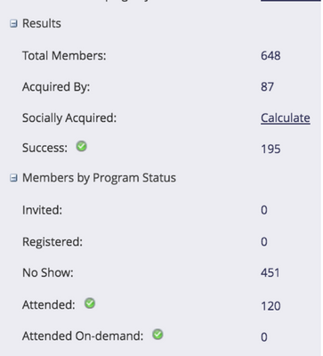
Many times I just take a screenshot of the program summary page for each program or transcribe this to an excel sheet. But this information can actually be found in the program performance report in the analytics section. You can also aggregate this data across multiple programs allowing for comparisons.
Report type:
Program Performance Report
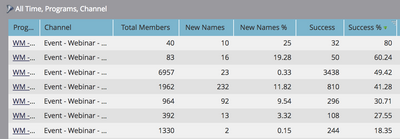
This report lets you look at the total members, new names, and successes across multiple programs. New names are determined by the acquisition program field. The number of successes is determined by the number of people that are in a specific progression status that is designated a success step. This also requires that you have your channels and progression statuses well defined. This is set in the admin section under tags/channels. It is important that the right people are set as members in the appropriate program and the statuses are set consistently in every program. See the channels chapter for more details.
This report allows you to compare programs across the same channel as well as different programs with different statuses to gauge success.
So, let’s go back to our webinar example. Say I want to look at how webinars performed overall this year and see how registration and attendance are trending. I can easily select the webinars from this year and add them to the report to view them together. I can also compare webinars across different regions and see if they differ in performance.
The possibilities are endless on how to use this report type.
Alternatively, if you have Advance Report Builder, you can get this type of information and much more with the different report types and pivot table capabilities. In this reporting example, several webinars can be compared side by side broken down by the different channel statuses.
I personally do all my reporting in Advanced Report Builder and live and die by ARB/RCE reports every day.
Scenario #4
Report type:
Program opportunity analysis report in Advanced Report Builder
Question:
How much pipeline did a particular program influence?
This report type ties channels and programs to dollars, pipeline, and revenue. Anytime you want to ask how a specific program or overall channel performed as measured monetarily, this is your go-to report type. As a marketer, I spend the majority of my time specifically using this report type and rely on this heavily to produce the reports that the CMO wants to know. Where did all the money go? What did I get for it?
In this report, I’m looking at how three specific channels performed over Q1 of last year. Since my sales cycle is greater than six months, I should have good reliable data to review. Content syndication did not perform as well compared to the other two channels. I’m spending around the same amount of each channel, but the multi-touch revenue won are several-fold lower than the other two channels. Maybe I need to optimize this channel, find other vendors, different offers or execute different follow up with these leads.
If I look at the webinar vs. online advertising channel, you’ll notice that the number of success (total) is significantly different. The number of members reaching success (i.e. attended a webinar for the webinar channel or converted by filling out a form from a paid PPC or social media campaign for the online advertising channel) is a magnitude of three-fold difference.
If I just looked at the cost of reaching success, I might draw the conclusion that online advertising is the way to go. But wait, I shouldn’t stop there. If I look at the MT revenue won, you’ll notice that the amount is quite similar. Therefore, the webinar and content syndication channels are performing similarly when it comes to how much closed-won revenue was influenced by each channel. It appears that the people who are attending the webinar are the right people to be talking to and it takes more volume of people flowing through the online advertising channel where they are downloading infographics and white paper to achieve similar results revenue-wise.
For a more detailed explanation of first-touch and multi-touch please see this recording and the following exercises.
How do I know if I have Advanced Report Builder? Look for the Revenue Explorer Tile
Scenario #5
Report type:
Opportunity analysis report
Question:
What marketing activities influenced a deal?
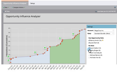
This is really one of my favorite reports that I think is underutilized. There are two scenarios where I use this report. The first one is after a deal closes, I want to do a bit of forensic work and look back on what marketing engagements and activities contributed to and influenced that deal. If something went really well, what can I do to repeat that? In this report, you are looking at one opportunity at an account. The orange dots indicate when a contact from this particular account “MegaCorp” became a member of a program. The green checkmark indicates when someone hit a program success. It’s less about looking at the number of cumulative interactions denoted by the y-axis and more about what types of engagement activities are happening over time.
What you will notice on the right-hand side is the names of people on this account. Manny and Jacob are both on the opportunity and are actively engaging with marketing programs. The number next to their name (16 and 9 respectively) is how many interactions or program membership each of them has had.
The green section is when the opportunity was opened and when it closed. You will be able to tell what marketing activities happened before the opportunity was created, what happened while it was open, and what happened after it closed.
The other scenario I like to use this type of reporting for is to show sales who else from a particular account is engaged with our marketing activities that they may not know about, especially if they are actively in conversations with them.
If you will look further down on the right-hand side, there is a list of people with no role. However, these people may be engaging with you like Sarah who has 12 interactions. If the deal was still open and the salesperson wasn’t aware of Sarah, this might be another good person to reach out to. The benefit of this report is, the person does not have to be placed on the opportunity to see all of their relevant information.
Bonus pro tip:
Report type:
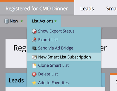
Smart list subscription
Purpose:
When you want to have a smart list emailed to you on a regular basis.
When you are hosting an event, you probably want to keep an eye on who is registered thus far or maybe the field marketing manager is constantly asking how many people have registered. Instead of having to log in to Marketo every time to review the registered list, you can set up a smart list subscription report sent to your email on a regular cadence. This has proven to be an incredible time-saver.
You must be a registered user to add a comment. If you've already registered, sign in. Otherwise, register and sign in.
- Copyright © 2025 Adobe. All rights reserved.
- Privacy
- Community Guidelines
- Terms of use
- Do not sell my personal information
Adchoices

