Re: Remove additional spacing from hidden fields on a form
- Subscribe to RSS Feed
- Mark Topic as New
- Mark Topic as Read
- Float this Topic for Current User
- Bookmark
- Subscribe
- Printer Friendly Page
- Mark as New
- Bookmark
- Subscribe
- Mute
- Subscribe to RSS Feed
- Permalink
- Report Inappropriate Content
I'm struggling with how to remove extra spaces being left on a form form hidden fields. It seems to be happening with both fields that are hidden in the form as well with fields that have visibility rules set and are hidden from there.
You can see an example on this page and form: https://discover.semi.org/LP-Test-Form.html
There are some fields that have visibility rules enabled that are shown or hidden based on the Country selected.
The red section above is coming from rows that are hidden by visibility rules. Try changing the country to Austria on the form and you'll see the "Email Opt In:" (which is a rich text field) and email opt-in checkboxes field show up in that blank area.
The black section above is from standard "hidden" fields on the form. I'd love to be able to get rid of these extra spaces on the form.
@Dave_Roberts - hoping you;ll help here! 🙂
Thanks so much!
Sheila
Solved! Go to Solution.
- Mark as New
- Bookmark
- Subscribe
- Mute
- Subscribe to RSS Feed
- Permalink
- Report Inappropriate Content
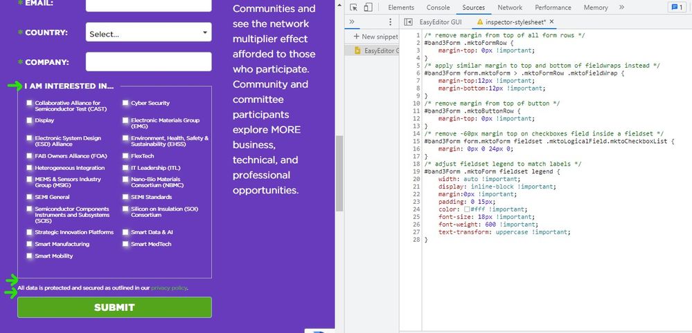
Hey Sheila, thanks again for setting up a new thread here. It looks like you've already gotten some feedback about what's causing the issue here so I've put together some CSS to help you solve the issue on your forms. I've attached a screenshot of what Im seeing on my end as well as a bit of code that you can drop into the end of your Custom CSS stylesheet on the form itself.
This spacing issue is actually something I see quite often when there's a set of custom CSS on a form. Many times, the spacing between the form fields is applied on the row (.mktoFormRow) or columns (.mktoFormCol) maybe b/c those are the most obvious choices when you're looking at the code. This approach however adds height to hidden fields (as you've seen here) b/c those are contained in both a row and a column before they are populated (or not) on the page.
The solution involves moving the spacing from the rows (margin-top: 24px) to the field wrappers (.mktoFieldWrap) b/c those will not be present on hidden fields until the field populates on the page (for the case of visibility rules). In this example, I've split the margin-top of 24px into a margin-top and margin-bottom of 12px to go around every field.
The other piece that was giving me some issues was the HTML text at the top of your fieldset that you were using for a label. I'd recommend moving that text (just text is ok, no html/css needed) into the "legend" (aka fieldset label) to better align that with the native fieldset element. There's a funky offset (margin-top -60px) on the checkbox field inside the fieldset to compensate for the "not so hidden legend element" so I've also adjusted that in the CSS below to help get this back to a "normal" state.
Here's a look at what Im seeing on my end in Chrome on a PC:

Here's the CSS I used in the inspector to create the preview here:
/* remove margin from top of all form rows */
#band3Form .mktoFormRow {
    margin-top: 0px !important;
}
/* apply similar margin to top and bottom of fieldwraps instead */
#band3Form form.mktoForm > .mktoFormRow .mktoFieldWrap {
    margin-top:12px !important;
    margin-bottom:12px !important;
}
/* remove margin from top of button */
#band3Form .mktoButtonRow {
    margin-top: 0px !important;
}
/* remove -60px margin top on checkboxes field inside a fieldset */
#band3Form form.mktoForm fieldset .mktoLogicalField.mktoCheckboxList {
    margin: 0px 0 24px 0;
}
/* adjust fieldset legend to match labels */
#band3Form .mktoForm fieldset legend {
    width: auto !important;
    display: inline-block !important;
    margin:0px !important;
    padding: 0 15px;
    color: #fff !important;
    font-size: 18px !important;
    font-weight: 600 !important;
    text-transform: uppercase !important;
}
Let me know if this just snaps right in for you or if you run into any issues with getting to a similar display.
Thanks again, and happy Friday 🙂
-Dave
- Mark as New
- Bookmark
- Subscribe
- Mute
- Subscribe to RSS Feed
- Permalink
- Report Inappropriate Content
Hey Sheila, thanks again for setting up a new thread here. It looks like you've already gotten some feedback about what's causing the issue here so I've put together some CSS to help you solve the issue on your forms. I've attached a screenshot of what Im seeing on my end as well as a bit of code that you can drop into the end of your Custom CSS stylesheet on the form itself.
This spacing issue is actually something I see quite often when there's a set of custom CSS on a form. Many times, the spacing between the form fields is applied on the row (.mktoFormRow) or columns (.mktoFormCol) maybe b/c those are the most obvious choices when you're looking at the code. This approach however adds height to hidden fields (as you've seen here) b/c those are contained in both a row and a column before they are populated (or not) on the page.
The solution involves moving the spacing from the rows (margin-top: 24px) to the field wrappers (.mktoFieldWrap) b/c those will not be present on hidden fields until the field populates on the page (for the case of visibility rules). In this example, I've split the margin-top of 24px into a margin-top and margin-bottom of 12px to go around every field.
The other piece that was giving me some issues was the HTML text at the top of your fieldset that you were using for a label. I'd recommend moving that text (just text is ok, no html/css needed) into the "legend" (aka fieldset label) to better align that with the native fieldset element. There's a funky offset (margin-top -60px) on the checkbox field inside the fieldset to compensate for the "not so hidden legend element" so I've also adjusted that in the CSS below to help get this back to a "normal" state.
Here's a look at what Im seeing on my end in Chrome on a PC:

Here's the CSS I used in the inspector to create the preview here:
/* remove margin from top of all form rows */
#band3Form .mktoFormRow {
    margin-top: 0px !important;
}
/* apply similar margin to top and bottom of fieldwraps instead */
#band3Form form.mktoForm > .mktoFormRow .mktoFieldWrap {
    margin-top:12px !important;
    margin-bottom:12px !important;
}
/* remove margin from top of button */
#band3Form .mktoButtonRow {
    margin-top: 0px !important;
}
/* remove -60px margin top on checkboxes field inside a fieldset */
#band3Form form.mktoForm fieldset .mktoLogicalField.mktoCheckboxList {
    margin: 0px 0 24px 0;
}
/* adjust fieldset legend to match labels */
#band3Form .mktoForm fieldset legend {
    width: auto !important;
    display: inline-block !important;
    margin:0px !important;
    padding: 0 15px;
    color: #fff !important;
    font-size: 18px !important;
    font-weight: 600 !important;
    text-transform: uppercase !important;
}
Let me know if this just snaps right in for you or if you run into any issues with getting to a similar display.
Thanks again, and happy Friday 🙂
-Dave
- Mark as New
- Bookmark
- Subscribe
- Mute
- Subscribe to RSS Feed
- Permalink
- Report Inappropriate Content
The original person that did the landing page template and forms css changes clearly didn't undertand the full structure of Marketo forms. Thanks for explaining the mktoFormRow vs MktoFieldWrap.
I've applied the new CSS and done some clearn up as well. I originally didn't put the "I am interested in..." as the fieldset legend because they wanted the green asterick to show that the checkboxes is a required field and you can't have html in the legend. But I went ahead and moved the text into the legend. Then I adjusted the CSS tin the fieldset label to remove the "dislay: none" and move label up. This moved the asterick in line with the fieldset legend:
#band3Form fieldset label.mktoLabel {
/* display: none; hide the checkboxes (parent) field label */
margin-top: -50px;
}
The only minor thing left is with the new code, the "Email Opt-In" text has a space between it and the "checkboxes" with the text. Is there any way to remove just that space? It's the mktoFieldWrap margin-bottom: 12px that I think is adding in the space.
Thanks again!
- Mark as New
- Bookmark
- Subscribe
- Mute
- Subscribe to RSS Feed
- Permalink
- Report Inappropriate Content
Hey Sheila, sorry to keep you waiting on this.
Here's a few more styles you can add to the form to hide the label for the hidden checkbox field (country-based visibility rules) and remove the margin on the bottom of the field to shore up the space above the button.
/* hide field label for this field */
label#LblmktoOptIn {display: none;}

/* remove margin-bottom from checkbox list */
#band3Form form.mktoForm .mktoLogicalField.mktoCheckboxList {
    margin-bottom: 0px;
}
Let me know if this works to solve the spacing issue on your end?
Thanks,
Dave
- Mark as New
- Bookmark
- Subscribe
- Mute
- Subscribe to RSS Feed
- Permalink
- Report Inappropriate Content
- Mark as New
- Bookmark
- Subscribe
- Mute
- Subscribe to RSS Feed
- Permalink
- Report Inappropriate Content
Nice work there, looks great so far!
Removing that space is definitely possible - let me take a look at the page again and work out a solution, I'll post back here a bit later today with an update.
- Mark as New
- Bookmark
- Subscribe
- Mute
- Subscribe to RSS Feed
- Permalink
- Report Inappropriate Content
Because you have a style that’s applied to the placeholder hidden rows as well as the VR-shown rows:
#band3Form .mktoFormRow {
    padding-bottom: 0 !important;
    margin-top: 24px !important;
}
You want to use my row tagging JS helper:
MktoForms2 :: FormsPlus::Tag v0.2.5
https://codepen.io/figureone/pen/2bdb98b8f3bbe9e03f2842a9c8ccdd2b?editors=0010
Then you can style only the rows that are currently shown by VRs:
#band3Form .mktoFormRow:not(.mktoPlaceholder) {
    padding-bottom: 0 !important;
    margin-top: 24px !important;
}
- Mark as New
- Bookmark
- Subscribe
- Mute
- Subscribe to RSS Feed
- Permalink
- Report Inappropriate Content
@SanfordWhiteman Very useful forms row tagging! Thank you for sharing this!
- Mark as New
- Bookmark
- Subscribe
- Mute
- Subscribe to RSS Feed
- Permalink
- Report Inappropriate Content
Hi @Sheila-SEMI
There is some custom CSS added on the form which is adding extra margin on all fields (including hidden) resulting in this much of extra space.
You've to ask your developer who coded the form to adjust the same.
Thanks,
Arun Sharma
- Mark as New
- Bookmark
- Subscribe
- Mute
- Subscribe to RSS Feed
- Permalink
- Report Inappropriate Content
Hmm, not sure what exactly is going on there, but the standard behaviour is that hidden fields do not leave blank spaces. So I would have a look at your lp template code rather than the out of the box Marketo functionality.
- Copyright © 2025 Adobe. All rights reserved.
- Privacy
- Community Guidelines
- Terms of use
- Do not sell my personal information
Adchoices


