Re: Positioning of Form Validation Messages
- Subscribe to RSS Feed
- Mark Topic as New
- Mark Topic as Read
- Float this Topic for Current User
- Bookmark
- Subscribe
- Printer Friendly Page
- Mark as New
- Bookmark
- Subscribe
- Mute
- Subscribe to RSS Feed
- Permalink
- Report Inappropriate Content
Hi There!
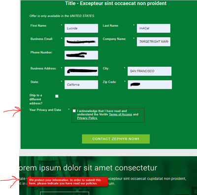
Is there some way to control the positioning of the form validation messages? That is, the message someone sees when she tries to submit a form without filling in a required field? See screenshot below where the validation message is nowhere near the unfilled required field (it's way below the form):
Solved! Go to Solution.
- Mark as New
- Bookmark
- Subscribe
- Mute
- Subscribe to RSS Feed
- Permalink
- Report Inappropriate Content
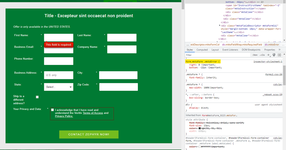
Here's a look at some CSS I added in the browser console to test out a fix. I think you could add this to your form's Custom CSS and get most of the issue resolved here:

Here's the CSS to add:
form.mktoForm .mktoError {
    right: 0 !important;
    bottom: -22px !important;
}
This will anchor the error text to the bottom right of each field. The "-22px" value in the "bottom" property is meant to offset the height of the error message.
Let me know if you need any help finding the Custom CSS input on the form to get this CSS into play or have a look thru the Marketo Docs here for reference: https://experienceleague.adobe.com/docs/marketo/using/product-docs/demand-generation/forms/form-desi... (note: you'll want to use the Edit Custom CSS option rather than the View Theme CSS panel)
- Mark as New
- Bookmark
- Subscribe
- Mute
- Subscribe to RSS Feed
- Permalink
- Report Inappropriate Content
Here's a look at some CSS I added in the browser console to test out a fix. I think you could add this to your form's Custom CSS and get most of the issue resolved here:

Here's the CSS to add:
form.mktoForm .mktoError {
    right: 0 !important;
    bottom: -22px !important;
}
This will anchor the error text to the bottom right of each field. The "-22px" value in the "bottom" property is meant to offset the height of the error message.
Let me know if you need any help finding the Custom CSS input on the form to get this CSS into play or have a look thru the Marketo Docs here for reference: https://experienceleague.adobe.com/docs/marketo/using/product-docs/demand-generation/forms/form-desi... (note: you'll want to use the Edit Custom CSS option rather than the View Theme CSS panel)
- Mark as New
- Bookmark
- Subscribe
- Mute
- Subscribe to RSS Feed
- Permalink
- Report Inappropriate Content
Hi @Dave_Roberts - That worked perfectly! Thanks so much!
- Mark as New
- Bookmark
- Subscribe
- Mute
- Subscribe to RSS Feed
- Permalink
- Report Inappropriate Content
@DeniseG2 btw the exact CSS rule you have that's triggering the problem is here:
.mktoForm {
  width: inherit !important;
}
Because the side effects of this rule can't be detected fully in JavaScript, the forms library miscalculates the size of elements.
The rule seems like a really dramatic way to begin restyling a Marketo form. Obviously if you remove that line now the form won't look the way you expect, but I'd encourage you/your developers to start off differently in the future. I can say in many years of customizing/responsive-izing Marketo forms I've never had that rule.
- Mark as New
- Bookmark
- Subscribe
- Mute
- Subscribe to RSS Feed
- Permalink
- Report Inappropriate Content
Hi @SanfordWhiteman - That's good to know. Thank you! That code is in a new LP template created by an extremely experienced Marketo template/builder/designer that I have partnered with for years. I don't know what that code is intended to do but will pass on your feedback.
- Mark as New
- Bookmark
- Subscribe
- Mute
- Subscribe to RSS Feed
- Permalink
- Report Inappropriate Content
Thank you very much, @Dave_Roberts! I will give that a try.
- Mark as New
- Bookmark
- Subscribe
- Mute
- Subscribe to RSS Feed
- Permalink
- Report Inappropriate Content
Hi @DeniseG2 ,
It seems some CSS code might be resulting in bad positioning of the error messages.
Please consult your developer to fix the same, mostly the error messages are positioined below the field as "position:absolute" and for that the element should be "position:relative", which means some CSS code added to the fields affecting the position.
Thanks,
Arun Sharma
- Mark as New
- Bookmark
- Subscribe
- Mute
- Subscribe to RSS Feed
- Permalink
- Report Inappropriate Content
Please consult your developer to fix the same, mostly the error messages are positioined below the field as "position:absolute" and for that the element should be "position:relative", which means some CSS code added to the fields affecting the position.
This is incorrect. The CSS position property has not been changed from the form defaults.
- Mark as New
- Bookmark
- Subscribe
- Mute
- Subscribe to RSS Feed
- Permalink
- Report Inappropriate Content
By default the validation message is showed next to the fieldt, but a bad CSS could easily cause what you're seeing on the LP. Can you please share the page URL so we can have a look?
- Mark as New
- Bookmark
- Subscribe
- Mute
- Subscribe to RSS Feed
- Permalink
- Report Inappropriate Content
Sure! Here it is (it's a test LP for the purposes of testing the form):
https://go.veritivcorp.com/Denise-Test-LP---Sample-Request---2-col-Shauna-Template.html
- Copyright © 2025 Adobe. All rights reserved.
- Privacy
- Community Guidelines
- Terms of use
- Do not sell my personal information
Adchoices
