Re: CSS for responsive Form fields (in 2 columns)?
- Subscribe to RSS Feed
- Mark Topic as New
- Mark Topic as Read
- Float this Topic for Current User
- Bookmark
- Subscribe
- Printer Friendly Page
- Mark as New
- Bookmark
- Subscribe
- Mute
- Subscribe to RSS Feed
- Permalink
- Report Inappropriate Content
Hi,
We're trying to embed a Marketo form on our website. The form will have First name & last name in first row, two columns & email address in second row/one column covering entire width of the page.
Does anyone know the CSS to achieve this? I have the mktoFormrow width set to 100% and mktoFormcol set to 48%. But that puts email address in second row in first column.
Any inputs will be appreciated!
Solved! Go to Solution.
- Mark as New
- Bookmark
- Subscribe
- Mute
- Subscribe to RSS Feed
- Permalink
- Report Inappropriate Content
You might need to get creative and use something like the nth-of-type selector to target the third .mktoFormCol to resize it differently than the first two.
That might look something like this:
.mktoFormCol { width: 48% !important;}
.mktoForm .mktoFormRow:nth-of-type(2) .mktoFormCol {
width:100% !important;
}
If you can post a link to a live page with the form loaded up on it, I can use the inspector to help discover a solution that'd work on your form.
You can find more about the nth-of-type selector here: CSS :nth-of-type() Selector
- Mark as New
- Bookmark
- Subscribe
- Mute
- Subscribe to RSS Feed
- Permalink
- Report Inappropriate Content
Hey Sonali,
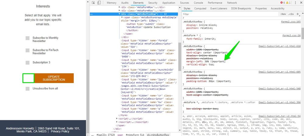
It looks like there is a margin-left: 30%; rule set on the .mktoButtonRow. Im guessing this style is on your template from the looks of it if you're trying to track it down. In the inspector, I was able to add margin:auto !important; to the button row and center the button on mobile. Depending on how you've got your CSS layered, you might also try something like: form.mktoForm .mktoButtonRow {margin-left:auto !important; margin-right:auto !important;}.
It looks like the checkbox labels are lining up to the right of the inputs on my end, not sure if that got fixed or could be browser specific? (Im using Chrome)
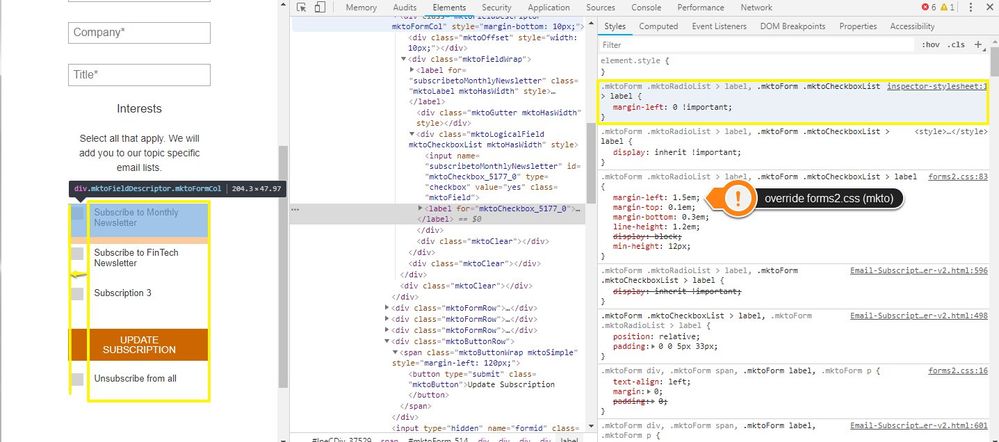
I did notice that there was a left-margin that was pushing your inputs in, squeezing those labels a bit. It's more noticeable when the button is centered (see below) so I thought I'd send over a solution to move those over once you get the button centered. In the shot below, I've added a new line of CSS to override the forms2.css file that Marketo loads with your forms. I've pointed out the default w/ the orange sticker and the new code in the yellow box. It move the checkboxes over about "1-checkbox width" to the left and they line up a bit nice with the left side of the button this way.
Here's that code for reference:
.mktoForm .mktoRadioList > label, .mktoForm .mktoCheckboxList > label {
margin-left: 0 !important;
}
- Mark as New
- Bookmark
- Subscribe
- Mute
- Subscribe to RSS Feed
- Permalink
- Report Inappropriate Content
Hi Sonali,
https://gist.github.com/cougrimes/5168524fd9365eedea16 supports up to three columns being normalized out for responsive using nth-last-child rather than nth-of-type, which can cause some issues otherwise.
- Mark as New
- Bookmark
- Subscribe
- Mute
- Subscribe to RSS Feed
- Permalink
- Report Inappropriate Content
@Courtney I was trying out your suggestion on my test page here. I'm running into some issues aligning the checkboxes to the right of the label and centering the button on mobile. Should the margin:auto !important; line work here or did I miss something?
- Mark as New
- Bookmark
- Subscribe
- Mute
- Subscribe to RSS Feed
- Permalink
- Report Inappropriate Content
You might need to get creative and use something like the nth-of-type selector to target the third .mktoFormCol to resize it differently than the first two.
That might look something like this:
.mktoFormCol { width: 48% !important;}
.mktoForm .mktoFormRow:nth-of-type(2) .mktoFormCol {
width:100% !important;
}
If you can post a link to a live page with the form loaded up on it, I can use the inspector to help discover a solution that'd work on your form.
You can find more about the nth-of-type selector here: CSS :nth-of-type() Selector
- Mark as New
- Bookmark
- Subscribe
- Mute
- Subscribe to RSS Feed
- Permalink
- Report Inappropriate Content
This worked! Thank a lot Dave Roberts
And thanks everyone for taking time to answer my query!
- Mark as New
- Bookmark
- Subscribe
- Mute
- Subscribe to RSS Feed
- Permalink
- Report Inappropriate Content
What are your breakpoints? A 2 column layout with span isn't necessarily "responsive."
- Copyright © 2025 Adobe. All rights reserved.
- Privacy
- Community Guidelines
- Terms of use
- Do not sell my personal information
Adchoices


