Re: Creating form with two fields in one row and one field in another row
- Subscribe to RSS Feed
- Mark Topic as New
- Mark Topic as Read
- Float this Topic for Current User
- Bookmark
- Subscribe
- Printer Friendly Page
- Mark as New
- Bookmark
- Subscribe
- Mute
- Subscribe to RSS Feed
- Permalink
- Report Inappropriate Content
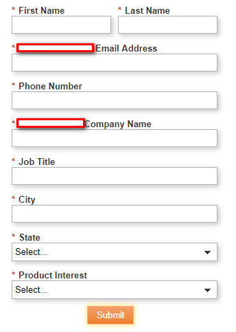
Hello! I'm trying to create a landing page with a form. I would like the form to look like the picture below but I am unable to figure out how to do it.
I can get it to display either in 1 column or 2 column format but I am unsure of how to display it so that it does both (or maybe it's not possible?).
Thanks in advance for any assistance!
- Mark as New
- Bookmark
- Subscribe
- Mute
- Subscribe to RSS Feed
- Permalink
- Report Inappropriate Content
Hey Jonathan,
This is indeed possible, it's just that Marketo's native CSS doesn't really provide a good shell for anything responsive when you drag and drop the columns using the editor. Generally, I'll override the native form styles to get my form to behave responsively by ditching the fixed width styles and replacing them with fluid widths (100% instead of 150px). There's a bit of CSS work to do, you'll need to make the form.mktoForm, .mktoFormRow, .mktoFormCol, .mktoFieldWrap, and .mktoField (inputs) all 100% wide in the CSS to get the fields to stretch/shrink along with the changing width of the container. I'd be happy to put together a basic CSS file to outline that if it'd be helpful.
The obstacle:
1) Writing CSS for a specific field is rarely the correct route -- in this case if you wrote something special for First and Last Name but then in the future wanted to do another line of 2-col fields you'd have to go in and edit the code.
2) All form rows and columns use the same classes so when you make a change to one, they all change -- this means you either get "all 2-col" or "all 1-col" fields in your form.
3) Marketo forms could use a lot of help in terms of being responsive and come chock-o-block with styles that most folks want to delete (by running some kinds script to remove the class names) but which can be overwritten with CSS if you know where to look.
The approach:
One of the little-used elements in Marketo Forms is the fieldset element - it can be added when you click the [+] to add a new field to your form, you'll see the "Rich Text" and "Fieldset" option. The fieldset is basically another container that you can add fields into (drag-and-drop for placement). It comes with a few styles of it's own that'll need to be hidden along with a <legend> (the fieldset's "label") that can be used to describe the functionality inside the editor (i.e. "All fields inside this fieldset will show up as 2-col") but hidden from the final render [so it serves as a "hint" to users and is obvious to anyone unfamiliar with the setup].
Because the fieldset is a "parent" element (it wraps your fields) you can use CSS selectors to style fields inside a fieldset differently than fields that are not in a fieldset, here's a quick example of what that'd look like:
/* full width inputs on the form */
form.mktoForm input[type=text] { width:100% !important; }
/* 1/2 width inputs INSIDE a fieldset at tablet -screens and up */
@media screen and (min-width:768px) {
form.mktoForm fieldset input[type=text] { width:50% !important; }
}The rule on line 2 makes the "text" fields 100% wide (1-column). The rule on lines 5-7 rely on a media query that starts at 768px (tablet size) and will make "text" fields inside a fieldset 50% wide instead.
The takeaway:
Using a fieldset is a way to "split" the styles for your fields into two sets, one INSIDE a fieldset and another OUTSIDE (default). You'll always want to make sure that the rules for the fields inside a fieldset follow (come after) the default rules for the fields outside a fieldset in your CSS.
---------------------------------------
If you can share a link to an LP with this form setup on it, I'd be happy to tinker with some basic CSS and share that here, it looks like there are a lot of folks who could use a solution like this. It looks like beyond the 2-col setup, there are some issues with the form labels -- I'd guess that has something to do with a fixed size for those elements, but I can also help iron that piece out if you're able to share a link.
Let me know if you've got any questions on this, Im happy to help build out a CSS solution to help support the community, I'd just need to be able to see your HTML/CSS to write up a solution.
- Mark as New
- Bookmark
- Subscribe
- Mute
- Subscribe to RSS Feed
- Permalink
- Report Inappropriate Content
Hi Jonathan,
Did the solutions provided here work for you? I have the same struggle, and changing the field and label width in the form builder page didn't really help.
Devraj Grewal Grégoire Michel Josh Gilchrist
The width of the form on LP is 800pxs with 20 pxs on the left, and the field lavel is 101 pxs, and the field itself is 150 pxs. The form doesn't have custom CSS.
Here's the LP I pulled in the form, and none of the fields are showing in 2-fields-in-a-row fashion. info.attivio.com/Elevate-ServiceNow-Apps-Trial_Elevate-Trial-Request-Page-Trial-2.html
I actually contacted Marketo support and they said that in Marketo we can have only 1 field in a row without custom coding. Is it true?
- Mark as New
- Bookmark
- Subscribe
- Mute
- Subscribe to RSS Feed
- Permalink
- Report Inappropriate Content
This is completely not true!
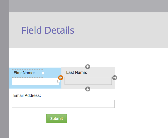
I'm not sure what I'm missing here, but you really just need to use the form editor to re-position the fields, here's a screenshot of how it's done.
- Mark as New
- Bookmark
- Subscribe
- Mute
- Subscribe to RSS Feed
- Permalink
- Report Inappropriate Content
Hi josh,
the problem with this feature is that it does not work correctly on responsive design. You have to hard code the field width so that the fieled on the second row appears as large as the combination of the 2 others, and this will work only on the larger screens (desktop, tablet in landscape mode) and break rapidly. You have no real control. Hard coding field width suis not really good responsive practice ![]()
Greg
- Mark as New
- Bookmark
- Subscribe
- Mute
- Subscribe to RSS Feed
- Permalink
- Report Inappropriate Content
I found something interesting this morning.
I created another LP with different template (which is pretty much blank), and voila, the form renders as is on the Form Builder.
Here's the new LP I created. info.attivio.com/ServiceNow_Trial_Request_Internal.html
I can't tell the difference between the other one and this one... Hope someone has some insights!
- Mark as New
- Bookmark
- Subscribe
- Mute
- Subscribe to RSS Feed
- Permalink
- Report Inappropriate Content
Hi Kanako,
In your first LP, there's a CSS block on the template between lines 81 and 196 that's manipulating the layout. In your second LP, there's no such setup.
- Mark as New
- Bookmark
- Subscribe
- Mute
- Subscribe to RSS Feed
- Permalink
- Report Inappropriate Content
That's what I thought when the support team told me we can't put 2 in a row. If this orange arrow doesn't mean to put 2 fields in a row, then it's very misleading. Do you happen to have a screenshot of LP with a form that has 2 fields in a row? I'd love to see what'd be the difference between mine and yours...
- Mark as New
- Bookmark
- Subscribe
- Mute
- Subscribe to RSS Feed
- Permalink
- Report Inappropriate Content
Hey Kanako,
I wasn't able to find a solution for this unfortunately. This is something that custom CSS may be able to solve but I wasn't able to figure it out. Marketo doesn't seem to have the capability to do this by itself.
- Mark as New
- Bookmark
- Subscribe
- Mute
- Subscribe to RSS Feed
- Permalink
- Report Inappropriate Content
Hi All,
this is possible using an advanced framework to inject css hooks in the form, so that you can apply advanced CSS.
See Better styling of forms : yet another framework
-Greg
- Mark as New
- Bookmark
- Subscribe
- Mute
- Subscribe to RSS Feed
- Permalink
- Report Inappropriate Content
Hi Greg,
On one hand, I see what you're doing with this framework, but that also seems like a lot of work. I'd really just recommend using a CSS reset to make multiple columns behave correctly and then just adjusting the parent element as needed. Granted, I only account for up to three form fields per row in my example, but tacking on extra ones isn't terribly difficult; you'd just use additional psuedoclasses which IE9+ and every other browser supports. No JS class additions needed.
- Mark as New
- Bookmark
- Subscribe
- Mute
- Subscribe to RSS Feed
- Permalink
- Report Inappropriate Content
Hi Courtney,
I prefer the method in which you just get rid of Marketo styles and start from a fresh CSS, using tag attributes to hook exactly the thing. The method I suggest is not that difficult, because it séparates the work of the web designer from that of the Marketo user. The web designer simply adds the JS to the LP templates or the form embed code, once for all, and then the Marketo user creating the page gain complete control and full responsiveness.
since I wrote this article, though, we have evolved to rather using and augmenting Sanford Whiteman‘s destyle library, we augmented it with attributes that add information about field types, in addition to field names, making it easy to style correctly radios, checkbox, and checkboxes types or to give a style to a specific field.
-Greg
- Mark as New
- Bookmark
- Subscribe
- Mute
- Subscribe to RSS Feed
- Permalink
- Report Inappropriate Content
Thank you all. I'll try the coding on Greg's post.
- Mark as New
- Bookmark
- Subscribe
- Mute
- Subscribe to RSS Feed
- Permalink
- Report Inappropriate Content
You can drag and drop the fields into position via the form editor and then adjust the lengths as needed.
When you drag and drop to re-position the field(s), you'll see arrows around the field indicating the field can be re-positioned to the left or right of other fields (as well as above or below).
- Mark as New
- Bookmark
- Subscribe
- Mute
- Subscribe to RSS Feed
- Permalink
- Report Inappropriate Content
Check the width of your labels in the form designer.
Oherwise, this is a CSS issue.
-Greg
- Mark as New
- Bookmark
- Subscribe
- Mute
- Subscribe to RSS Feed
- Permalink
- Report Inappropriate Content
Jonathan,
If you want only the first and last name fields to appear in a two column format and the remaining to appear in one column, you can adjust the field width for the remaining fields. This will make it appear as if they are on one column.
- Copyright © 2025 Adobe. All rights reserved.
- Privacy
- Community Guidelines
- Terms of use
- Do not sell my personal information
Adchoices

