Your Achievements
Next /
Sign inSign in to Community to gain points, level up, and earn exciting badges like the new Applaud 5 BadgeLearn more!
View All BadgesSign in to view all badges
Re: The New UI makes the User friendly harder when want a local Asset inside a program
Topic Options
- Subscribe to RSS Feed
- Mark Topic as New
- Mark Topic as Read
- Float this Topic for Current User
- Bookmark
- Subscribe
- Printer Friendly Page
Anonymous
Not applicable
07-31-2013
02:25 AM
- Mark as New
- Bookmark
- Subscribe
- Mute
- Subscribe to RSS Feed
- Permalink
- Report Inappropriate Content
07-31-2013
02:25 AM
These things in the new UI i don't understand why Marketo choice to do more double Clicks and drag and drops.
Here is a irritation Example when creating a new Local Asset in a Program that you want to create in a folder you have in teh program.

#fig2.

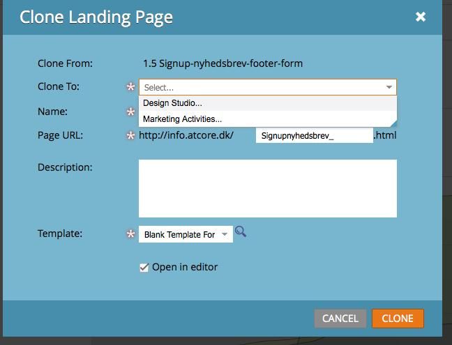
There a Even more issue with the new UI when cloning assets.

#fig4

The Last Example is not Course by the new UI was there already in the old. Importing to a list you Created.
All these step show a lot of double clicks form the user end.
#fig5

#fig6

Here is a irritation Example when creating a new Local Asset in a Program that you want to create in a folder you have in teh program.
- Create a Program Any
- Create 2-3 Folder that will keep it easier for you to look on your Local Asset.
- Here comes the Tricky Part. Create a new Local Accest by left clicking on the folder you want the Asset in (Look Fig. 1)
- Not i need to Choice a Campaign folder, but not able to choice a subfolder inside my program. First Question here why do I need to Choice the same Program i just right clicked on? (Fig.2.)
- Now i need to Drag and Drop the element in the program to the right folder.
- Step 4 and 5 is steps that I will see as skipped. Since the user already is the right place.

#fig2.

There a Even more issue with the new UI when cloning assets.
- I press clone on a Landing page i create
- I need to Choice if i want it in Marketing Activities or Design studio (fig.3)
- Then i need to Search for a folder (in Marketo Case a Program Name) why is the option same program remove? (Fig. 4)

#fig4

The Last Example is not Course by the new UI was there already in the old. Importing to a list you Created.
- I create a List i want to Import Leads to inside a program or in Design studio
- I Right Click on the list i created and press import. (Fig.5)
- Choice the CSV file i need to import. I process to Final step 3 i need to Choice the same list i just right click on (Fig.6)
All these step show a lot of double clicks form the user end.
#fig5

#fig6

Labels:
- Labels:
-
Lead Management
2 REPLIES 2
Anonymous
Not applicable
07-31-2013
09:12 AM
- Mark as New
- Bookmark
- Subscribe
- Mute
- Subscribe to RSS Feed
- Permalink
- Report Inappropriate Content
07-31-2013
09:12 AM
Hi Tom.
I created a Idea now. thanks
Please like it on http://community.marketo.com/MarketoIdeaDetail?id=08750000000Ivp9AAC and voted for it.
I created a Idea now. thanks
Please like it on http://community.marketo.com/MarketoIdeaDetail?id=08750000000Ivp9AAC and voted for it.
Anonymous
Not applicable
07-31-2013
08:11 AM
- Mark as New
- Bookmark
- Subscribe
- Mute
- Subscribe to RSS Feed
- Permalink
- Report Inappropriate Content
07-31-2013
08:11 AM
The new interface does have some curious issues. Whenever you right click on a folder or program, it really should be smart enough to auto-populate the folder/program you have alredy right clicked on. This is a surprising oversight given the amount of time they put into the UI design, however it is something I'm sure they will remedy.
Have you created an idea for this yet, so that we can get this issue on their radar?
Have you created an idea for this yet, so that we can get this issue on their radar?
- Copyright © 2025 Adobe. All rights reserved.
- Privacy
- Community Guidelines
- Terms of use
- Do not sell my personal information
Adchoices