Stylize Marketo Form
- Subscribe to RSS Feed
- Mark Topic as New
- Mark Topic as Read
- Float this Topic for Current User
- Bookmark
- Subscribe
- Printer Friendly Page
- Mark as New
- Bookmark
- Subscribe
- Mute
- Subscribe to RSS Feed
- Permalink
- Report Inappropriate Content
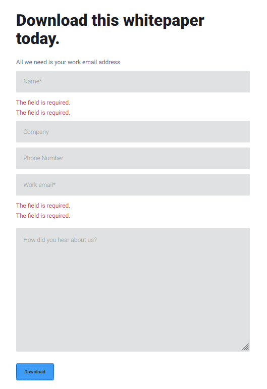
Hi - I'm super rusty with CSS but hoping someone can point me in the right direction. On the page below, I need to style the first form to look like the second form, what's the best way to pull the CSS styling on the second form to drop into the custom CSS styling for the Marketo form?
Digital Transformation In Education - Liquit
Solved! Go to Solution.
- Labels:
-
custom css
-
form styling
- Mark as New
- Bookmark
- Subscribe
- Mute
- Subscribe to RSS Feed
- Permalink
- Report Inappropriate Content
Well, someone with enough experience w/Marketo forms can definitely tweak them to look 99.9% identical. But it’s not an instant thing, as you have to translate styles for the new HTML.
Also, as I pointed out, the error message logic is different on your existing form. Marketo forms pop up errors next to a single field at a time. You can customize that using JS, but again it takes an experienced dev.
- Mark as New
- Bookmark
- Subscribe
- Mute
- Subscribe to RSS Feed
- Permalink
- Report Inappropriate Content
Hey @jinawatson -- I'm always down for a form styling exercise and had a little time to tinker this morning.
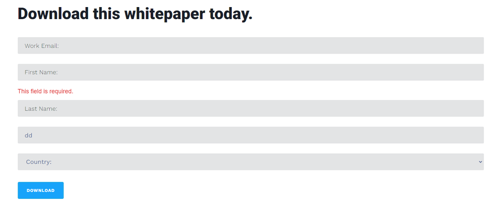
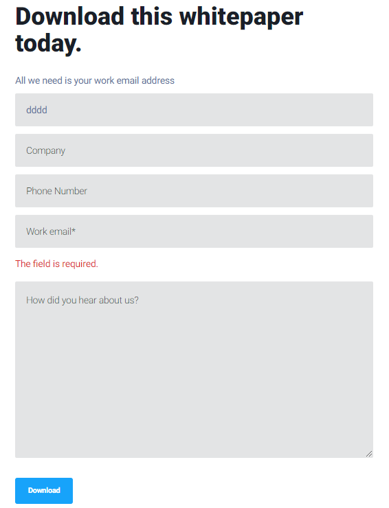
Here's a snapshot of what I'm seeing on my end, I think I've this pretty close to matchy-matchy for you or at least a solid starting point for your dev team to roll with:
Above: If you were to place the CSS below into the Custom CSS on this form in Marketo, you should see something like this on the page.
Below: This is what the bottom form looks like (the non-Marketo form from the website)
Here's the code you can drop in there, let me know if anything looking wonky or if there's anything I can help ya iron out on this one.
.mktoForm input[type="text"], .mktoForm input[type="url"], .mktoForm input[type="email"], .mktoForm input[type="tel"], .mktoForm input[type="number"], .mktoForm input[type="date"], .mktoForm select.mktoField, .mktoForm textarea.mktoField {
    margin-top: 10px !important;
    padding: 20px !important;
    background: #e3e4e5 !important;
    border-radius: 3px !important;
    border: 1px solid #e3e4e5 !important;
    font-size: 18px !important;
    line-height: normal !important;
     margin-bottom: 15px !important;
    color: #61709a !important;
}
form.mktoForm select.mktoField {
    padding: 0px 20px !important;

}
form.mktoForm .mktoFormRow {
    margin-bottom: 0px !important;
}
form.mktoForm .mktoFormCol {
    min-height: 0 !important;
    margin: 0px !important;
}

form.mktoForm .mktoError {
    position: relative;
    bottom: 0 !important;
    left: 0;
    right: auto !important;
    z-index: -1 !important;
    width: 100% !important;
}

form.mktoForm .mktoErrorArrowWrap {
    display: none !important;
}
form.mktoForm .mktoError .mktoErrorMsg {
    width: 100% !important;
    max-width: 100% !important;
    background: none;
    border: none !important;
    box-shadow: none !important;
    text-shadow: none !important;
    color: #dc3232 !important;
    font-size: 18px !important;
    font-weight: 400 !important;
    padding:  0px !important;
    display: inline-block;
}

form.mktoForm .mktoButtonRow {
    margin-top: 20px !important;
    text-align: left !important;
}
form.mktoForm button[type=submit] {
    background: #17a3fa !important;
        margin-bottom: 25px !important;
    padding: 15px 25px !important;
    font-weight: 600 !important;
    box-shadow: none !important;
    transition: all 250ms ease-in-out;
    color: #fff !important;
}
form.mktoForm button[type=submit]:hover {
    background: #eaf5fe !important;
    border-color: #eaf5fe !important;
}
- Mark as New
- Bookmark
- Subscribe
- Mute
- Subscribe to RSS Feed
- Permalink
- Report Inappropriate Content
Thanks Dave! I tried to drop it in but it didn't render correctly. I have put it on their web dev team to figure it out now. 🙂 I appreciate you working through it!
- Mark as New
- Bookmark
- Subscribe
- Mute
- Subscribe to RSS Feed
- Permalink
- Report Inappropriate Content
Bummer, this may have something to do with a conflict with the website styling. Normally to work something like this out, we'll clone the form and web page and do some testing to get the website styles to gel with what is coming from Marketo. The issue usually has something to do with 1) The load order of the stylesheets and 2) Different styles for form elements (like inputs and buttons) that are written for the website forms but leak over into the Marketo forms b/c they're not written in a specific enough way. Keep me in mind if you run into obstacles here and I'd be happy to loop back on this one to help ya out.
- Mark as New
- Bookmark
- Subscribe
- Mute
- Subscribe to RSS Feed
- Permalink
- Report Inappropriate Content
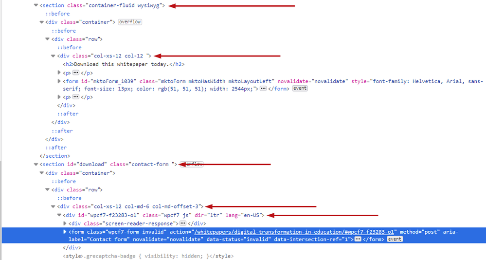
The underlying HTML markup is completely different, you won’t just be able to “drop” styles in.
At the very least you need to ensure the parent elements are the same, right now you’re not even starting with the same inheritance:
Also, are you sure you want this rather unusual experience to be duplicated on the Marketo form?
- Mark as New
- Bookmark
- Subscribe
- Mute
- Subscribe to RSS Feed
- Permalink
- Report Inappropriate Content
Ahh, I see.
We are replacing forms on a the website of a company we acquired so we can migrate them from HubSpot to Marketo but the existing styling matches our website versus theirs. Just trying to make it look like it fits in with the page layout overall.
- Mark as New
- Bookmark
- Subscribe
- Mute
- Subscribe to RSS Feed
- Permalink
- Report Inappropriate Content
Well, someone with enough experience w/Marketo forms can definitely tweak them to look 99.9% identical. But it’s not an instant thing, as you have to translate styles for the new HTML.
Also, as I pointed out, the error message logic is different on your existing form. Marketo forms pop up errors next to a single field at a time. You can customize that using JS, but again it takes an experienced dev.
- Mark as New
- Bookmark
- Subscribe
- Mute
- Subscribe to RSS Feed
- Permalink
- Report Inappropriate Content
Thanks! I'm going to have their web dev team style it out. 🙂
- Copyright © 2025 Adobe. All rights reserved.
- Privacy
- Community Guidelines
- Terms of use
- Do not sell my personal information
Adchoices


