Re: Restyling Marketo Form Challenges
- Subscribe to RSS Feed
- Mark Topic as New
- Mark Topic as Read
- Float this Topic for Current User
- Bookmark
- Subscribe
- Printer Friendly Page
- Mark as New
- Bookmark
- Subscribe
- Mute
- Subscribe to RSS Feed
- Permalink
- Report Inappropriate Content
We're redesigning our preference center and running into some challenges with the landing page and form functionality. I followed this extraordinarily helpful tutorial on restyling the form, which works fantastically for the most part, but am now running into a few additional issues: Form Layout Update (CSS Styling)
Here's my form, hosted on a Marketo landing page.
A functionality issue I'm having
- I'm using checkbox lists for all of my checkboxes, and have the main options grouped in fieldsets. When a user checks either "subscribe to all" or "unsubscribe from all" I want to check or uncheck all checkbox lists in the fieldset. I'm using the script described in this discussion, which works perfectly when my "subscribe to all/unsubscribe from all" fields are using the checkbox input, but it falls apart when I change them to a checkbox list: Re: Marketo Form: Uncheck other boxes when a certain checkbox gets checked
Moved this to its own question: Check all Checkbox List Fields in a Form
Here are the design issues I'm having difficulty solving
- I want to apply a style to the very top row of the form (where subscribe/unsub all fields are located). I tried applying a class to .mktoFormRow:nth-of-type(1) but this is applying the class to the first row of my fieldset as well. How can I apply a style to a single row of my form?
- I'm using a free-form landing page template. Beneath my form I have that rich text section with logos. I'd like this rich text section (identified with a style called "logos" in my stylesheet) to stick to the footer of the webpage, always below the form itself. Whenever the form resizes (due to visibility rules), that logo section covers the submit button. How can I add content that will always display below the submit button on a form?
Thank you for any guidance you can provide!
Solved! Go to Solution.
- Mark as New
- Bookmark
- Subscribe
- Mute
- Subscribe to RSS Feed
- Permalink
- Report Inappropriate Content
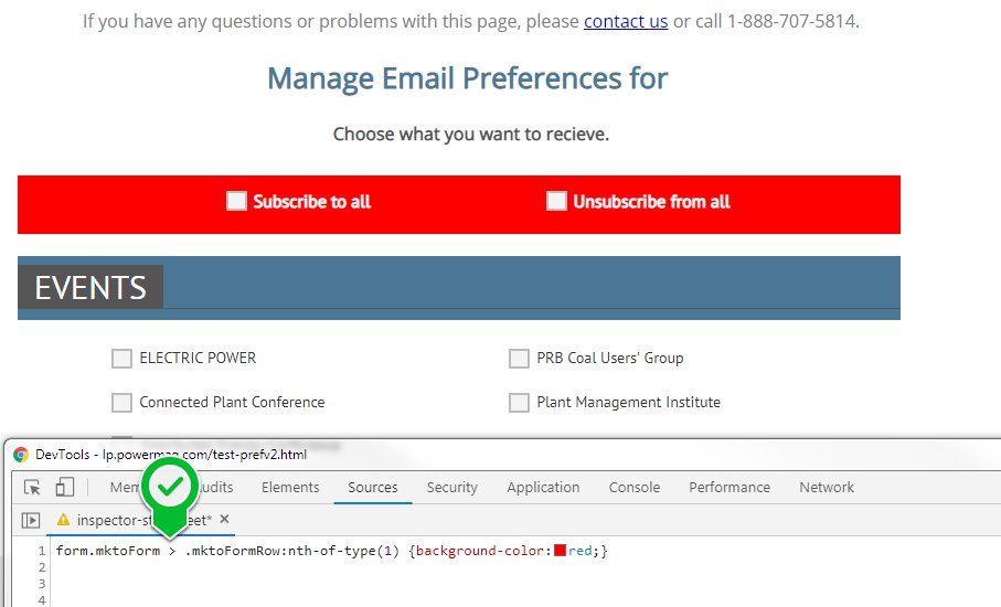
For the 2nd part, you can target just the 1st row in your form using the following CSS:
form.mktoForm > .mktoFormRow:nth-of-type(1) {background-color:red;}
This targets the 1st form row that is a child of the form element, so it'll exclude all of the other rows.
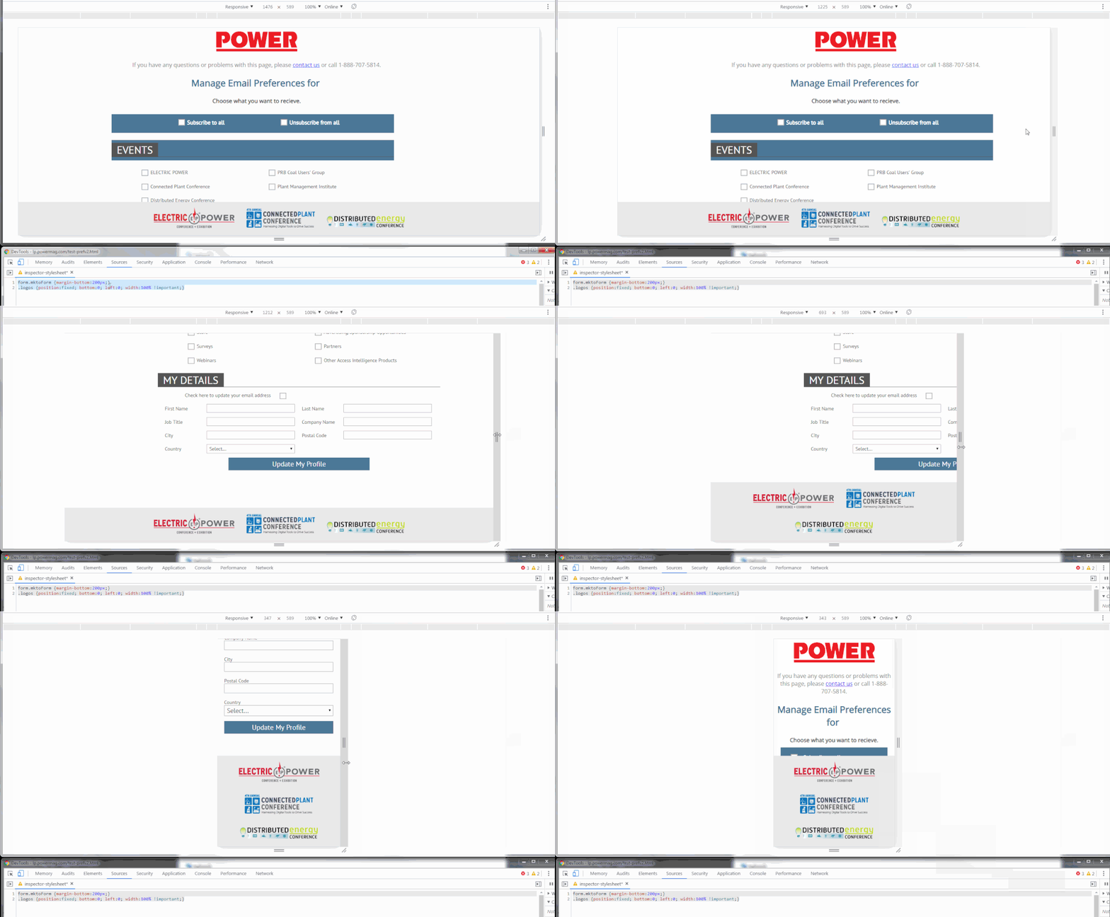
For the 3rd part, you can use the position:fixed; bottom:0; left:0; styles on your .logos container to fix that to the bottom of the page. You'll need to make it full width with the 100% rule as well. This'll make it stick to the bottom of the page, but it'll cover up the content until you scroll down the page. To make sure that the .logos container doesn't overlap the submit button, you can add a margin to the bottom of your form to offset the maximum height of the logos container when it all stacks up for mobile (about 200px).
Here's a look at the page with these styles applied in the inspector:
and here's the styles I used that you can copy/paste into your CSS document:
form.mktoForm {margin-bottom:200px;}
.logos {position:fixed; bottom:0; left:0; width:100% !important;}
- Mark as New
- Bookmark
- Subscribe
- Mute
- Subscribe to RSS Feed
- Permalink
- Report Inappropriate Content
Thank you, this is incredibly helpful!
- Mark as New
- Bookmark
- Subscribe
- Mute
- Subscribe to RSS Feed
- Permalink
- Report Inappropriate Content
Suggest you rework your form first:
A person shouldn't be able to select both, it's one or the other... These should be radio buttons styled as checkboxes (various CSS tutorials online)
If these checkboxes aren't actually being submitted as data, and are only there to help the person check or uncheck dozens of boxes, they should be buttons which the person can click and get an action, not checkboxes
- Mark as New
- Bookmark
- Subscribe
- Mute
- Subscribe to RSS Feed
- Permalink
- Report Inappropriate Content
Please separate these into different threads. There are people here with different specialties and it's not fair to expect one single correct answer.
You might also change the first question so it's clear it doesn't relate to styling. That's a behavioral/interaction goal, not a style.
- Mark as New
- Bookmark
- Subscribe
- Mute
- Subscribe to RSS Feed
- Permalink
- Report Inappropriate Content
I submitted the challenge with using checkbox list input types to select/deselect other checkboxes here! https://nation.marketo.com/message/208556-check-all-checkbox-list-fields-in-a-form
- Mark as New
- Bookmark
- Subscribe
- Mute
- Subscribe to RSS Feed
- Permalink
- Report Inappropriate Content
Yes of course! I'll submit a new question for the functionality portion of this challenge.
- Copyright © 2025 Adobe. All rights reserved.
- Privacy
- Community Guidelines
- Terms of use
- Do not sell my personal information
Adchoices


