Re: Need help formatting text for mobile
- Subscribe to RSS Feed
- Mark Topic as New
- Mark Topic as Read
- Float this Topic for Current User
- Bookmark
- Subscribe
- Printer Friendly Page
- Mark as New
- Bookmark
- Subscribe
- Mute
- Subscribe to RSS Feed
- Permalink
- Report Inappropriate Content
Hello Community,
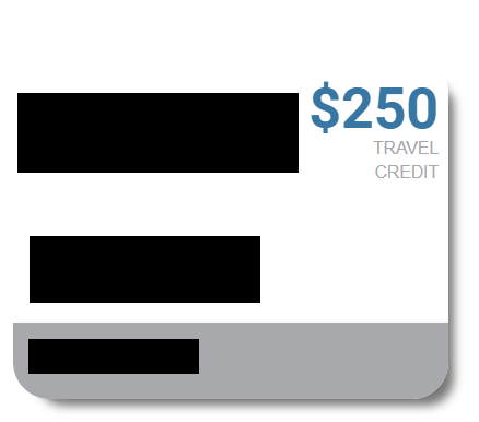
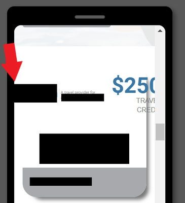
I am working on a Marketo landing page and have an issue where the text is coming off of an "image" built using CSS.
I have researched and tried different methods to format the text, such as using flex-wrap, etc., but am not getting anywhere.
Any help would be much appreciated. Please see screenshots below and a link to the lp here: http://promos.ovstravel.com/IM---Operational-Testing-Program_SMS-Test-Landing-Page.html
In desktop view:
In mobile view:
Solved! Go to Solution.
- Labels:
-
landing page
-
mobile
-
mobile responsive
- Mark as New
- Bookmark
- Subscribe
- Mute
- Subscribe to RSS Feed
- Permalink
- Report Inappropriate Content
Hey LK,
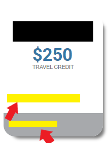
Thanks for getting the page approved so I could have a quick look. On my end, everything seems to be showing as-expected in Chrome on a PC. Were you using a different browser when you experienced this issue? I've attached a screenshot below to show you what Im seeing on my end when I pull up the page and resize it down to mobile:
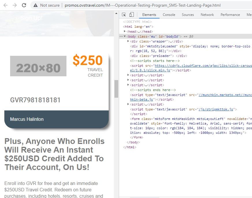
*note: There seems to be an error w/ the image URL so nothing is displaying in the image box when I load the page. I've added a placeholder in the inspector tools for example here.
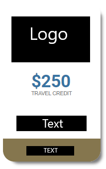
I added a few styles into the dev console in the browser to try and see if we could stack the elements in there for mobile instead of having them shrink and stay in the same row. I was able to accomplish this using the flex-direction property and changing it from "column" (for mobile, stacked) to "row" (for mobile+, horizontal) as you go from mobile to tablet and up. There's a few other adjustments in the CSS to deal with the spacing of the element in the different orientations, let me know if you've got questions about anything here.
/* mobile styles first ( <480px) */

/* display flex container as a column to stack items and center justify them */
.eu .sec4_inner_left {
    flex-direction:column;
    justify-content: center;
    margin-bottom:20px;
}

/* center align image and add some spacing top/bottom */
.eu .sec4_left_logo {
    padding:0px !important;
    text-align:center;
    margin:20px 0;
}

/* mobile (landscape) and up styles next (480px+) */
@media screen and (min-width:480px) {
    /* adjust flex container orientation (row instead of column = horizontal display) */
    .eu .sec4_inner_left {
        flex-direction:row;
        justify-content: normal;
    }
    /* add padding back around logo image */
    .eu .sec4_left_logo {
        padding:20px !important;
    }
    /* justify $250 credit text to right */
    #sec4_credit_text {
        margin-left:auto;
    }
}
... and here's what Im seeing in mobile view with these styles added to the page:
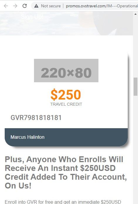
In terms of implementing this, it'd be best to modify the stylesheet (arr_style.css) at the source of these styles. You'll notice there's an "!important" flag on the logo padding to work around the existing padding set on the arr_style file.
Next best thing would be to dump them into a <style> tag inside the Edit Page Metatags menu under Custom HEAD HTML to populate them at the page level. That'd end up looking something like this:
<style>
/* remove this line and replace it with the CSS above */
</style>
1) Let me know if you're using a different browser when you're seeing things get pushed out of the container on mobile
2) or if you've got any questions/issues with putting the code above into play or testing it out.
Thanks again,
Dave
- Mark as New
- Bookmark
- Subscribe
- Mute
- Subscribe to RSS Feed
- Permalink
- Report Inappropriate Content
Since those two pieces are wrapped in their own paragraph (kinda on their own "line") we can use the text-align settings to adjust them to center (for mobile) and then to left (for 480px+).
Here's a look at the updated CSS with the add'l items centered on mobile and left on mobile+:
Look for the "/* THIS IS NEW **************/" comments to find the new lines (four total, two mobile, two mobile+) below:
/* mobile styles first ( <480px) */

/* display flex container as a column to stack items and center justify them */
.eu .sec4_inner_left {
    flex-direction:column;
    justify-content: center;
    margin-bottom:20px;
}

/* center align image and add some spacing top/bottom */
.eu .sec4_left_logo {
    padding:0px !important;
    text-align:center;
    margin:20px 0;
}
/* THIS IS NEW **************/
/* center align bottom text */
#sec4_bottom_text {text-align:center;}
#sec4_blue_text {text-align:center;}

/* mobile (landscape) and up styles next (480px+) */
@media screen and (min-width:480px) {
    /* adjust flex container orientation (row instead of column = horizontal display) */
    .eu .sec4_inner_left {
        flex-direction:row;
        justify-content: normal;
    }
    /* add padding back around logo image */
    .eu .sec4_left_logo {
        padding:20px !important;
    }
    /* justify $250 credit text to right */
    #sec4_credit_text {
        margin-left:auto;
    }
    /* THIS IS NEW ***************/
    /* left align text on bottom */
    #sec4_bottom_text {text-align:left;}
    #sec4_blue_text {text-align:left;}
}
- Mark as New
- Bookmark
- Subscribe
- Mute
- Subscribe to RSS Feed
- Permalink
- Report Inappropriate Content
Hey Guitarrista82,
It looks like the link you posted is pushing me to a login page rather than a page with a price offer on it (https://www.icerewardslifestyle.com/login-page/?utm_source=mkto-fallback)
I'd be happy to help out here if you're able to host this in such a way that I don't need to login or send me some login creds in a Direct Message here in the community to get started looking at it.
Usually with stuff like this that floats over something else on the page, the css uses some kind of positioning (absolute/relative) to make it happen and based on the mobile screenshot you shared w/ the content popping out of the box, I suspect that might be a part of the issue here. In any case - if I can get into the a live view of the page and into the inspector I can probably help you get to the bottom of this one.
Thanks,
Dave
- Mark as New
- Bookmark
- Subscribe
- Mute
- Subscribe to RSS Feed
- Permalink
- Report Inappropriate Content
Hi Dave!
The link should work now...I just needed to approve the page: http://promos.ovstravel.com/IM---Operational-Testing-Program_SMS-Test-Landing-Page.html
One note is that I did resize the logo on the image, but it's not ideal. It looks really small now so wondering if there's another option, like having the $250 Travel Credit text move down below the logo?
Thank you,
LK
- Mark as New
- Bookmark
- Subscribe
- Mute
- Subscribe to RSS Feed
- Permalink
- Report Inappropriate Content
Hey LK,
Thanks for getting the page approved so I could have a quick look. On my end, everything seems to be showing as-expected in Chrome on a PC. Were you using a different browser when you experienced this issue? I've attached a screenshot below to show you what Im seeing on my end when I pull up the page and resize it down to mobile:

*note: There seems to be an error w/ the image URL so nothing is displaying in the image box when I load the page. I've added a placeholder in the inspector tools for example here.
I added a few styles into the dev console in the browser to try and see if we could stack the elements in there for mobile instead of having them shrink and stay in the same row. I was able to accomplish this using the flex-direction property and changing it from "column" (for mobile, stacked) to "row" (for mobile+, horizontal) as you go from mobile to tablet and up. There's a few other adjustments in the CSS to deal with the spacing of the element in the different orientations, let me know if you've got questions about anything here.
/* mobile styles first ( <480px) */

/* display flex container as a column to stack items and center justify them */
.eu .sec4_inner_left {
    flex-direction:column;
    justify-content: center;
    margin-bottom:20px;
}

/* center align image and add some spacing top/bottom */
.eu .sec4_left_logo {
    padding:0px !important;
    text-align:center;
    margin:20px 0;
}

/* mobile (landscape) and up styles next (480px+) */
@media screen and (min-width:480px) {
    /* adjust flex container orientation (row instead of column = horizontal display) */
    .eu .sec4_inner_left {
        flex-direction:row;
        justify-content: normal;
    }
    /* add padding back around logo image */
    .eu .sec4_left_logo {
        padding:20px !important;
    }
    /* justify $250 credit text to right */
    #sec4_credit_text {
        margin-left:auto;
    }
}
... and here's what Im seeing in mobile view with these styles added to the page:

In terms of implementing this, it'd be best to modify the stylesheet (arr_style.css) at the source of these styles. You'll notice there's an "!important" flag on the logo padding to work around the existing padding set on the arr_style file.
Next best thing would be to dump them into a <style> tag inside the Edit Page Metatags menu under Custom HEAD HTML to populate them at the page level. That'd end up looking something like this:
<style>
/* remove this line and replace it with the CSS above */
</style>
1) Let me know if you're using a different browser when you're seeing things get pushed out of the container on mobile
2) or if you've got any questions/issues with putting the code above into play or testing it out.
Thanks again,
Dave
- Mark as New
- Bookmark
- Subscribe
- Mute
- Subscribe to RSS Feed
- Permalink
- Report Inappropriate Content
Hi Dave,
Thanks so much for your help!
If I wanted to center the text below the logo and $250 text in mobile view (480px) would I apply the same CSS styling?
Thank you,
LK
- Mark as New
- Bookmark
- Subscribe
- Mute
- Subscribe to RSS Feed
- Permalink
- Report Inappropriate Content
Since those two pieces are wrapped in their own paragraph (kinda on their own "line") we can use the text-align settings to adjust them to center (for mobile) and then to left (for 480px+).
Here's a look at the updated CSS with the add'l items centered on mobile and left on mobile+:
Look for the "/* THIS IS NEW **************/" comments to find the new lines (four total, two mobile, two mobile+) below:
/* mobile styles first ( <480px) */

/* display flex container as a column to stack items and center justify them */
.eu .sec4_inner_left {
    flex-direction:column;
    justify-content: center;
    margin-bottom:20px;
}

/* center align image and add some spacing top/bottom */
.eu .sec4_left_logo {
    padding:0px !important;
    text-align:center;
    margin:20px 0;
}
/* THIS IS NEW **************/
/* center align bottom text */
#sec4_bottom_text {text-align:center;}
#sec4_blue_text {text-align:center;}

/* mobile (landscape) and up styles next (480px+) */
@media screen and (min-width:480px) {
    /* adjust flex container orientation (row instead of column = horizontal display) */
    .eu .sec4_inner_left {
        flex-direction:row;
        justify-content: normal;
    }
    /* add padding back around logo image */
    .eu .sec4_left_logo {
        padding:20px !important;
    }
    /* justify $250 credit text to right */
    #sec4_credit_text {
        margin-left:auto;
    }
    /* THIS IS NEW ***************/
    /* left align text on bottom */
    #sec4_bottom_text {text-align:left;}
    #sec4_blue_text {text-align:left;}
}
- Mark as New
- Bookmark
- Subscribe
- Mute
- Subscribe to RSS Feed
- Permalink
- Report Inappropriate Content
Thank you for your help, Dave!
I added a little more padding to the logo, from 20px to 35px, but other than that everything looked/worked perfectly 👍.
- Mark as New
- Bookmark
- Subscribe
- Mute
- Subscribe to RSS Feed
- Permalink
- Report Inappropriate Content
@Dave_Roberts
I've moved this comment to this thread: https://nation.marketo.com/t5/forums/replypage/board-id/product_and_support-discussions/message-id/1...
Hello, the width of the button on the form is a little smaller than I would like. How can I make it closer in size to the other buttons on the landing page (regardless of desktop vs. mobile)? Link to landing page: http://promos.ovstravel.com/IM---Operational-Testing-Program_SMS-Test-Landing-Page.html.
Thank you,
LK
- Mark as New
- Bookmark
- Subscribe
- Mute
- Subscribe to RSS Feed
- Permalink
- Report Inappropriate Content
Thanks for posting an updated look at it, glad that's working out on your end. If this solves the issue with the mobile text formatting, would you mind marking the most helpful answer as correct for anyone else who's looking for some help with something like this or to provide help on the open question?
I posted some feedback in the other thread, thanks again for getting that going to keep the community organized.
-Dave
- Mark as New
- Bookmark
- Subscribe
- Mute
- Subscribe to RSS Feed
- Permalink
- Report Inappropriate Content
Some of the logos are also getting knocked off of the image now ☹️.
- Copyright © 2025 Adobe. All rights reserved.
- Privacy
- Community Guidelines
- Terms of use
- Do not sell my personal information
Adchoices
