Media Queries to fix email displaying odd on Android OS
- Subscribe to RSS Feed
- Mark Topic as New
- Mark Topic as Read
- Float this Topic for Current User
- Bookmark
- Subscribe
- Printer Friendly Page
- Mark as New
- Bookmark
- Subscribe
- Mute
- Subscribe to RSS Feed
- Permalink
- Report Inappropriate Content
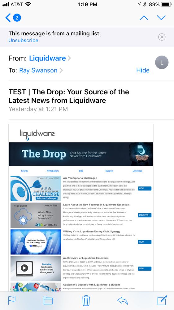
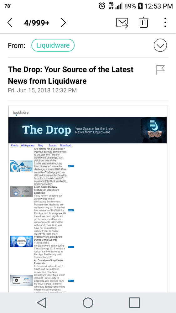
So I just found out that some of my corporate emails are displaying odd on Android devices (multi column layouts all pushed to the left, with tons of whitespace on the right), but the emails check out fine on iOS devices, Gmeail, Outlook, etc.From what I'm seeing is that I could use media queries to help solve this, but I can't find any resources on how to use these. Does anyone have any experience or recommendations on where I can find information on how to do this/solve this?
- Mark as New
- Bookmark
- Subscribe
- Mute
- Subscribe to RSS Feed
- Permalink
- Report Inappropriate Content
Hey Ray-
Just to throw an idea out there, I like to think about this the other way around and work from the "least capable" devices (those that support the least modern code) and up, using media queries instead to set the desktop layout instead of the mobile stacking. This follows a mobile-first approach to email and can help to layer the code for different ESPs -- ex. Some will read the inline styles only, others (which can) will read the <style> and further yet, some will read the media queries in the style element.
- Mark as New
- Bookmark
- Subscribe
- Mute
- Subscribe to RSS Feed
- Permalink
- Report Inappropriate Content
Be aware that media queries are only supported by the most recent versions of android, which for the moment have a minor market share. Unlike IOS, Android users tend not to upgrade rapidly on the most recent versions of Android (mostly because the phone vendors have developed some additional layers on top of Android and do not support the Android upgrades).
-Greg
- Mark as New
- Bookmark
- Subscribe
- Mute
- Subscribe to RSS Feed
- Permalink
- Report Inappropriate Content
This is extremely hard to diagnose without code, but I would take a look at that banner, which seems to be going to 100% width instead of scaling to the viewport. Additionally, Android has some specific things to keep in mind when designing for mobile--some of the tactics that work on iOS won't work for Android.
Also, if I had to be completely honest, you probably need to rework this design so that text is actually readable on mobile devices (most likely with stacking the image, then text), because although it fits the screen, it's super difficult to read.
- Copyright © 2025 Adobe. All rights reserved.
- Privacy
- Community Guidelines
- Terms of use
- Do not sell my personal information
Adchoices

