Re: Marketo form issue - non responsive
- Subscribe to RSS Feed
- Mark Topic as New
- Mark Topic as Read
- Float this Topic for Current User
- Bookmark
- Subscribe
- Printer Friendly Page
- Mark as New
- Bookmark
- Subscribe
- Mute
- Subscribe to RSS Feed
- Permalink
- Report Inappropriate Content
Hi!
I am having some trouble with a Marketo form.
I have tried altering the CSS multiple times and each time I do, it reverts to a single column layout. Has anyone experienced this issue before? I have looked at multiple post within Marketo Nation, implemented recommendations to no avail.
Attaching the current CSS (that does not contain my edits) below:
.mktoForm input[type=text],
.mktoForm input[type=url],
.mktoForm input[type=email],
.mktoForm input[type=tel],
.mktoForm input[type=number],
.mktoForm input[type=date],
.mktoForm textarea.mktoField,
.mktoForm select.mktoField {
border: 0!important;
border-radius: 0!important;
background: none!important;
border: 1px solid #B3B3B3 !important;
text-align: left;
margin: 0;
padding: 10px 16px;
font-size: 16px;
color: #000000;
float: none;
width: auto;
font-weight: 500;
text-align: left;
line-height: 20px;
font-family: "National",sans-serif !important;
}

.mktoForm div, .mktoForm span, .mktoForm label, .mktoForm p {
text-align: left;
margin: 0;
padding: 0;
font-size: 14px;
color: #000000;
float: none;
width: auto;
line-height: 20px;
font-family: "National",sans-serif !important;
}
.mktoForm button.mktoButton {
cursor: pointer;
margin: 0;
display: inline-block;
font-weight: 700;
position: relative;
text-align: center;
transition: all .15s linear;
border-radius: 3px;
border-style: solid;
border-width: 1px;
padding: 12px 50px;
background: #E12C2C !important;
border-color: #E12C2C !important;
color: #ffffff !important;
font-size: 16px!important;
line-height: 25px!important;
font-family: "National", sans-serif !important;
}

.mktoForm .mktoHtmlText {
color: #000000 !important;
line-height: 15px !important;
font-size: 12px !important;
font-family: 'National',sans-serif!important;
width: 450px !important;
}

.mktoForm .mktoAsterix {
float: left;
color: #bf0000;
padding-left: 0px;
display: none;
}

.mktoLabel .mktoHasWidth {
width: auto;
}

.mktoForm {
width: 650px !important
}

.mktoButtonWrap {
margin-left: 0px !important;
}
Any help or recs would be greatly appreciated!
Solved! Go to Solution.
- Mark as New
- Bookmark
- Subscribe
- Mute
- Subscribe to RSS Feed
- Permalink
- Report Inappropriate Content
You might be running into an issue with the load order of the CSS when you fiddle around with it and it can definitely be frustrating. Most times you're able to accomplish things by copying the selector you see in the inspector and adding an "!important" tag to the end of each rule inside that selector. The reason this works is because the Custom CSS and Marketo forms2.css get loaded after (further down the document) your theme stylesheets in the <head> -- they get tacked onto the end of the <head> and inside the <form> element once the forms2.js runs on the page to unfold the form which means they come after your other CSS and typically override it.
I borrowed a little bit of a multi-column boilerplate CSS, courtesy of @Casey_Grimes which can be found here:
https://gist.github.com/cougrimes/5168524fd9365eedea16 and added a few bits in there to dial it for your form and your breakpoints (600px).
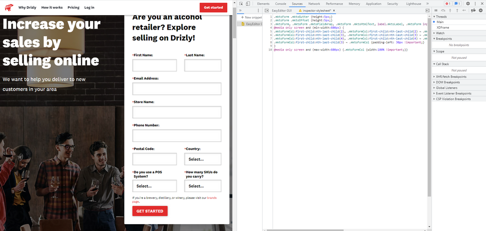
Here's a look at what Im seeing in the tablet view when I resize the browser window:

and here's a look at the CSS I'm using:
.mktoForm .mktoGutter {height:5px;} /* adjust space between field and label */
.mktoForm .mktoOffset {height:5px;} /* adjust space between field rows */

.mktoForm, .mktoForm .mktoFieldWrap, .mktoForm .mktoHtmlText, label.mktoLabel, .mktoForm input, .mktoForm select, .mktoForm textarea .mktoLogicalField .mktoCheckboxList {width:100% !important;}

@media only screen and (min-width:600px) {
.mktoFormCol:first-child:nth-last-child(2), .mktoFormCol:first-child:nth-last-child(2) ~ .mktoFormCol {width: 100% !important;}
.mktoFormCol:first-child:nth-last-child(3), .mktoFormCol:first-child:nth-last-child(3) ~ .mktoFormCol {width: 50% !important;}
.mktoFormCol:first-child:nth-last-child(4), .mktoFormCol:first-child:nth-last-child(4) ~ .mktoFormCol {width: 33.3333% !important;}
.mktoFormCol:first-child:nth-last-child(3) ~ .mktoFormCol {padding-left: 30px !important;}
}

@media only screen and (max-width:600px) {.mktoFormCol {width:100% !important;}}
You should be able to put this code into the Custom CSS on your form or even include it on the template or an external stylesheet (which would be the preferred method) to get it into play.
Let me know if this works out for you - the fields should just stack up on mobile the way you'd expect and then do the 2-column thing at 600px+.
Thanks,
Dave
- Mark as New
- Bookmark
- Subscribe
- Mute
- Subscribe to RSS Feed
- Permalink
- Report Inappropriate Content
You might be running into an issue with the load order of the CSS when you fiddle around with it and it can definitely be frustrating. Most times you're able to accomplish things by copying the selector you see in the inspector and adding an "!important" tag to the end of each rule inside that selector. The reason this works is because the Custom CSS and Marketo forms2.css get loaded after (further down the document) your theme stylesheets in the <head> -- they get tacked onto the end of the <head> and inside the <form> element once the forms2.js runs on the page to unfold the form which means they come after your other CSS and typically override it.
I borrowed a little bit of a multi-column boilerplate CSS, courtesy of @Casey_Grimes which can be found here:
https://gist.github.com/cougrimes/5168524fd9365eedea16 and added a few bits in there to dial it for your form and your breakpoints (600px).
Here's a look at what Im seeing in the tablet view when I resize the browser window:

and here's a look at the CSS I'm using:
.mktoForm .mktoGutter {height:5px;} /* adjust space between field and label */
.mktoForm .mktoOffset {height:5px;} /* adjust space between field rows */

.mktoForm, .mktoForm .mktoFieldWrap, .mktoForm .mktoHtmlText, label.mktoLabel, .mktoForm input, .mktoForm select, .mktoForm textarea .mktoLogicalField .mktoCheckboxList {width:100% !important;}

@media only screen and (min-width:600px) {
.mktoFormCol:first-child:nth-last-child(2), .mktoFormCol:first-child:nth-last-child(2) ~ .mktoFormCol {width: 100% !important;}
.mktoFormCol:first-child:nth-last-child(3), .mktoFormCol:first-child:nth-last-child(3) ~ .mktoFormCol {width: 50% !important;}
.mktoFormCol:first-child:nth-last-child(4), .mktoFormCol:first-child:nth-last-child(4) ~ .mktoFormCol {width: 33.3333% !important;}
.mktoFormCol:first-child:nth-last-child(3) ~ .mktoFormCol {padding-left: 30px !important;}
}

@media only screen and (max-width:600px) {.mktoFormCol {width:100% !important;}}
You should be able to put this code into the Custom CSS on your form or even include it on the template or an external stylesheet (which would be the preferred method) to get it into play.
Let me know if this works out for you - the fields should just stack up on mobile the way you'd expect and then do the 2-column thing at 600px+.
Thanks,
Dave
- Mark as New
- Bookmark
- Subscribe
- Mute
- Subscribe to RSS Feed
- Permalink
- Report Inappropriate Content
Thank you so much for your help, Dave! The solution you proposed worked!
I really appreciate it!
- Mark as New
- Bookmark
- Subscribe
- Mute
- Subscribe to RSS Feed
- Permalink
- Report Inappropriate Content
@smcgregor try using following code for mobile:
@media(max-width: 767px) {
.mktoForm input[type=text], .mktoForm input[type=url], .mktoForm input[type=email], .mktoForm input[type=tel], .mktoForm input[type=number], .mktoForm input[type=date], .mktoForm textarea.mktoField, .mktoForm select.mktoField {
width: 100% !important;
}

.mktoForm .mktoHtmlText {
width: 100% !important;
}

.mktoForm .mktoOffset {
display: none;
}

.mktoForm label.mktoLabel {
width: 100% !important;
}
}
Hope this will help
Thanks
- Mark as New
- Bookmark
- Subscribe
- Mute
- Subscribe to RSS Feed
- Permalink
- Report Inappropriate Content
Hi! Thank you for your help - for some reason it is still doing the same thing i.e. expanding past the white box/unresponsive. I am so confused as I have tried your way and a few others yet it is still yielding the same result - do you think this could be a result of another form living on this page? Or the page itself? For context, this is a wordpress page, not a marketo landing page. Thank you again, I really appreciate the help!
We tried removing a few other forms to see if that would change anything, but it did not: bevalcinsights.com/production-testing-page/
- Copyright © 2025 Adobe. All rights reserved.
- Privacy
- Community Guidelines
- Terms of use
- Do not sell my personal information
Adchoices