Lightbox form styled with an image
- Subscribe to RSS Feed
- Mark Topic as New
- Mark Topic as Read
- Float this Topic for Current User
- Bookmark
- Subscribe
- Printer Friendly Page
- Mark as New
- Bookmark
- Subscribe
- Mute
- Subscribe to RSS Feed
- Permalink
- Report Inappropriate Content
I have this lightbox form started in codepen:
https://codepen.io/daytwo-nutrition/pen/poeRdow
There are 2 things I need here:
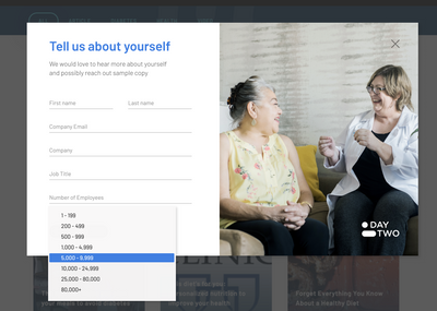
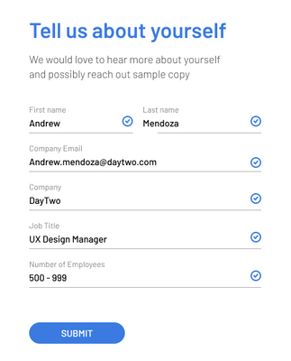
1. I need this lightbox to be styled like this:
2. I need smartforms to work with the lightbox
I tried to destyle the form using this code but it did not work:
https://codepen.io/figureone/pen/MbPOdj
Solved! Go to Solution.
- Mark as New
- Bookmark
- Subscribe
- Mute
- Subscribe to RSS Feed
- Permalink
- Report Inappropriate Content
Hello @Dave_Roberts & @SanfordWhiteman
I also was wondering if there is a way to pop a "thank you we will be in touch soon" message in the modal on submit or on the page? If not I will work on an automated email to be sent out on submit.
- Mark as New
- Bookmark
- Subscribe
- Mute
- Subscribe to RSS Feed
- Permalink
- Report Inappropriate Content
I tried to destyle the form using this code but it did not work:https://codepen.io/figureone/pen/MbPOdj
Not sure what you mean by "did not work"? You're not currently loading that code in your Pen now.
Based on your mockup, I would say you don't want to use the Marketo Forms built-in lightbox, because it's not designed to put the form in the 1st column of a 2-column layout (the image being the other col). Instead, use a 3rd-party lightbox like Magnific Popup or fslightbox. (Ordinarily I'd avoid jQuery, which Magnific depends on, but the fact is you always have jQ as MktoForms2.$ if you have a Marketo form, so there's no overhead.).
But I don't see a distinct reason that you'd need to remove (as opposed to simply override) the Marketo CSS? The form itself isn't drastically reformatted that I can see.
SmartForms, to the degree they work*, will work fine whether the form is in a modal or not.
*last time I checked their attempt to integrate w/the Marketo JS API, it was really sloppy,
but the lightbox wouldn't make it more or less sloppy AFAIK
- Mark as New
- Bookmark
- Subscribe
- Mute
- Subscribe to RSS Feed
- Permalink
- Report Inappropriate Content
Hi @SanfordWhiteman sorry about the incorrect pen link. I think the one I sent you was one of yours that I also had open:
https://codepen.io/daytwo-nutrition/pen/poeRdow
So two things:
1. the form input fields have strange grey shading at the top and inside the input boxes themselves
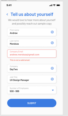
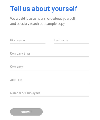
2. The background image is loaded via CSS. Can I not lock it in place for desktop and present a form like this for tablet/mobile?:
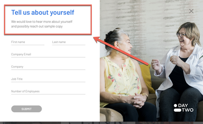
3. Hopefully simple thing. Adding content above the form - how do I do that?:
I am going to assume you will say the mobile option is the only one that will work using a Marketo Lightbox - correct?
Another question. How do you suggest implementing forms2.js? In the header on every page? In the footer on every page? Using GTM?
Thank you,
Jen
- Mark as New
- Bookmark
- Subscribe
- Mute
- Subscribe to RSS Feed
- Permalink
- Report Inappropriate Content
Another question. How do you suggest implementing forms2.js? In the header on every page? In the footer on every page? Using GTM?
The forms2.min.js library should only be loaded separately from the <form> element if you have a range of different forms that can be used on the page (in different parts of the DOM).
In that case, you do only want to load the library once to eliminate extra network requests. (Note the library determines that it's already been loaded, so there's no functional risk to loading it more than once, only a bandwidth impact. But bandwidth is important, esp. on mobile.)
If you want to load it once, by all means put it in the <head>.
I wouldn't advise putting it in a tag manager unless you're very careful with load order. Lotsa pages out there trying to use MktoForms2 before it exists.
Otherwise, keep it with the <form> element followed by the <script> with loadForm() (i.e. the default embed code setup).
- Mark as New
- Bookmark
- Subscribe
- Mute
- Subscribe to RSS Feed
- Permalink
- Report Inappropriate Content
Thanks Sanford I believe I get it. If there is more than one form on a page would you still load the forms2.js with each embed code?
- Mark as New
- Bookmark
- Subscribe
- Mute
- Subscribe to RSS Feed
- Permalink
- Report Inappropriate Content
Thanks Sanford I believe I get it. If there is more than one form on a page would you still load the forms2.js with each embed code?
I would not. That creates network overhead.
- Mark as New
- Bookmark
- Subscribe
- Mute
- Subscribe to RSS Feed
- Permalink
- Report Inappropriate Content
Hey Jen,
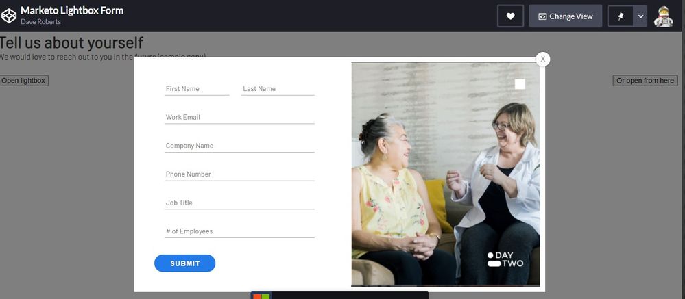
I fiddled with the code you added to CodePen and have something setup here: https://codepen.io/dRoberts/pen/MWpmPad
Disclaimer: This is my first "pen" so lemme know if you're not able to see/access that for whatever reason.
Here's a look at the desktop view:
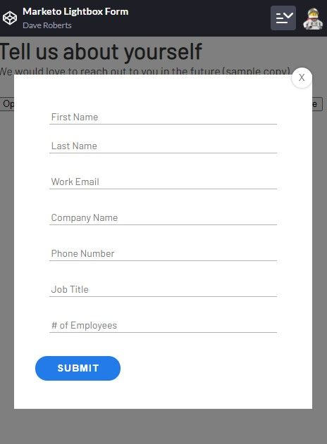
...and the mobile view where everything is stacked:
I did my best to comment and organize the CSS so it was a little easier to find things if you wanted to make any adjustments. Let me know if you've got any questions about the styling or if this looks like it might work for what you're after?
1. the form input fields have strange grey shading at the top and inside the input boxes themselvesThis is a "box-shadow" rather than a border. Sometimes a 1px box shadow is used in place of a border or outline.
3. Hopefully simple thing. Adding content above the form - how do I do that?:To add some content above the form, you'd want to do that in the form editor and just drag in a new Rich Text element to the top of the form and add your H4 and paragraph inside the editable area there.
etc.
For what it's worth, if you're already using a page built on Bootstrap there's a native "modal" element that works really well to put an editable form and/or text element into without dealing w/ all the noise of the built-in lightbox feature. This takes a little setup at the template level, but it basically puts you in a place to be able to design and edit the modal experience instead of overriding styles and being stuck w/ the native lightbox architecture.
- Mark as New
- Bookmark
- Subscribe
- Mute
- Subscribe to RSS Feed
- Permalink
- Report Inappropriate Content
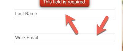
Hi @Dave_Roberts thank you for this. I am trying to solve now the positioning of the error message on the form (seems like each form input has its own rules for the positioning of the message. I am also trying to change the input box underlines from grey to red on an error and add an X as seen below into the box.
I feel like I may be handling this the wrong way in trying to override styles and you mentioned bootstrap...I am not sure how to begin using bootstrap <panicked face>
Also Dave this was my first Pen also 😉 Thanks so much for your help!
- Mark as New
- Bookmark
- Subscribe
- Mute
- Subscribe to RSS Feed
- Permalink
- Report Inappropriate Content
Hey Jen,
I've updated the pen here: https://codepen.io/dRoberts/pen/MWpmPad
For the (X) icon on the right side of the invalid fields, I'll usually use an image there and load it into the background image of the input. With most elements you can get away with using the ::before and ::after pseudo-elements for this but those won't work for text inputs.
To update this, you'll just want to load a small image (I used 15x15 in the example) into your Design Studio (or on the website depending on where the form page is hosted) and swap out the URL of the placeholder to the URL of the image you just loaded.
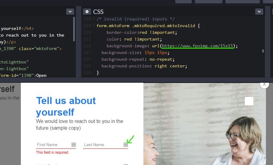
For the validation styles, there's a class called ".mktoRequired" that gets put onto any input which is required. In the initial load state of the form, this is the only validation class present. Once you interact with a field, it'll get a new class which you can use to style the validation rules. The new class will either be ".mktoValid" for valid fields or ".mktoInvalid" for invalid fields. In this case, Im using the .mktoInvalid class to style the input to have a red border-bottom and text.
The error message is broken up into a few bits (I've clustered them in the pen) - there's a "container" that positions the text and then a "text box" with the text inside it. These have a bunch of little rules to override, but I'll usually just work thru the inspector looking at the existing styles and then writing new styles with a stronger [better] selector to override them.
For example, I'll use: form.mktoForm { ...}
Instead of: .mktoForm {...} [which is how it is written on forms2.css and also targets <div class="mktoForm">...</div> which doesn't really help]
The Bootstrap adjustments to add a modal to your page would probably need to get added in at the template level, so there might be a bit of dev overhead there to get it setup but from my experience, it's much easier to manage and customize (albeit technical) compared to the built-in lightbox functionality. Most templates these days use Bootstrap in one way or another, so you might already have something like this setup on your template. If you'd like to open a new thread that's more specific to "how to make a modal using Bootstrap" and post some working code for a template there (that uses bootstrap) I'd be happy to help walk thru setting that up a little at at time in the community here -- I think it might be something everyone could benefit from.
Finally, in terms of using the !important flag to override a bunch of styling stuff -- it's definitely not ideal or as good as it "should" be, but given the way Marketo is loading the styles onto the page and the load order of things you add beyond that, it's usually the path of least resistance in the longrun -- albeit a bit clunky and manual (the advantage is that it's a little easier to update/edit once you've got the initial round of styles in there b/c everything is more accessible - there's just a lot to get together).
Let me know if those new styles work out for what you were after or if you've got any questions about how any of that stuff works.
Thanks again,
Dave
- Mark as New
- Bookmark
- Subscribe
- Mute
- Subscribe to RSS Feed
- Permalink
- Report Inappropriate Content
Hello @Dave_Roberts & @SanfordWhiteman
I also was wondering if there is a way to pop a "thank you we will be in touch soon" message in the modal on submit or on the page? If not I will work on an automated email to be sent out on submit.
- Mark as New
- Bookmark
- Subscribe
- Mute
- Subscribe to RSS Feed
- Permalink
- Report Inappropriate Content
I also was wondering if there is a way to pop a "thank you we will be in touch soon" message in the modal on submit or on the page?
Sure, you can use the concept from this rather ancient blog post. It still works.
- Mark as New
- Bookmark
- Subscribe
- Mute
- Subscribe to RSS Feed
- Permalink
- Report Inappropriate Content
Thank you - that worked
- Mark as New
- Bookmark
- Subscribe
- Mute
- Subscribe to RSS Feed
- Permalink
- Report Inappropriate Content
Hi @Dave_Roberts your code worked great - thank you. I have added it to my pen.
So the issues that I have last to resolve are:
1. How do I get the form to show an icon (checkmark instead of the X) when someone has passed validation?
2. How can I alter the submit form button to be grey until all of the inputs have passed?
We are so close on this one! Thank you and I do plan to spin up the bootstrap convo you mentioned that would be helpful
- Mark as New
- Bookmark
- Subscribe
- Mute
- Subscribe to RSS Feed
- Permalink
- Report Inappropriate Content
Hey Jen,
I updated the pen here: https://codepen.io/dRoberts/pen/MWpmPad to include a new rule for "valid inputs" that's very similar to the invalid input rule w/ the icon. For now, I've changed the placeholder to have a green background so it's visually obvious that it's the "valid" state in the example, but you can just swap that out with the checkmark icon image rather than the "X".
For the button being grayed out, that gets a little more complicated - as far as I know you need some script to achieve that behavior (Sanford keep me honest here). I think you'd need to do something like deactivate the submit button, then trigger off the fields getting focused > count the number of required fields > count the number of 'valid' fields. Then when those numbers match, "activate" the form button (remove whatever is deactivating it).
Let me know if the "valid" images are working on your end. I'm not sure how to go about the button de-activation/activation in a sure-fire way, maybe that's something Sanford's got a better idea for?
- Mark as New
- Bookmark
- Subscribe
- Mute
- Subscribe to RSS Feed
- Permalink
- Report Inappropriate Content
For the button being grayed out, that gets a little more complicated - as far as I know you need some script to achieve that behavior (Sanford keep me honest here).
That's right. You do need JavaScript. But you don't need to count the fields to determine validity, you can call validate().
Disable the button by default (set the Boolean property disabled to true).
Then when the form is first ready, do a first check to see if it's already valid (since Pre-Fill can mean it's valid to begin with). Whenever the input or change events fire on the form element, check validity again. When it becomes valid, enable the button by setting disabled to false.
- Mark as New
- Bookmark
- Subscribe
- Mute
- Subscribe to RSS Feed
- Permalink
- Report Inappropriate Content
Hi @SanfordWhiteman here is my code pen:
https://codepen.io/daytwo-nutrition/pen/poeRdow
I added the confirmation message but am still unsure about the submit button only turning blue on validation. Can you help me with the code?
- Mark as New
- Bookmark
- Subscribe
- Mute
- Subscribe to RSS Feed
- Permalink
- Report Inappropriate Content
Thank you @Dave_Roberts that worked. @Dave_Roberts you really saved me here - awesome so awesome
Any ideas on how to add a success message to the modal?
@SanfordWhiteman would like to have your input on the above success message and the inactive/active state of the submit button.
Also you both - how would I capture the URL or page name of the page the form was filled on?
- Mark as New
- Bookmark
- Subscribe
- Mute
- Subscribe to RSS Feed
- Permalink
- Report Inappropriate Content
Also you both - how would I capture the URL or page name of the page the form was filled on?
See the 2nd code snippet in this post: https://nation.marketo.com/t5/product-blogs/consider-decoding-urls-if-you-re-just-storing-them-for/b...
It's also a good to post to read all the way through to learn about the technical side of attribution tracking & URLs.
- Copyright © 2025 Adobe. All rights reserved.
- Privacy
- Community Guidelines
- Terms of use
- Do not sell my personal information
Adchoices
