Re: Landing page doesn't look good on mobile
- Subscribe to RSS Feed
- Mark Topic as New
- Mark Topic as Read
- Float this Topic for Current User
- Bookmark
- Subscribe
- Printer Friendly Page
- Mark as New
- Bookmark
- Subscribe
- Mute
- Subscribe to RSS Feed
- Permalink
- Report Inappropriate Content
Hi,
I have build a landing page for a campaign, based on Landing Page Template - Guided.
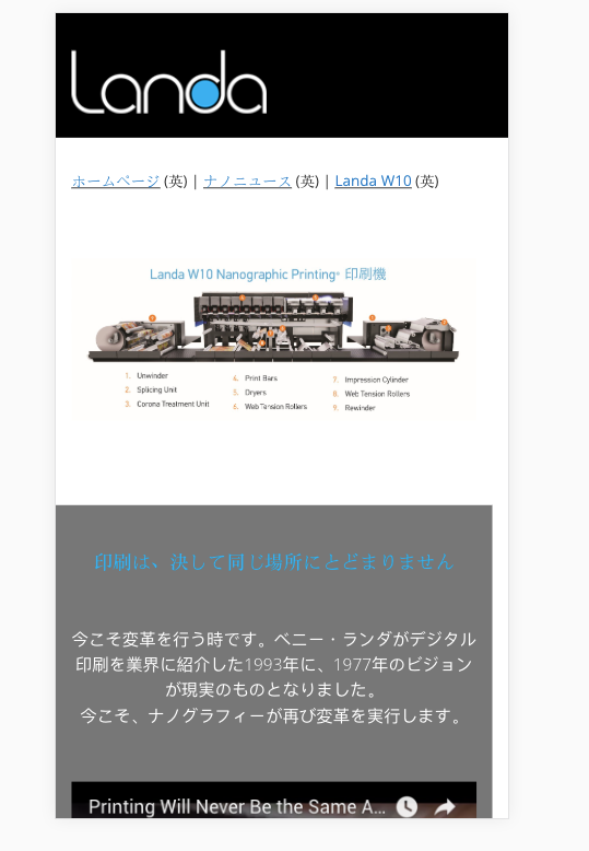
It is fair on desktop (not too flexible though) but the problem is when going mobile:
1. Photos stays the same size (banner image, image on body) so they looked cut-out (half image)
2. Youtube videos (embed as iframe) the same
3. Navigation header (where the logo is), yep, the same
Not sure what to do.
Is there a template I can download to better fit mobile?
Other solution?
Thanks in advance,
Ophir
Solved! Go to Solution.
- Mark as New
- Bookmark
- Subscribe
- Mute
- Subscribe to RSS Feed
- Permalink
- Report Inappropriate Content
Hi Ophir Gal,
Try leaving the height at 315 on the iframe and just change the width to 100%.
- Mark as New
- Bookmark
- Subscribe
- Mute
- Subscribe to RSS Feed
- Permalink
- Report Inappropriate Content
Hi Ophir Gal,
Your Youtube iframes currently have a fixed width:
<iframe width="560" height="315" src="youtube.com/embed/hjxK26reKP4?rel=0&cc_load_policy=1&hl=ja" frameborder="0" allow="autoplay; encrypted-media" allowfullscreen=""></iframe>
Try removing the height completely and setting the width to 100%.
<iframe width="100%" src="youtube.com/embed/hjxK26reKP4?rel=0&cc_load_policy=1&hl=ja" frameborder="0" allow="autoplay; encrypted-media" allowfullscreen=""></iframe>
Also do this on the images you have inserted.
Hopefully that should fix your issues.
Thanks,
Gerard
- Mark as New
- Bookmark
- Subscribe
- Mute
- Subscribe to RSS Feed
- Permalink
- Report Inappropriate Content
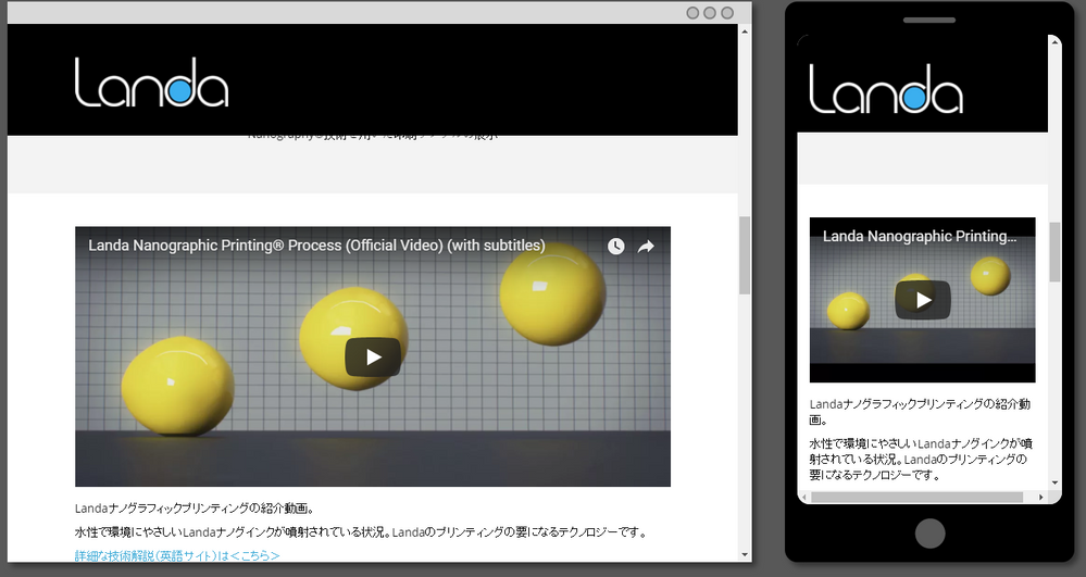
Here are examples of what it looks like when I swapped the widths to be 100% and removed the height. Everything looks good.
- Mark as New
- Bookmark
- Subscribe
- Mute
- Subscribe to RSS Feed
- Permalink
- Report Inappropriate Content
Thanks Gerard Donnelly,
It works perfect for images, but the YouTube videos gets squashed on desktop:
Any idea?
- Mark as New
- Bookmark
- Subscribe
- Mute
- Subscribe to RSS Feed
- Permalink
- Report Inappropriate Content
Hi Ophir Gal,
Try leaving the height at 315 on the iframe and just change the width to 100%.
- Mark as New
- Bookmark
- Subscribe
- Mute
- Subscribe to RSS Feed
- Permalink
- Report Inappropriate Content
Exactly what I did.
Thanks Gerard Donnelly
- Mark as New
- Bookmark
- Subscribe
- Mute
- Subscribe to RSS Feed
- Permalink
- Report Inappropriate Content
I added height="315" as a default for now, and it looks ok:
if you got a better solution, I'll give it a try.
Thanks for the help so far!
Ophir
- Mark as New
- Bookmark
- Subscribe
- Mute
- Subscribe to RSS Feed
- Permalink
- Report Inappropriate Content
Please provide the URL of your page.
This is necessarily a HTML/CSS issue and we cannot help you without a URL.
And also, what template are you using ?
-Greg
- Mark as New
- Bookmark
- Subscribe
- Mute
- Subscribe to RSS Feed
- Permalink
- Report Inappropriate Content
Hi Grégoire Michel,
It's Landing Page Template - Guided, and the page is https://go.landanano.com/Japan-VIP-Event-2018-Summary.html
Do you mean it is necessary to edit the code?
Thanks,
Ophir
- Mark as New
- Bookmark
- Subscribe
- Mute
- Subscribe to RSS Feed
- Permalink
- Report Inappropriate Content
Hi,
Usually, such issues are only dealt in the HTML/CSS as Grégoire Michel mentioned.
- Mark as New
- Bookmark
- Subscribe
- Mute
- Subscribe to RSS Feed
- Permalink
- Report Inappropriate Content
Thanks both - see the almost ideal solution by Gerard (and myself... ![]() ).
).
- Copyright © 2025 Adobe. All rights reserved.
- Privacy
- Community Guidelines
- Terms of use
- Do not sell my personal information
Adchoices


