Re: Is there a way to put form questions on different pages, so that the forms don't look so long?
- Subscribe to RSS Feed
- Mark Topic as New
- Mark Topic as Read
- Float this Topic for Current User
- Bookmark
- Subscribe
- Printer Friendly Page
- Mark as New
- Bookmark
- Subscribe
- Mute
- Subscribe to RSS Feed
- Permalink
- Report Inappropriate Content
MY QUESTION: Is there a way to put form questions on different pages, so that the forms don't look so long?
MY HOPE: I'm hoping there is a way to do this without having to create a form for each question, and a corresponding landing page for each also.
- Mark as New
- Bookmark
- Subscribe
- Mute
- Subscribe to RSS Feed
- Permalink
- Report Inappropriate Content
Hi Gabby, hopefully I can be helpful here. We had what I think was a similar use case at a previous company where we wanted to reduce the number of fields showing on the screen at a time to make the form seem less daunting and to give it some more structure - the impact of changing from a single long form to having the user complete it in 3 smaller parts, in our case was a considerable increase in conversion rate (~30%).
Hopefully I'm understanding correctly that this is essentially what you're trying to achieve. I've recreated quickly what we had since I no longer have access to the original page (that means there is probably a much tidier execution of this that can be done, but hopefully this gives you the basic idea).
This is what I mocked up: get.asknicely.com/TEST---multi-part-form-2.html
- there's just two parts to this form, but could easily be extended to more.
- there's no validation, so you can click forward to the second "page" without entering anything
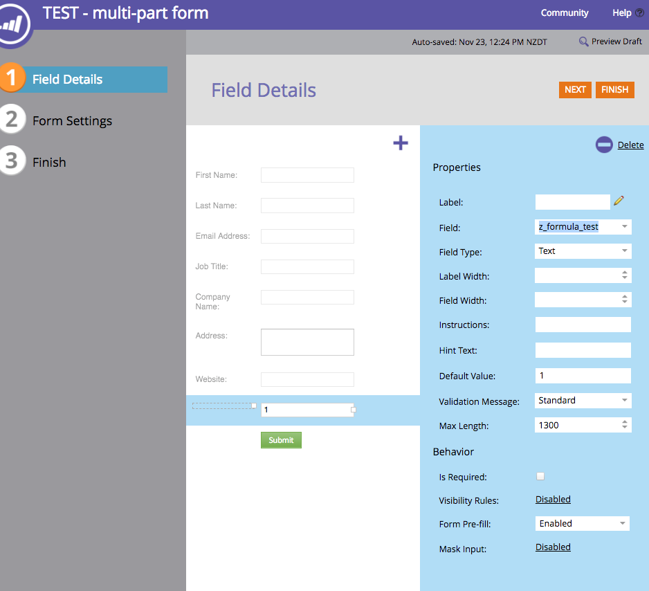
1: Created a marketo form with all the fields I need on it (see screen shot attached)
- note, I've added one additional field here, which in my case is called "z_formula_test" which was just a handy spare field to use, but you'd probably want to use something more logical like "form step" and I've set this to have a default value of 1 to set us at the first step when we first load the form.
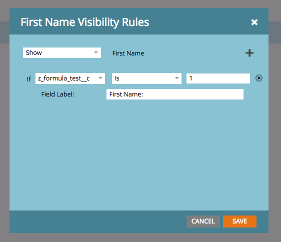
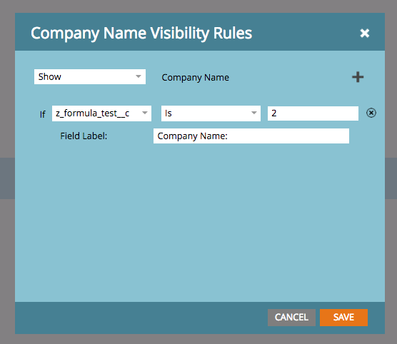
- then I've added visibility rules to each field on the form (see second and third screen shot) - for the personal details (email, first, last, job title) which I want to display first, they display when my field "z_formula_test" is 1, for the company details (company, address, website), they will display when the value is 2
- the last step in the form setup is to add a bit of custom CSS to hide the submit button until we're ready and to hide the "z_formula_test" field - this looks like:
.mktoButtonRow{display: none;}#z_formula_test__c{display: none;}
(note that I just made the label of the "z_formula_test" field empty so only needed to hide the field - again, probably neater ways of doing this, but in the interest of time...)
2: Then I created a landing page with the form on. For this, at minimum I needed the ability to place a form and section of custom HTML, in order to insert some Javascript.
- once the form was added, I inserted the custom html and javascript below:
<div><button class="an-button" id="button1" style="display: none;"><sub></sub> Company details ></button></div>
<script>// <![CDATA[
MktoForms2.whenReady(function (form) {
form.vals({ "z_formula_test__c":"1"});
var btn = document.getElementById("button1");
$( "#button1" ).css( "display", "inline-block" );
btn.onclick = function() {
form.vals({ "z_formula_test__c":"2"});
$( ".mktoButtonRow" ).css( "display", "block" );
$( "#button1" ).css( "display", "none" );
};
});
// ]]></script>
What this does:
1) adds the first button to advance to the next stage of the form (which is hidden until the form is loaded)
2) adds a click action on that button which:
- updates the z_formula_test field to "2"
- shows the submit button
- hides the first button (itself)
And that's pretty much it. Splits the form in two but just gives you one form to manage in Marketo, and one page to manage.
You can add/remove fields or change them between steps just from the form editor and still supports all the other marketo form functions.
* Like I said, this is a quick re-hash of something I did previously, there's a few things missing:
- you'd probably want to add some validation to the onclick function on the first button so that users didn't get right through to the end and find info was missing (alternative might be to add a 3rd state for the z_formula_test field that would show everything - then if there was any sort of validation error at the end, you could set that so it would show all fields, although that's probably not the most favorable option)
- you'd also definitely want to add a similar button to 'get back to' the first stage, so doing the reverse of the first button (or rather than hiding the first button, you could change it's functionality and label once it's been clicked).- I'd also say a drawback of this method is it's not technically separate pages, so could cause some issues with users using the back button - I think you can work around that by setting a browser state - you'd have to look into that though.
Also, one other note: I did use some Jquery in there to ease the pain of selecting objects - make sure you've got that running or adjust accordingly.
Again, I stress, this is a basic implementation to explain how we made this work (hopefully similar to what you're trying to do) - not a perfect solution, so take this as a guide and extend it.
Hope that helps!
{checks furiously before submitting to ensure no surplus tagging}
- Mark as New
- Bookmark
- Subscribe
- Mute
- Subscribe to RSS Feed
- Permalink
- Report Inappropriate Content
That's exactly what I need- no refresh. Thanks!
- Mark as New
- Bookmark
- Subscribe
- Mute
- Subscribe to RSS Feed
- Permalink
- Report Inappropriate Content
Nice... but yet again there's no indication that the OP is speaking of anything other than the built-in Progressive Profiling behavior.
Don't get why this thread has attracted so many custom suggestions given the pretty clearly stated need?
- Mark as New
- Bookmark
- Subscribe
- Mute
- Subscribe to RSS Feed
- Permalink
- Report Inappropriate Content
Maybe just lots of people wanting to be helpful. Not sure I see the problem ¯\_(ツ)_/¯
- Mark as New
- Bookmark
- Subscribe
- Mute
- Subscribe to RSS Feed
- Permalink
- Report Inappropriate Content
Problem comes when people don't know how Progressive Profiling works, where it works (everywhere), or that it even exists as an option. Since there are ostensibly knowledgeable agencies still saying it doesn't work with embedded forms (confusing it with Pre-Fill) there's a definite knowledge gap.
So of course advanced, JS-driven behaviors are very exciting, but it's a question of firming up the base of knowledge.
- Mark as New
- Bookmark
- Subscribe
- Mute
- Subscribe to RSS Feed
- Permalink
- Report Inappropriate Content
We had the same challenge and tried to configure it with the progressive profiling but it didn't work since we needed to show/hide complete sections every time without refreshing the page, instead of specific fields.
Eventually we worked with the team at overstack.io to develop a custom javascript code that deals with that.
They also helped us implementing a custom tracking functionality which records any form engagement in Google Analytics.
Good luck!
- Mark as New
- Bookmark
- Subscribe
- Mute
- Subscribe to RSS Feed
- Permalink
- Report Inappropriate Content
But it wasn't "the same challenge" in that case, then. Let's stay on topic and not add more FUD about Progressive Profiling not working — people see posts like this and run with the idea and the next thing you know, I'm hearing "From what I've read, Progressive Profiling doesn't work" and then I have to go back to the beginning and explain what it is, what it's expected to do, and that it does work reliably, even with the embed on non-Marketo sites (another vastly common misunderstanding).
- Mark as New
- Bookmark
- Subscribe
- Mute
- Subscribe to RSS Feed
- Permalink
- Report Inappropriate Content
Hi Gabby Owens,
When you say "form questions", are you referring to form fields? And just to clarify, do you want 1 form with several form fields, but place the same form on different pages in a way that each page shows only the desired field/question? Would be really helpful if you could elaborate more on the requirement.
Best Always,
Karan Hari
Senior Product Manager - Marketo Engage
- Mark as New
- Bookmark
- Subscribe
- Mute
- Subscribe to RSS Feed
- Permalink
- Report Inappropriate Content
Hi, Karan Hari:
Yes, form questions = form fields.
Also yes- want 1 form with several form fields, but place the same form on different pages in a way that each page shows only the desired field/question.
- Mark as New
- Bookmark
- Subscribe
- Mute
- Subscribe to RSS Feed
- Permalink
- Report Inappropriate Content
You have just described the Progressive Profiling feature to a T! Read more about it in the docs and try it out.
- Mark as New
- Bookmark
- Subscribe
- Mute
- Subscribe to RSS Feed
- Permalink
- Report Inappropriate Content
Hi Sanford Whiteman,
Progressive profiling can work if it is the same form being used in the same page. In which case, each field can be progressively shown as and when the user visits. But In this case, I think what Gabby is asking is - Say there are 10 pages and only 1 form (With 10 pick list fields), each field is a different question with a different set of picklist.
The desired outcome is to place this form in those 10 different pages with the requirement that each page should show only 1 desired field, in the respective pages. So if 1,2,3 are the respective LPs and ABC are respective form fields, the preferred outcome is to have LP1 with form fiield A , LP2 with Form field B , LP3 with form field C and so on, Keeping in mind that Gabby wants to use only 1 form for all these pages. In my opinion, I think this would require the use of Javascript. But again, I have limited knowledge on javascript, so cant say for sure.
Best Always,
Karan Hari
Senior Product Manager - Marketo Engage
- Mark as New
- Bookmark
- Subscribe
- Mute
- Subscribe to RSS Feed
- Permalink
- Report Inappropriate Content
(You don't have to tag me if I'm already on the thread!)
Progressive profiling can work if it is the same form being used in the same page.
ProgPro works across all pages that the form is on. In fact ProgPro fields are regarded as filled in regardless of what form (or not a form at all) sourced the data.
If the revealed questions depend specifically on the page, i.e. Question 5 on pages A and M, Question 6 on page C, Question 7 on Pages B and E, then this can't be done with ProgPro because it doesn't have a field order (the "progressive" part). If the pages differ by query string, then you still wouldn't need JS, because you could use Visibility Rules and a hidden field. However, if the pages are not distinguished by query string but rather by the full page path/filename, you would need minimal assistance from JS (to fill a hidden field which in turns could be used in VRs).
If you're right that there is no order to the questions intended, then we don't have the full picture from the OP yet.
- Mark as New
- Bookmark
- Subscribe
- Mute
- Subscribe to RSS Feed
- Permalink
- Report Inappropriate Content

I understand. And thanks for the explanation. But as explained above, if the case that I referred to above is the same as what Gabby's requirement is, then it would need a different approach as supposed to progressive profiling, is what I meant.
Senior Product Manager - Marketo Engage
- Mark as New
- Bookmark
- Subscribe
- Mute
- Subscribe to RSS Feed
- Permalink
- Report Inappropriate Content
It's not inappropriate to tag, just redundant as I already see the replies to me. If you're replying to someone else and want to tag me in that would make sense.
- Mark as New
- Bookmark
- Subscribe
- Mute
- Subscribe to RSS Feed
- Permalink
- Report Inappropriate Content
Understood! Thanks.
Senior Product Manager - Marketo Engage
- Mark as New
- Bookmark
- Subscribe
- Mute
- Subscribe to RSS Feed
- Permalink
- Report Inappropriate Content
Karan Hari I just want form questions to show on 1 page at a time. I am doing a survey, but don't want all of the survey/form questions to show at once. I just want the user to see 1 question at a time.
- Mark as New
- Bookmark
- Subscribe
- Mute
- Subscribe to RSS Feed
- Permalink
- Report Inappropriate Content
You can do it by creating your own HTML form, you will have an HTML page with different div tags, in each div you will add each question and you are going to hide/show them, at the final question you will have the submit button which will then send all the information to the Marketo form using the js-api:
- Mark as New
- Bookmark
- Subscribe
- Mute
- Subscribe to RSS Feed
- Permalink
- Report Inappropriate Content
P.S. The behavior you describe here doesn't require a non-Marketo form... it can be done with Marketo's built-in Visibility Rules feature. VRs plus a little Forms 2.0 API JS (not an entire hidden form or anythiing, simply a whenRendered listener) gives the same effect. I'll put up a demo later tonight.
- Mark as New
- Bookmark
- Subscribe
- Mute
- Subscribe to RSS Feed
- Permalink
- Report Inappropriate Content
It also works, that depends on how much code you want to add. Having the own html form makes the styling easier
- Mark as New
- Bookmark
- Subscribe
- Mute
- Subscribe to RSS Feed
- Permalink
- Report Inappropriate Content
Most people here want to add (let alone write) as little code as possible, to be sure. From a styling perspective, by definition an entirely custom form wins!
- Copyright © 2025 Adobe. All rights reserved.
- Privacy
- Community Guidelines
- Terms of use
- Do not sell my personal information
Adchoices


