Re: Icons Rendering Differently in Mobile View of Form vs. Desktop
- Subscribe to RSS Feed
- Mark Topic as New
- Mark Topic as Read
- Float this Topic for Current User
- Bookmark
- Subscribe
- Printer Friendly Page
- Mark as New
- Bookmark
- Subscribe
- Mute
- Subscribe to RSS Feed
- Permalink
- Report Inappropriate Content
Hi,
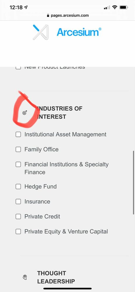
We have been working on building out our preference center, which features some icons to accompany the headings for each section. Though we've built this within the form builder, we seem to be having issues whenever we preview the form on the landing page that it will be living on (our Subscribe/Subscription Management LP). The alignment isn't rendering with any problem in the desktop mode, but when we view on mobile, it is skewed to the right.
Essentially, we'd need the icons to align with the left edge of the checkboxes. Any ideas?
Solved! Go to Solution.
- Mark as New
- Bookmark
- Subscribe
- Mute
- Subscribe to RSS Feed
- Permalink
- Report Inappropriate Content
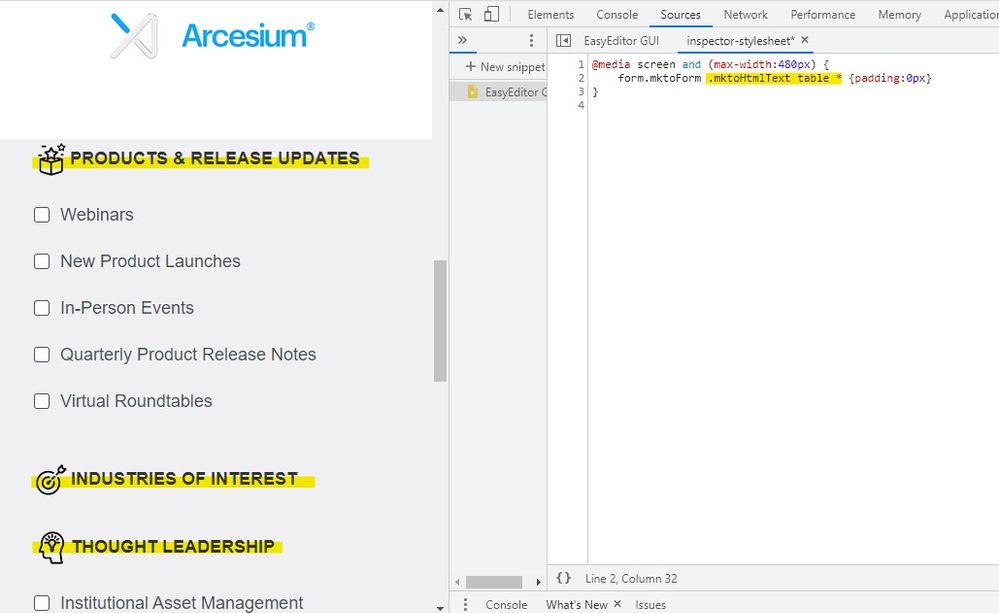
I've added a bit of CSS in the inspector (pictured below) that targets the mobile display (less than 480px) which removes the padding on any elements that are inside of a table in one of the rich text elements on your form. This should work to kind of isolate the header elements you've got there (both the icon and the labels) but not have an impact on the other elements on the form.
Here's a look at the CSS you could try adding onto the end of the Custom CSS sheet (on the form):
@media screen and (max-width:480px) {
    form.mktoForm .mktoHtmlText table * {padding:0px !important}
}
Here's what Im seeing on my end when I add this code into the browser:

Let me know if that works out for you or if you've got any questions about what's going on here.
Thanks,
Dave
- Mark as New
- Bookmark
- Subscribe
- Mute
- Subscribe to RSS Feed
- Permalink
- Report Inappropriate Content
The default form css file (forms2.css) has a pretty "thick" layer of mobile styling that uses a media query at a max-width of 480px -- basically, it's mobile-last. Because the styles are wrapped in a max-width media query (instead of doing a mobile-first min-width media query) I've seen it override styles that you'd other wise expect to see come thru. As Sanford mention, if you could share a link to a live page for us to look at it'd be possible to get to the bottom of the issue using the browser inspector tools.
- Mark as New
- Bookmark
- Subscribe
- Mute
- Subscribe to RSS Feed
- Permalink
- Report Inappropriate Content
I've added a bit of CSS in the inspector (pictured below) that targets the mobile display (less than 480px) which removes the padding on any elements that are inside of a table in one of the rich text elements on your form. This should work to kind of isolate the header elements you've got there (both the icon and the labels) but not have an impact on the other elements on the form.
Here's a look at the CSS you could try adding onto the end of the Custom CSS sheet (on the form):
@media screen and (max-width:480px) {
    form.mktoForm .mktoHtmlText table * {padding:0px !important}
}
Here's what Im seeing on my end when I add this code into the browser:

Let me know if that works out for you or if you've got any questions about what's going on here.
Thanks,
Dave
- Mark as New
- Bookmark
- Subscribe
- Mute
- Subscribe to RSS Feed
- Permalink
- Report Inappropriate Content
- Mark as New
- Bookmark
- Subscribe
- Mute
- Subscribe to RSS Feed
- Permalink
- Report Inappropriate Content
Here's a link to a live landing page that the form is living on: https://pages.arcesium.com/subscribe.html.
Thanks!
- Copyright © 2025 Adobe. All rights reserved.
- Privacy
- Community Guidelines
- Terms of use
- Do not sell my personal information
Adchoices
