Re: Form shrinks on responsive LP
- Subscribe to RSS Feed
- Mark Topic as New
- Mark Topic as Read
- Float this Topic for Current User
- Bookmark
- Subscribe
- Printer Friendly Page
- Mark as New
- Bookmark
- Subscribe
- Mute
- Subscribe to RSS Feed
- Permalink
- Report Inappropriate Content
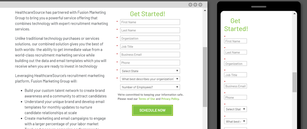
We have a guided LP template and is built to be responsive, however, when I throw a form in there (one w/ CSS or one w/o) it gets super narrow on mobile. Not sure if its the LP or the form itself: solutions.healthcaresource.com/fusion-request.html
Suggestions?
Solved! Go to Solution.
- Mark as New
- Bookmark
- Subscribe
- Mute
- Subscribe to RSS Feed
- Permalink
- Report Inappropriate Content
Because you put the form inside a .col-5 container:
.col-5 {
    -ms-flex: 0 0 41.666667%;
    flex: 0 0 41.666667%;
    max-width: 41.666667%;
}
Betwen the flex and the max-width you end up constraining it to 41 ⅔ % of the screen.
- Mark as New
- Bookmark
- Subscribe
- Mute
- Subscribe to RSS Feed
- Permalink
- Report Inappropriate Content
Once again, you've saved the day! We outsourced our templates so I had no idea what the root cause was. Thank you, Sanford!
- Mark as New
- Bookmark
- Subscribe
- Mute
- Subscribe to RSS Feed
- Permalink
- Report Inappropriate Content
Im a little late to the part here, but wanted to pile on with a solution to get this working a bit better in mobile.
The .col-5 class that's in there right now constrains the column to a fixed width "all the time".
What we'd rather have in there is a full-width column (.col-12) for mobile and then a smaller column at the medium breakpoint (768px) for tablet and larger displays.
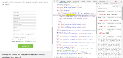
You can use the bootstrap classes to accomplish this without much fuss, you'll just need to replace the .col-5 class with .col-12 .col-md-5 which means it should be "12-columns (full-width) until the medium breakpoint, then it should only be 5/12 columns wide instead".
I've highlighted a shot of the code I updated in the inspector and a preview of the mobile view (less than 768px wide) for reference here.
It looks like you'd need to edit the template to update this code, but you should be able to safely replace these classes and re-approve the template to kinda plug this in.
- Copyright © 2025 Adobe. All rights reserved.
- Privacy
- Community Guidelines
- Terms of use
- Do not sell my personal information
Adchoices

