Form Layout Update (CSS Styling)
- Subscribe to RSS Feed
- Mark Topic as New
- Mark Topic as Read
- Float this Topic for Current User
- Bookmark
- Subscribe
- Printer Friendly Page
- Mark as New
- Bookmark
- Subscribe
- Mute
- Subscribe to RSS Feed
- Permalink
- Report Inappropriate Content
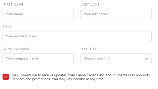
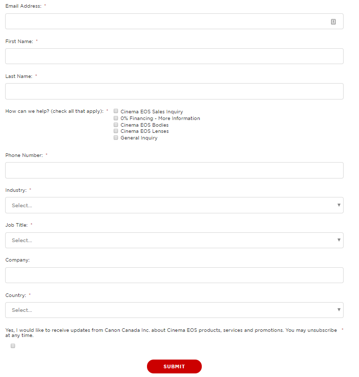
If anyone has ever had an issue like this, we do need some tips. We are trying to adjust and align our forms look and feel to our global design, but finding some challenges alongside. Our Marketo Support team also couldn't find an answer to our issues, so, maybe someone here has a bit of a guidance.
Essentially, we have our sites on Wordpress (duh) and we have different forms on different pages, but, of course, the layout follows (or should follow) our design principles.
We know that the form carries the styling placed on the website since we're not using Marketo LPs, but we simply cannot fine tune some little issues, such as (but not limited to):
- Alignment of checkboxes
- Same line name boxes
- Responsive design changes for boxes in the same line
You can find attached both achieved and desired versions. Let me know if you have any tips.
Cheers,
Saulo Avelar
Desired:
Achieved:
- Labels:
-
Web Personalization
- Mark as New
- Bookmark
- Subscribe
- Mute
- Subscribe to RSS Feed
- Permalink
- Report Inappropriate Content
Hi Saulo,
Your desired look of the form is definitely possible with some CSS and JavaScript adjustments. So, in addition to Sandford Whiteman form destyling script you have the following options:
- Responsive Multi-Column Layout: Using CSS flexbox, you can keep the same amount of columns that you create in the form editor in Marketo but still have a fully responsive form that falls back to single column rows on small screens. The support for CSS flexbox is pretty decent these days including IE 10+ (https://caniuse.com/#feat=flexbox). All other browser, e.g. IE 9 (if you still have to support this browser), will simply display single column rows that are fully functional. Gutters are also possible if we hide the default Marketo form gutter elements and use negative margins (for the rows) and paddings (for the columns).
- To move the checkboxes to the left of the associated label, I'd suggest to use some JavaScript that will automatically reorder the checkboxes for all forms on the page. Marketo Forms are using two labels for checkboxes — one before the checkbox and another one after. As Marketo always uses the first label for single checkboxes or radio buttons and leaves the second label empty (these are only used if you create multiple checkboxes/radio buttons), we simply have to switch the text of the two labels to achieve that. That's also necessary in order to use custom styling for checkboxes that works across all common browsers. For custom styling to work, we can hide the default checkbox for the user (still visible to e.g. screenreaders etc.), create a new fake element that will be our new checkbox / radio button and style this element however we desire. Using CSS's :checked state we can style this fake checkbox differently in the checked state using just CSS.
- The other styles in your example can be achieved with some CSS, e.g. uppercase labels, light grey text, increased padding on form elements etc.
The following CSS and JavaScript code is using all these methods and create some base styling for the form (responsive columns, custom checkboxes etc.). I've commented all the necessary parts in the code to indicate why they are used and what they are doing.
CSS
/*------------------------------------*\
#BASE-STYLES
\*------------------------------------*/
/**
* Just in case this is not already set on the page, we have to change the
* default box sizing for Marketo Forms to have a custom gutter width.
*/
.mktoForm *,
.mktoForm *::before,
.mktoForm *::after {
box-sizing: border-box;
}
/**
* Set all relevant form elements to have 100% width
*/
.mktoForm,
.mktoForm .mktoField,
.mktoForm .mktoHtmlText,
.mktoForm .mktoFormCol,
.mktoForm .mktoFieldWrap,
.mktoForm .mktoCheckboxList,
.mktoForm .mktoRadioList {
width: 100% !important;
}
/**
* Hide default gutter and offset elements in Marketo Forms
*/
.mktoForm .mktoOffset,
.mktoForm .mktoGutter {
display: none;
}
/**
* Vertical form row spacing, optional
*/
.mktoForm .mktoFieldDescriptor {
margin-bottom: 10px;
}
/**
* This is a progressive enhancement for all browsers that support
* flexbox (IE10+). Other browser will just show the form fields in
* one column opposed to multiple columns.
*
* 1. Breakpoint: One column -> Multiple columns
* 2. Column gutter width
*/
@media (min-width: 740px) { /* [1] */
.mktoForm .mktoFormRow {
display: -webkit-box;
display: -ms-flexbox;
display: flex;
margin-right: -10px; /* [2] */
}
.mktoForm .mktoFormRow .mktoFormCol {
min-width: 0;
padding-right: 10px; /* [2] */
}
}
/*
* As we removed all default styling, we have to show the asterix and
* checkboxes/radio button in the same line than labels
*/
.mktoForm .mktoAsterix,
.mktoForm .mktoCheckboxList input,
.mktoForm .mktoRadioList input {
display: inline-block;
width: auto !important;
}
/**
* As textboxes are always 100% wide, there's no need to resize them horizontally
*/
.mktoForm textarea.mktoField {
resize: vertical !important; /* [1] */
}
/*------------------------------------*\
#CUSTOM-STYLES
\*------------------------------------*/
/**
* Visually
hide the input elements by moving them outside the visible area.
*/
.mktoForm .mktoCheckboxList > input,
.mktoForm .mktoRadioList > input {
position: absolute;
left: -9999px;
}
/**
* 1. Fake checkboxes/radio buttons will be positioned relatively to this element.
* 2. Adjust padding to your needs. Please note that the left padding needs to be
* higher to leave space for the custom checkbox.
*/
.mktoForm .mktoCheckboxList > label,
.mktoForm .mktoRadioList > label {
position: relative; /* [1] */
padding: 0 0 5px 33px; /* [2] */
}
/**
* Fake checkboxes to allow custom styling. These styles are for unchecked checkboxes
* or radio button.
*/
.mktoForm .mktoCheckboxList label::before,
.mktoForm .mktoRadioList label::before {
position: absolute;
top: 0;
left: 0;
width: 18px;
height: 18px;
background: lightgray;
border: 2px solid lightgray;
content: "";
}
/**
* Styling for the checked state of checkboxes and radio buttons.
*/
.mktoForm .mktoCheckboxList input:checked + label::before,
.mktoForm .mktoRadioList input:checked + label::before {
background-color: red;
}
/**
* Style radio buttons slightly differently.
*/
.mktoForm .mktoRadioList label::before {
border-radius: 50%;
}
JavaScript
MktoForms2.whenRendered(function(form) {
var formEl = form.getFormElem()[0];
destyleMktoForm(form);
moveCheckboxesToTheLeft(form);
formEl.setAttribute("data-styles-ready", "true");
});
/*
* @author Sanford Whiteman
* @version v1.103
* @license MIT License: This license must appear with all reproductions of this software.
*
* Create a completely barebones, user-styles-only Marketo form
* by removing inline STYLE attributes and disabling STYLE and LINK elements
*/
function destyleMktoForm(form) {
var formEl = form.getFormElem()[0];
var arrayFrom = Function.prototype.call.bind(Array.prototype.slice);
// remove element styles from <form> and children
var styledEls = arrayFrom(formEl.querySelectorAll("[style]")).concat(formEl);
styledEls.forEach(function(el) {
el.removeAttribute("style");
});
// disable remote stylesheets and local <style>s
var styleSheets = arrayFrom(document.styleSheets);
styleSheets.forEach(function(ss) {
if (
[mktoForms2BaseStyle, mktoForms2ThemeStyle].indexOf(ss.ownerNode) != -1 ||
formEl.contains(ss.ownerNode)
) {
ss.disabled = true;
}
});
}
/**
* By default all checkboxes and radio buttons are right aligned in
* Marketo Forms. This function moves these elements to the left side.
*/
function moveCheckboxesToTheLeft(form) {
var formEl = form.getFormElem()[0];
var formRowEl = formEl.querySelectorAll(".mktoFormRow");
for (var i = 0; i < formRowEl.length; i++) {
// Get all checkboxes and radio buttons within form row
var formCheckboxEl = formRowEl[i].querySelectorAll(
"input[type=checkbox], input[type=radio]"
);
var hasOnlyOneCheckbox =
formCheckboxEl !== null && formCheckboxEl.length === 1;
// Check if there's only one of these elements in that row to
// ensure to only transform single checkbox / radio button elements
if (hasOnlyOneCheckbox) {
var formCheckboxLabel = formRowEl[i].querySelectorAll(
"label[for=" + formCheckboxEl[0].getAttribute("name") + "],\
label[for=" + formCheckboxEl[0].getAttribute("id") + "]"
);
// Check if second label element is empty which should be the case
// for all single checkbox / radio button elements
if (formCheckboxLabel[1].textContent === "") {
formCheckboxLabel[1].innerHTML = formCheckboxLabel[0].innerHTML;
formCheckboxLabel[0].innerHTML = "";
}
}
}
}
Best regards,
Markus
- Mark as New
- Bookmark
- Subscribe
- Mute
- Subscribe to RSS Feed
- Permalink
- Report Inappropriate Content
Obviously we would need your URLs. Can't troubleshoot a screenshot!
You also might look at some approaches that Marketo Forms power users have taken. I have the Form Destyling Code that allows you to disable all built-in styles from Marketo forms (keeping the usual inner HTML). Courtney Grimes has a CSS style reset (a complementary approach) if you search for it.
- Mark as New
- Bookmark
- Subscribe
- Mute
- Subscribe to RSS Feed
- Permalink
- Report Inappropriate Content
Hey Sanford,
Thanks for following up.
My bad. The link to the website page with embed form is Contact a Cinema EOS Professional - Canon Cinema EOS
Let me know what do you think.
Cheers,
- Mark as New
- Bookmark
- Subscribe
- Mute
- Subscribe to RSS Feed
- Permalink
- Report Inappropriate Content
You can also look at Greg Michel's new CSS class framework concept (and my touchup to his JS): Better styling of forms : yet another framework
- Mark as New
- Bookmark
- Subscribe
- Mute
- Subscribe to RSS Feed
- Permalink
- Report Inappropriate Content
And we would need the live form you're trying to match as well.
- Copyright © 2025 Adobe. All rights reserved.
- Privacy
- Community Guidelines
- Terms of use
- Do not sell my personal information
Adchoices

