- Marketing Nation
- :
- Products
- :
- Product Discussions
- :
- Form fields are extremely wide
Form fields are extremely wide
- Subscribe to RSS Feed
- Mark Topic as New
- Mark Topic as Read
- Float this Topic for Current User
- Bookmark
- Subscribe
- Printer Friendly Page
- Mark as New
- Bookmark
- Subscribe
- Mute
- Subscribe to RSS Feed
- Permalink
- Report Inappropriate Content
Re: Form fields are extremely wide
Well... you've manually overridden the default form styles to use flexbox instead. That's why it looks that way, because you have all manner of custom CSS.
- Mark as New
- Bookmark
- Subscribe
- Mute
- Subscribe to RSS Feed
- Permalink
- Report Inappropriate Content
Re: Form fields are extremely wide
Can I assume this issue is on the web development team side? Is there anything you recommend I share with them or adjustments they can make to fix?
- Mark as New
- Bookmark
- Subscribe
- Mute
- Subscribe to RSS Feed
- Permalink
- Report Inappropriate Content
- Mark as New
- Bookmark
- Subscribe
- Mute
- Subscribe to RSS Feed
- Permalink
- Report Inappropriate Content
Re: Form fields are extremely wide
That was it. Fixed in 5 minutes. Thank you!
- Mark as New
- Bookmark
- Subscribe
- Mute
- Subscribe to RSS Feed
- Permalink
- Report Inappropriate Content
Re: Form fields are extremely wide
Great!
- Mark as New
- Bookmark
- Subscribe
- Mute
- Subscribe to RSS Feed
- Permalink
- Report Inappropriate Content
Re: Form fields are extremely wide
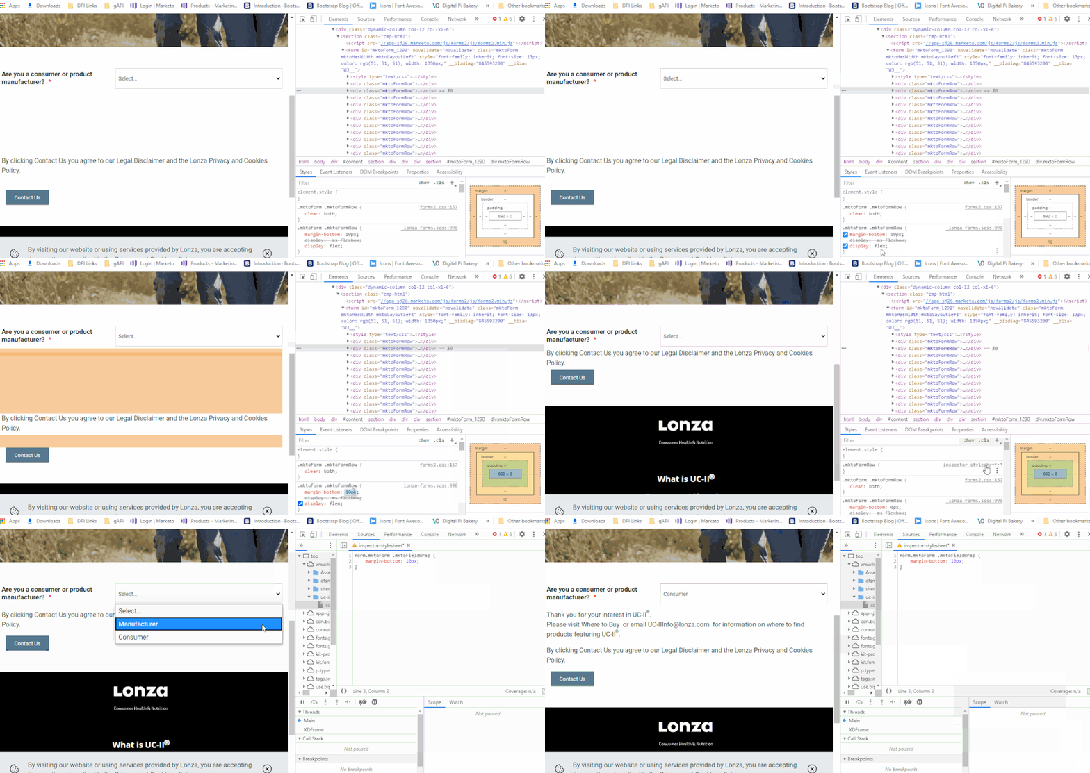
Good to see the width issue get ironed out. I know Im a little late to the party here but I did notice one more little thing that you might think about putting into play to shrink up the add'l space of "empty" (hidden) fields.
As-is, there's a margin on the bottom of each form row and when you hide a bunch of the rows you end up with a very large vertical gap in the form. In the screen below, I first REMOVE the 10px of margin-bottom in the CSS (that can also be set to 0px) and then ADD the same 10px margin-bottom to the .mktoFieldWrap element instead. This fieldwrap doesn't show up on the hidden fields until they're shown so you don't end up w/ any extra space like you do when the margin is on the rows. The .mktoFieldWrap element is the parent to the label and input elements in the form architecture and any input must be contained in a row so it works out about the same (and even better if you ever do 2-col layouts b/c you get the margin below EACH field instead of one margin below both fields when the columns stack).
Hope this reaches you in time to get it in play alongside the other changes, let me know if you've got any questions about the code provided or whatever.
- « Previous
-
- 1
- 2
- Next »
- Copyright © 2025 Adobe. All rights reserved.
- Privacy
- Terms of use
- Do not sell my personal information
Adchoices


.png)