Form Checkbox Not Appearing on Marketo Landing Page
- Subscribe to RSS Feed
- Mark Topic as New
- Mark Topic as Read
- Float this Topic for Current User
- Bookmark
- Subscribe
- Printer Friendly Page
- Mark as New
- Bookmark
- Subscribe
- Mute
- Subscribe to RSS Feed
- Permalink
- Report Inappropriate Content
Hello,
I have added a Marketo form to a custom Marketo landing page that was built by an outside development team.
The form uses the Dark Theme and I am applying custom code to modify the button's color and alignment on the form.
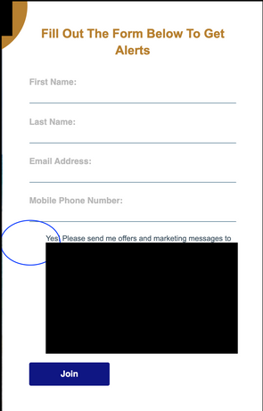
The main problem I am having with the form is that the checkbox is not appearing in the form when placed on the landing page.
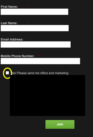
Please see screenshots below of both the form as it appears on the landing page and the form in preview mode with the dark theme.
Form On LP:
Preview of Form in Marketo with Dark Theme:
I am thinking that the checkbox isn't appearing on the page because no styling is being applied to it, like shadow or borders. But I'm not sure. If that is the case, how would I add a border/shadow to the checkbox to make it show up?
.mktoButton {
  background: {{Lead.Brand Secondary Color}} !important;
  color: #ffffff !important;
  border-color: none !important;
  box-shadow: none !important;
  font-size: 16px !important;
  padding: 0.625rem 1.125rem !important;
  line-height: 1.5 !important;
  border-radius: 0.2rem !important;
  font-weight: 700 !important;
  font-family: 'Helvetica' !important;
  text-shadow: none !important;
}

.mktoButton:hover {
  background: {{Lead.Brand Secondary Color}} !important;
  color: #ffffff !important;
  border-color: none !important;
}

.mktoForm {
  width:100% !important;
}
.mktoFormRow, .mktoFieldWrap, .mktoButtonRow {
  width:100% !important;
}
.mktoForm input[type=url],
.mktoForm input[type=text],
.mktoForm input[type=date],
.mktoForm input[type=tel],
.mktoForm input[type=email],
.mktoForm input[type=number],
.mktoForm textarea.mktoField,
.mktoForm select.mktoField {
  width:100% !important;

}
Solved! Go to Solution.
- Labels:
-
checkboxes
-
css
-
form
-
marketo forms
- Mark as New
- Bookmark
- Subscribe
- Mute
- Subscribe to RSS Feed
- Permalink
- Report Inappropriate Content
Hey LK,
Here's a bit of code I put together in the inspector to work out both issues (checkbox and button center). From what I could see there are a few conflicts with the "arr_style.css" file and a few issues w/ the dark theme css from Marketo that were messing with the checkbox display. It does look like you've got both a :before AND :after checkbox pseudo-element setup in the css and I've just display those "none" to get rid of them here (you could also find that CSS and remove it).
At the very bottom of the code, there's a line to center the button on the form - this works by displaying the button wrapper as an inline-block (think paragraph block) and then aligning the "text" (eg the button) to center inside the wrapper which should help with the 2nd part of this question here: https://nation.marketo.com/t5/product-discussions/button-not-centering-in-marketo-form/m-p/314532/hi...
/* override css on arr_style.css which display:none the radio and checkbox inputs */
form.mktoForm .mktoRadioList > input, form.mktoForm .mktoCheckboxList > input {
    display: block !important;
}
/* override theme css: the dark theme sets the checkbox and radio to opacity:0; */
form.mktoForm input[type=checkbox], form.mktoForm input[type=radio] {
    opacity: 1;
}
/* hide the :before and :after checkbox:checked characters */
.mktoForm input[type=checkbox]:checked + label:before, .mktoForm input[type=checkbox]:checked + label:after  {
    display: none;
}

/* center form button - display wrapper as inline block and center button w/ text-align */
form.mktoForm .mktoButtonWrap {
    display: inline-block;
    text-align: center;
}
Here's a look at what Im seeing when adding this CSS in the inspector.
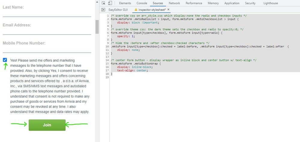
... and here's a look at some context for the overrides - the new rules are at the top and the arrows point to the rules they are overriding.
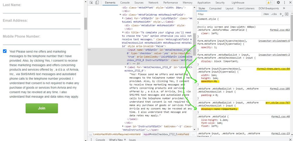
Let me know if you've got any questions about how to get this into play and/or if there's anything else I can help out with here to get the styling setup the way you'd prefer to see it.
Thanks,
Dave
- Mark as New
- Bookmark
- Subscribe
- Mute
- Subscribe to RSS Feed
- Permalink
- Report Inappropriate Content
Hey LK,
Here's a bit of code I put together in the inspector to work out both issues (checkbox and button center). From what I could see there are a few conflicts with the "arr_style.css" file and a few issues w/ the dark theme css from Marketo that were messing with the checkbox display. It does look like you've got both a :before AND :after checkbox pseudo-element setup in the css and I've just display those "none" to get rid of them here (you could also find that CSS and remove it).
At the very bottom of the code, there's a line to center the button on the form - this works by displaying the button wrapper as an inline-block (think paragraph block) and then aligning the "text" (eg the button) to center inside the wrapper which should help with the 2nd part of this question here: https://nation.marketo.com/t5/product-discussions/button-not-centering-in-marketo-form/m-p/314532/hi...
/* override css on arr_style.css which display:none the radio and checkbox inputs */
form.mktoForm .mktoRadioList > input, form.mktoForm .mktoCheckboxList > input {
    display: block !important;
}
/* override theme css: the dark theme sets the checkbox and radio to opacity:0; */
form.mktoForm input[type=checkbox], form.mktoForm input[type=radio] {
    opacity: 1;
}
/* hide the :before and :after checkbox:checked characters */
.mktoForm input[type=checkbox]:checked + label:before, .mktoForm input[type=checkbox]:checked + label:after  {
    display: none;
}

/* center form button - display wrapper as inline block and center button w/ text-align */
form.mktoForm .mktoButtonWrap {
    display: inline-block;
    text-align: center;
}
Here's a look at what Im seeing when adding this CSS in the inspector.

... and here's a look at some context for the overrides - the new rules are at the top and the arrows point to the rules they are overriding.

Let me know if you've got any questions about how to get this into play and/or if there's anything else I can help out with here to get the styling setup the way you'd prefer to see it.
Thanks,
Dave
- Mark as New
- Bookmark
- Subscribe
- Mute
- Subscribe to RSS Feed
- Permalink
- Report Inappropriate Content
Hi Dave,
Thank you so much! I was at a loss for how to fix these issues. I really appreciate your help. Maybe this will help others in the future who run into similar issues. 🙂
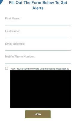
Here's a screenshot of the "fixed form":
Thanks again!
LK
- Mark as New
- Bookmark
- Subscribe
- Mute
- Subscribe to RSS Feed
- Permalink
- Report Inappropriate Content
Also, for the first question, impossible to look into without a URL.
- Mark as New
- Bookmark
- Subscribe
- Mute
- Subscribe to RSS Feed
- Permalink
- Report Inappropriate Content
Yes, I will do so.
Please see the landing page here: http://promos.ovstravel.com/IM---Operational-Testing-Program_SMS-Test-Landing-Page.html
Thank you,
LK
- Mark as New
- Bookmark
- Subscribe
- Mute
- Subscribe to RSS Feed
- Permalink
- Report Inappropriate Content
I'm also noticing that there appear to be two checkboxes...I did add CSS styling to the LP Template to customize the checkbox, so not sure if that actually ended up creating an extra checkbox or what.
- Copyright © 2025 Adobe. All rights reserved.
- Privacy
- Community Guidelines
- Terms of use
- Do not sell my personal information
Adchoices
