Re: Embedded javascript on forms taking up rows
- Subscribe to RSS Feed
- Mark Topic as New
- Mark Topic as Read
- Float this Topic for Current User
- Bookmark
- Subscribe
- Printer Friendly Page
- Mark as New
- Bookmark
- Subscribe
- Mute
- Subscribe to RSS Feed
- Permalink
- Report Inappropriate Content
Hello!
I added 2 javascript code snippets into my form by adding rich text to the forms and putting the scripts directly in them.
Previously, when I did this, it didn't create additional rows in my form but now it's taking up space in the form and I'm unsure what changed.
Here's a test page I created: https://go.cornerstoneondemand.com/SJ-Test_CS_WP_lp-form-test.html
Anyone have any ideas?
Solved! Go to Solution.
- Mark as New
- Bookmark
- Subscribe
- Mute
- Subscribe to RSS Feed
- Permalink
- Report Inappropriate Content
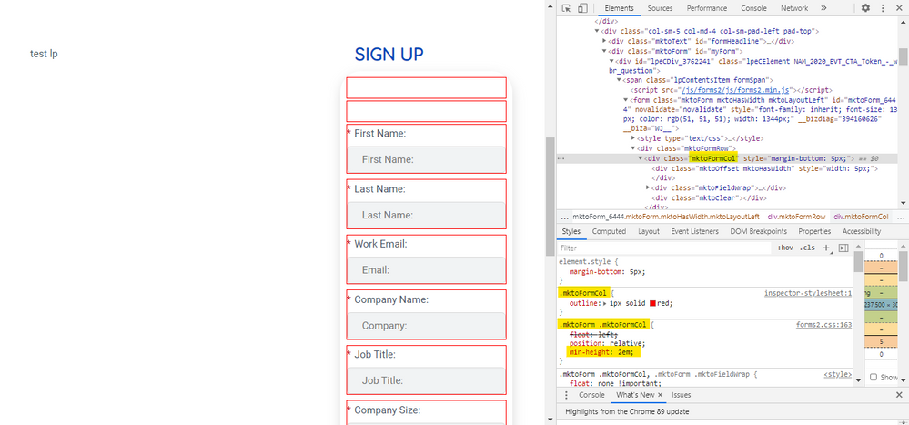
You'll also notice in the shot above that there's an inline style on the column's HTML of "margin-bottom:5px;". This gets added by the form script to all columns and will cause a much smaller gap (5px) even after you shrink the min-height of the columns to zero.
To deal with this, I'll usually remove the margin from the bottom of the form columns:
form.mktoForm .mktoFormCol { margin-bottom: 0px !important;}and then add that margin to the bottom of the field wrap instead:
form.mktoForm .mktoFieldWrap { margin-bottom: 5px;}
so, all together with the min-height rule above, it'd look like this:
form.mktoForm .mktoFormCol {
    min-height: 0px !important;
    margin-bottom: 0px !important;

}

form.mktoForm .mktoFieldWrap {
    margin-bottom: 5px;
}- Mark as New
- Bookmark
- Subscribe
- Mute
- Subscribe to RSS Feed
- Permalink
- Report Inappropriate Content
There's a min-height set by the forms2.css file that you'll want to override with some CSS.
In the screenshot below, I've outlined the columns in red so it's clear what's going on here, and highlighted the style that's setting the min-height.
Adding this CSS to the Custom CSS on the form should do the trick here.
form.mktoForm .mktoFormCol {min-height:0px !important;}
There may be a better place to include this CSS if you're using a global stylesheet of some kind for your forms so that it styles ANY form placed onto the page instead of just modifying "this" specific form as it would if you added it into the Custom CSS at the form level.
- Mark as New
- Bookmark
- Subscribe
- Mute
- Subscribe to RSS Feed
- Permalink
- Report Inappropriate Content
You'll also notice in the shot above that there's an inline style on the column's HTML of "margin-bottom:5px;". This gets added by the form script to all columns and will cause a much smaller gap (5px) even after you shrink the min-height of the columns to zero.
To deal with this, I'll usually remove the margin from the bottom of the form columns:
form.mktoForm .mktoFormCol { margin-bottom: 0px !important;}and then add that margin to the bottom of the field wrap instead:
form.mktoForm .mktoFieldWrap { margin-bottom: 5px;}
so, all together with the min-height rule above, it'd look like this:
form.mktoForm .mktoFormCol {
    min-height: 0px !important;
    margin-bottom: 0px !important;

}

form.mktoForm .mktoFieldWrap {
    margin-bottom: 5px;
}- Mark as New
- Bookmark
- Subscribe
- Mute
- Subscribe to RSS Feed
- Permalink
- Report Inappropriate Content
This worked perfectly thank you!
- Mark as New
- Bookmark
- Subscribe
- Mute
- Subscribe to RSS Feed
- Permalink
- Report Inappropriate Content
Rich Text areas always take up space (due primarily to margin styles) even if they only hold a <script>.
You must've changed the global CSS, which in turn made the height more apparent. Look for min-height styles.
- Copyright © 2025 Adobe. All rights reserved.
- Privacy
- Community Guidelines
- Terms of use
- Do not sell my personal information
Adchoices
