Re: Deciphering the Email Program Report
- Subscribe to RSS Feed
- Mark Topic as New
- Mark Topic as Read
- Float this Topic for Current User
- Bookmark
- Subscribe
- Printer Friendly Page
- Mark as New
- Bookmark
- Subscribe
- Mute
- Subscribe to RSS Feed
- Permalink
- Report Inappropriate Content
1) Engagement - What exactly gets tracked as an engagement? An email has text and links. Since engagement is not the same as link clicks, what is it exactly?
2) Click report - Where can I see a report of which specific links were clicked?
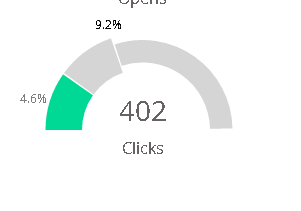
3) In the Opens, Clicks, Click to Open, and Unsubscribes graphs, there is a wider section and a narrower section. The wider section is split into green and gray halves. Why are they split and what does that mean? For example, if Click to Open shows 8.2% as the main result, the graph shows 8.2% in green, 16.4% at the end of the wider gray, and then the rest is a narrower gray. What is the wider gray part showing?
I realize these are pretty newbie-level questions, but I couldn't find the answers anywhere in the support/discussion sections. Is there any official documentation on these things?
Thanks for your help.
Solved! Go to Solution.
- Labels:
-
Lead Management
- Mark as New
- Bookmark
- Subscribe
- Mute
- Subscribe to RSS Feed
- Permalink
- Report Inappropriate Content
2. Clicks - you can create a Email Link Performance report to see this.
3. Unsure about this chart. Can you send a screen shot?
Ok, I think this just means that 8.2% is the click to open. Ignore the gray part.
- Mark as New
- Bookmark
- Subscribe
- Mute
- Subscribe to RSS Feed
- Permalink
- Report Inappropriate Content
Ignore the gray part? It's there for a reason, isn't it?
I have the same question as the OP, but hover adds no detail and I'm not getting the math to add up to anything else on the chart.
Anyone have any insight on the gray slice?
- Mark as New
- Bookmark
- Subscribe
- Mute
- Subscribe to RSS Feed
- Permalink
- Report Inappropriate Content
Hi Steve,
I'm the OP and I recently brought up this question again to support by opening a case. The response I received from support was:
"You are only concerned with the green parts of the graphs for gathering statistics. The Gray area to scale doesn't really mean anything important and is more for aesthetics."
So, although I agree with you that this doesn't make any sense and is actually confusing/misleading, looks like this is the way the Marketo people choose to display charts.
- Mark as New
- Bookmark
- Subscribe
- Mute
- Subscribe to RSS Feed
- Permalink
- Report Inappropriate Content
I finally found (by digging, not searching <argh>) something that indicated this is only to show scale when the slice is too small to see otherwise.
Agreed Alex. It's obviously confusing but it is documented... I just missed it several times going through the docs (admittedly a newbie mistake) and didn't hit on the right terms to find it by search.
Here t'is for the next confused pie chart reader:
Use the Email Program Dashboard - Marketo Docs - Product Docs
- Mark as New
- Bookmark
- Subscribe
- Mute
- Subscribe to RSS Feed
- Permalink
- Report Inappropriate Content
Nice find. I had scoured the documentation before opening this thread originally in 2014 and didn't find anything about it.
Even with that info, I don't think it makes sense. In your screenshot, the green 4.6% is very visible. And since it's not actually properly scaled in the first place (the green part is not 4.6% of the total chart area), adding another section "for scale" isn't useful.
- Mark as New
- Bookmark
- Subscribe
- Mute
- Subscribe to RSS Feed
- Permalink
- Report Inappropriate Content
I really liked this email summary report that Marketo creates for me in the Program dashboard. I am looking for it now in the Engagement Program (first time using it) but so confused as to how I can get the report in the Engagement Program. Any ideas? Thanks!
- Mark as New
- Bookmark
- Subscribe
- Mute
- Subscribe to RSS Feed
- Permalink
- Report Inappropriate Content
Nevermind! Found it. Thanks!
- Mark as New
- Bookmark
- Subscribe
- Mute
- Subscribe to RSS Feed
- Permalink
- Report Inappropriate Content
Engagement I would have never guessed is measured against the entire Marketo population. Do you know if this and other facts are documented somewhere? Otherwise, how would people possibly know that's what it's reporting?
- Mark as New
- Bookmark
- Subscribe
- Mute
- Subscribe to RSS Feed
- Permalink
- Report Inappropriate Content
2. Clicks - you can create a Email Link Performance report to see this.
3. Unsure about this chart. Can you send a screen shot?
Ok, I think this just means that 8.2% is the click to open. Ignore the gray part.
- Copyright © 2025 Adobe. All rights reserved.
- Privacy
- Community Guidelines
- Terms of use
- Do not sell my personal information
Adchoices
