Re: CSS-Required Asterisk Position
- Subscribe to RSS Feed
- Mark Topic as New
- Mark Topic as Read
- Float this Topic for Current User
- Bookmark
- Subscribe
- Printer Friendly Page
- Mark as New
- Bookmark
- Subscribe
- Mute
- Subscribe to RSS Feed
- Permalink
- Report Inappropriate Content
I am having a hell of a time trying to position the required asterisk. I used some css styling to redo the generic boring checkboxes, but now that little guy just floats above. I also scrubbed all the pre-filled marketo css per Sanford Whiteman .
Anyone have a trick for this?
Here's the page:
test
Solved! Go to Solution.
- Labels:
-
Products
- Mark as New
- Bookmark
- Subscribe
- Mute
- Subscribe to RSS Feed
- Permalink
- Report Inappropriate Content
Hi Douglas,
This is because you are using chekboxes without a label, yet the * is attached to the label.
Just hide them with CSS and recreate them in the checkboxes display value where you can add some html/css:
<span style="color:red;">*</span>I agree to sell you my soul in exchange for a nickel and two chickens.
But remember that under GDPR (and most of equivalent opt-in regulations), you should not make the consent mandatory.
-Greg
- Mark as New
- Bookmark
- Subscribe
- Mute
- Subscribe to RSS Feed
- Permalink
- Report Inappropriate Content
Thanks Grégoire. Super helpful.
- Mark as New
- Bookmark
- Subscribe
- Mute
- Subscribe to RSS Feed
- Permalink
- Report Inappropriate Content
Hi Douglas,
Pls mark the answer as correct for future reference.
-Greg
- Mark as New
- Bookmark
- Subscribe
- Mute
- Subscribe to RSS Feed
- Permalink
- Report Inappropriate Content
Ok, follow up question, how do I target those specific asterisks? Trying to avoid using nth child to target those two labels.
Larger question as this is my first time using Marketo forms (and would solve my problem), can you assign css id to elements to target them in the form editor in the design studio? if I could give them a class or ID I could easily hide them in my CSS
- Mark as New
- Bookmark
- Subscribe
- Mute
- Subscribe to RSS Feed
- Permalink
- Report Inappropriate Content
Hey Douglas,
You can use the class "mktoAsterix" to target the native mktoAsterix.
I'll normally write something like this to hide them:
.mktoAsterix {display:none !important;}
For the other <span> approach, you could add an attribute to your span like this:
<span name="myElement-required" style="color:red">*</span>
Then you could target that span using something similar to the CSS you found above:
span[name="myElement-required"] {
/* woohoo */
}
----
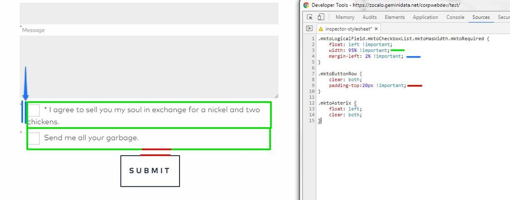
I went in and had a look at the form sample you posted and put together a few lines of CSS that seem to be ironing that out for me in Chrome at least. I tried to color code the CSS parts so those made sense in context:
Here's the CSS I used to modify this:
.mktoLogicalField.mktoCheckboxList.mktoHasWidth.mktoRequired {
float: left !important;
width: 95% !important;
margin-left: 2% !important;
}
.mktoButtonRow {
clear: both;
padding-top:20px !important;
}
.mktoAsterix {
float: left;
clear: both;
}
---
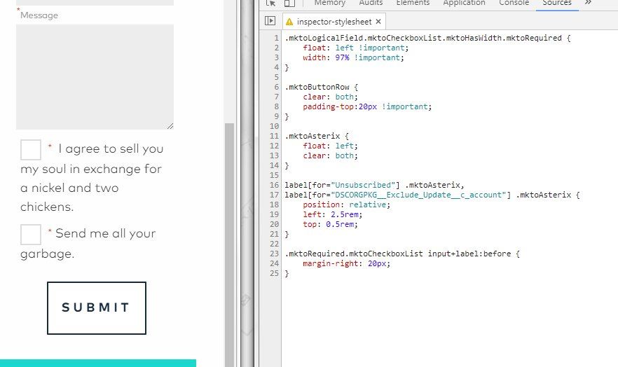
..then I noticed that the asterisk were on the left side of the checkbox instead on the right side, so I modified the CSS a little to give you another option here. I've hidden the <span> asterix in this example (you could just remove it) and set a style to look for a ".mktoRequired" checkbox list and give that a little extra margin-right to make room for the asterix on the right side of the label.
Here's the code for that if you wanted to give it a try, this builds on the previous example a bit.:
.mktoLogicalField.mktoCheckboxList {
float: left !important;
width: 97% !important;
}
.mktoButtonRow {
clear: both;
padding-top:20px !important; /* push button down a bit */
}
.mktoAsterix {
float: left;
clear: both;
}
/* add specific labels here for each required checkbox item */
label[for="Unsubscribed"] .mktoAsterix,
label[for="DSCORGPKG__Exclude_Update__c_account"] .mktoAsterix {
position: relative;
left: 2.5rem;
top: 0.5rem;
}
.mktoRequired.mktoCheckboxList input+label:before {
margin-right: 20px;
}
Let me know if any of this is helpful / worked or if you've got questions on what's going on here.
- Mark as New
- Bookmark
- Subscribe
- Mute
- Subscribe to RSS Feed
- Permalink
- Report Inappropriate Content
Found a solution:
label[for="something"] {
   /* woohoo! */
}
allows you to target specific labels. But still would love to hear your thoughts.
- Mark as New
- Bookmark
- Subscribe
- Mute
- Subscribe to RSS Feed
- Permalink
- Report Inappropriate Content
Hi Douglas,
read this: Better styling of forms : yet another framework and use the JS proposed by Sanford in this comment https://nation.marketo.com/community/champion/blog/2018/01/28/better-styling-of-forms-a-global-frame...
- Copyright © 2025 Adobe. All rights reserved.
- Privacy
- Community Guidelines
- Terms of use
- Do not sell my personal information
Adchoices


