Re: Can we control the option area for the select fields in Marketo Form?
- Subscribe to RSS Feed
- Mark Topic as New
- Mark Topic as Read
- Float this Topic for Current User
- Bookmark
- Subscribe
- Printer Friendly Page
- Mark as New
- Bookmark
- Subscribe
- Mute
- Subscribe to RSS Feed
- Permalink
- Report Inappropriate Content
Hi,
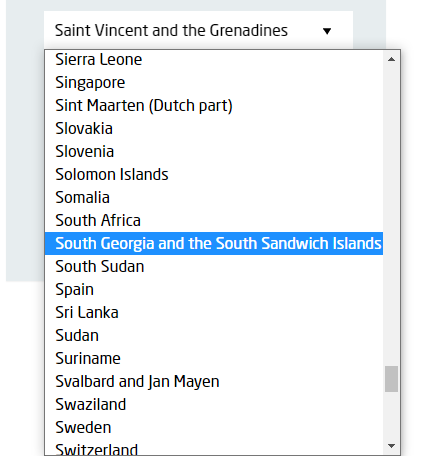
I am facing an issue while using select fields in the Marketo Form, if the option value is larger than the select box width then the options box width expand accordingly, and look wider than the select field area. Is there something we can control the width of the option values box? Attaching a screenshot for reference.
Any suggestion would be very helpful.
Thanks!
Jasbir
Solved! Go to Solution.
- Mark as New
- Bookmark
- Subscribe
- Mute
- Subscribe to RSS Feed
- Permalink
- Report Inappropriate Content
Hey Jasbir,
As far as I know this is not possible using the native <select> field in a Marketo Form -- you'd need to create a custom HTML/CSS element that was a "pseudo-select" element to get something like this to work. It might be worth noting that this'll show up differently depending on which browser you're looking at as well.
Here's an article from stackoverflow with some details for reference: https://stackoverflow.com/questions/7208786/how-to-style-the-option-of-an-html-select-element
The only ideas I've got to work around this would be to expand the width of the form itself to give the select a bit more room to match up with the longer options or to make the font-size of the fields smaller maybe?
- Mark as New
- Bookmark
- Subscribe
- Mute
- Subscribe to RSS Feed
- Permalink
- Report Inappropriate Content
Like Dave says, this isn’t a “Marketo form” thing, it’s common to all native HTML forms. Unlike some hacked-together form builders, Marketo does the right thing and uses a true form and native input elements.
You might consider a 3rd-party widget, but be aware that it’s almost impossible to preserve mobile usability without using a true select. Which means mobile users will still see the overflow, although of course the overall UI is very different.
- Mark as New
- Bookmark
- Subscribe
- Mute
- Subscribe to RSS Feed
- Permalink
- Report Inappropriate Content
Sure @SanfordWhiteman & @Dave_Robertsand Thanks for your valuable comments.
- Mark as New
- Bookmark
- Subscribe
- Mute
- Subscribe to RSS Feed
- Permalink
- Report Inappropriate Content
Hey Jasbir,
As far as I know this is not possible using the native <select> field in a Marketo Form -- you'd need to create a custom HTML/CSS element that was a "pseudo-select" element to get something like this to work. It might be worth noting that this'll show up differently depending on which browser you're looking at as well.
Here's an article from stackoverflow with some details for reference: https://stackoverflow.com/questions/7208786/how-to-style-the-option-of-an-html-select-element
The only ideas I've got to work around this would be to expand the width of the form itself to give the select a bit more room to match up with the longer options or to make the font-size of the fields smaller maybe?
- Copyright © 2025 Adobe. All rights reserved.
- Privacy
- Community Guidelines
- Terms of use
- Do not sell my personal information
Adchoices
