Re: Button not centering in Marketo form
- Subscribe to RSS Feed
- Mark Topic as New
- Mark Topic as Read
- Float this Topic for Current User
- Bookmark
- Subscribe
- Printer Friendly Page
- Mark as New
- Bookmark
- Subscribe
- Mute
- Subscribe to RSS Feed
- Permalink
- Report Inappropriate Content
Hello,
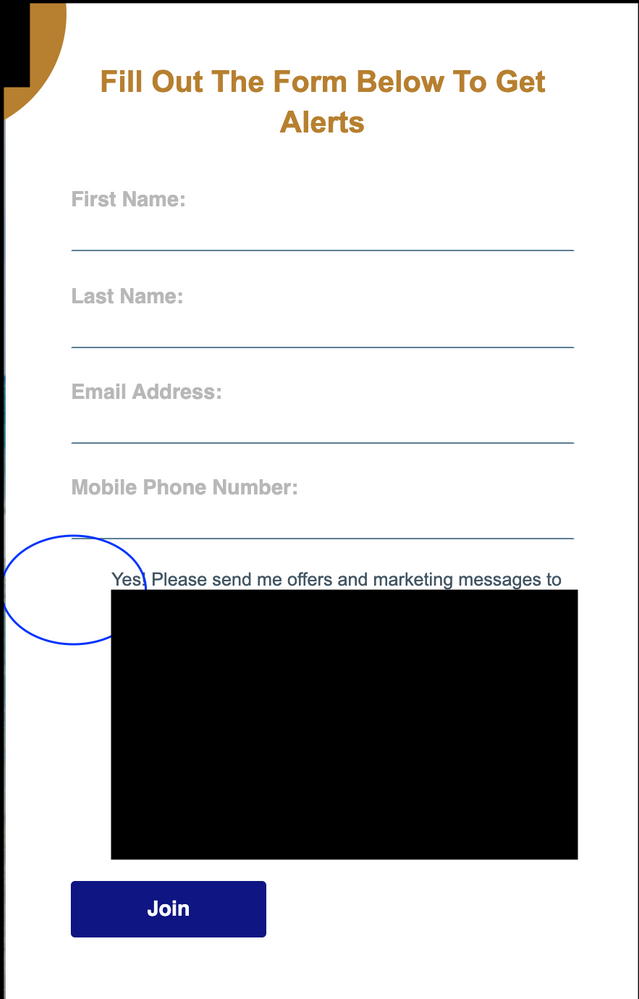
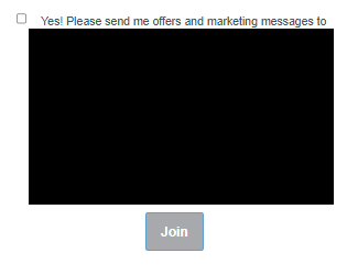
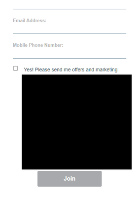
I am trying to center a button on a Marketo form. I have used the following code but the button is still not centering.
Does anyone have any suggestions?
.mktoForm {
  width:100% !important;
}
.mktoFormRow, .mktoFieldWrap, .mktoButtonRow {
  width:100% !important;
}
.mktoForm input[type=url],
.mktoForm input[type=text],
.mktoForm input[type=date],
.mktoForm input[type=tel],
.mktoForm input[type=email],
.mktoForm input[type=number],
.mktoForm textarea.mktoField,
.mktoForm select.mktoField {
  width:100% !important;

}

input[type="checkbox" i] {
    background-color: #000 !important;
    cursor: default;
    appearance: auto;
    box-sizing: border-box;
    margin: 3px 3px 3px 4px;
    padding: initial;
    border: initial;
}

}
Thank you,
LK
Solved! Go to Solution.
- Mark as New
- Bookmark
- Subscribe
- Mute
- Subscribe to RSS Feed
- Permalink
- Report Inappropriate Content
I've added some feedback here: https://nation.marketo.com/t5/product-discussions/button-not-centering-in-marketo-form/m-p/314532/hi... which covers the centering of the button -- I read/responded to this post before I saw the other w/ the link.
Here's the bit of code that's centering the button isolated from the other example:
/* center form button - display wrapper as inline block and center button w/ text-align */
form.mktoForm .mktoButtonWrap {
    display: inline-block;
    text-align: center;
}
Please let me know if you've got any feedback specifically about centering the button on this thread so we can try and keep it useful for anyone who comes along in the future with a similar question.
Thanks again,
Dave
- Mark as New
- Bookmark
- Subscribe
- Mute
- Subscribe to RSS Feed
- Permalink
- Report Inappropriate Content
To add CSS that overrides the native styles I usually will use a more specific selector in tandem with the !important flag.
/* rather than a simple selector ... */
button.mktoButton {...}

/* the native stylesheet uses ... */
.mktoForm .mktoButtonWrap.mktoBlueBox .mktoButton {...}

/* so using something like this usually does the trick */
form.mktoForm .mktoButtonWrap[class] button.mktoButton {
    border: none !important;
    min-width: 180px !important;
}
form.mktoForm .mktoButtonWrap[class] button.mktoButton:hover,
form.mktoForm .mktoButtonWrap[class] button.mktoButton:active,
form.mktoForm .mktoButtonWrap[class] button.mktoButton:focus {
    /* add hover, active and focus CSS here as needed */
}
Depending on the button you choose in the Form Editor, there will be another class added to the ".mktoButtonWrap" element - in this case you've got the ".mktoBlueBox" button selected. In the last line of code above, you'll notice the [class] piece tacked onto the .mktoButtonWrap selector to help override any of the button classes that get added. Generally, I avoid using the button picker and instead use CSS to style the button consistently from page-to-page and leave it setup as the default "green gradient" button that shows up whenever you make a net-new form in the instance.
You can play w/ the min-width setting (180px) to force the button to be wider on both desktop and mobile. I wasn't able to see any other button on the website without logging in, but this should be easy enough to adjust to be close to the other buttons you're using on the website.
At the very bottom of the code I also added a line to help control the "hover", "active" and "focus" states of the button so you could have some control over the "interactive" parts of the display. I usually use this to change the background and border color (if you're using a border) as well as the text color if/when needed. This part isn't necessary to get anything here to work, just a springboard for any future use-cases if you wanted some control over the active button states.
Let me know if that worked out for you or if there's anything else I can help you get into play here.
Thanks again,
Dave
- Mark as New
- Bookmark
- Subscribe
- Mute
- Subscribe to RSS Feed
- Permalink
- Report Inappropriate Content
I've added some feedback here: https://nation.marketo.com/t5/product-discussions/button-not-centering-in-marketo-form/m-p/314532/hi... which covers the centering of the button -- I read/responded to this post before I saw the other w/ the link.
Here's the bit of code that's centering the button isolated from the other example:
/* center form button - display wrapper as inline block and center button w/ text-align */
form.mktoForm .mktoButtonWrap {
    display: inline-block;
    text-align: center;
}
Please let me know if you've got any feedback specifically about centering the button on this thread so we can try and keep it useful for anyone who comes along in the future with a similar question.
Thanks again,
Dave
- Mark as New
- Bookmark
- Subscribe
- Mute
- Subscribe to RSS Feed
- Permalink
- Report Inappropriate Content
Thank you for sharing
- Mark as New
- Bookmark
- Subscribe
- Mute
- Subscribe to RSS Feed
- Permalink
- Report Inappropriate Content
Thank you so much Dave! 😄
- Mark as New
- Bookmark
- Subscribe
- Mute
- Subscribe to RSS Feed
- Permalink
- Report Inappropriate Content
Hello, the width of the button on the form is a little smaller than I would like. How can I make it closer in size to the other buttons on the landing page (regardless of desktop vs. mobile)?
Also, how do I remove the border appearing around the button? I've tried adding this code below to the form theme custom CSS, but no luck 😥:
  border: none !important;
  border-color: none !important;
Link to landing page: http://promos.ovstravel.com/IM---Operational-Testing-Program_SMS-Test-Landing-Page.html.
Thank you,
LK
- Mark as New
- Bookmark
- Subscribe
- Mute
- Subscribe to RSS Feed
- Permalink
- Report Inappropriate Content
To add CSS that overrides the native styles I usually will use a more specific selector in tandem with the !important flag.
/* rather than a simple selector ... */
button.mktoButton {...}

/* the native stylesheet uses ... */
.mktoForm .mktoButtonWrap.mktoBlueBox .mktoButton {...}

/* so using something like this usually does the trick */
form.mktoForm .mktoButtonWrap[class] button.mktoButton {
    border: none !important;
    min-width: 180px !important;
}
form.mktoForm .mktoButtonWrap[class] button.mktoButton:hover,
form.mktoForm .mktoButtonWrap[class] button.mktoButton:active,
form.mktoForm .mktoButtonWrap[class] button.mktoButton:focus {
    /* add hover, active and focus CSS here as needed */
}
Depending on the button you choose in the Form Editor, there will be another class added to the ".mktoButtonWrap" element - in this case you've got the ".mktoBlueBox" button selected. In the last line of code above, you'll notice the [class] piece tacked onto the .mktoButtonWrap selector to help override any of the button classes that get added. Generally, I avoid using the button picker and instead use CSS to style the button consistently from page-to-page and leave it setup as the default "green gradient" button that shows up whenever you make a net-new form in the instance.
You can play w/ the min-width setting (180px) to force the button to be wider on both desktop and mobile. I wasn't able to see any other button on the website without logging in, but this should be easy enough to adjust to be close to the other buttons you're using on the website.
At the very bottom of the code I also added a line to help control the "hover", "active" and "focus" states of the button so you could have some control over the "interactive" parts of the display. I usually use this to change the background and border color (if you're using a border) as well as the text color if/when needed. This part isn't necessary to get anything here to work, just a springboard for any future use-cases if you wanted some control over the active button states.
Let me know if that worked out for you or if there's anything else I can help you get into play here.
Thanks again,
Dave
- Mark as New
- Bookmark
- Subscribe
- Mute
- Subscribe to RSS Feed
- Permalink
- Report Inappropriate Content
Thank you so much Dave! The button looks much better, wider and without that green outline 🙂
LK
- Mark as New
- Bookmark
- Subscribe
- Mute
- Subscribe to RSS Feed
- Permalink
- Report Inappropriate Content
... re-threaded this post to: https://nation.marketo.com/t5/product-discussions/form-checkbox-not-appearing-on-marketo-landing-pag......
- Mark as New
- Bookmark
- Subscribe
- Mute
- Subscribe to RSS Feed
- Permalink
- Report Inappropriate Content
Could you post a link to a test page with this form on it? If I can get into the dev console and have a look at the code I can probably help you get this ironed out. To be clear here - are you looking to deal with the button being centered on the form or the left spacing on the dark background input (or both)?
- Copyright © 2025 Adobe. All rights reserved.
- Privacy
- Community Guidelines
- Terms of use
- Do not sell my personal information
Adchoices


