Re: Align Radio buttons on forms
- Subscribe to RSS Feed
- Mark Topic as New
- Mark Topic as Read
- Float this Topic for Current User
- Bookmark
- Subscribe
- Printer Friendly Page
- Mark as New
- Bookmark
- Subscribe
- Mute
- Subscribe to RSS Feed
- Permalink
- Report Inappropriate Content
Hi there,
Im struggling to make it so the radio buttons are next to each other. on the one line.
any ideas on how to achieve this in CSS?
Thanks
the page is here - https://direct.digitalmarketinginstitute.com/students/courses/test-area/professional-diploma-in-digi...
and if you scroll down a navigational bar will appear at the top and click on 'Test Brochure'
Solved! Go to Solution.
- Mark as New
- Bookmark
- Subscribe
- Mute
- Subscribe to RSS Feed
- Permalink
- Report Inappropriate Content
Hey Callum,
Thanks for the reminder here, I was able to see the form on the links you shared.
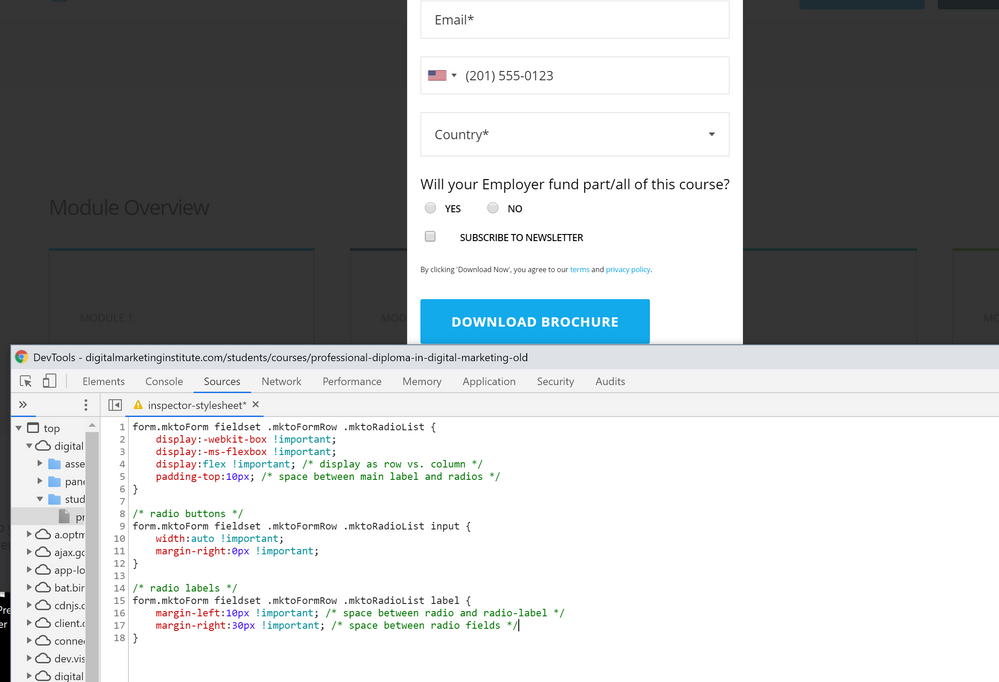
I've gone into the inspector to add a few styles to the page so you could see what this should look like once it's in place. The CSS below should be able to be copied and pasted into either A) the form's Custom CSS in the form editor (for local application, this form only) -or- B) into your site's stylesheet for a more global application (for all forms on pages that use this stylesheet).
form.mktoForm fieldset .mktoFormRow .mktoRadioList {
display:-webkit-box !important;
display:-ms-flexbox !important;
display:flex !important; /* display as row vs. column */
padding-top:10px; /* space between main label and radios */
}
/* radio buttons */
form.mktoForm fieldset .mktoFormRow .mktoRadioList input {
width:auto !important;
margin-right:0px !important;
}
/* radio labels */
form.mktoForm fieldset .mktoFormRow .mktoRadioList label {
margin-left:10px !important; /* space between radio and radio-label */
margin-right:30px !important; /* space between radio fields */
}I've added a few inline comments to the CSS to help make sense of the controls, let me know if you've got any questions on any of that. Any of the comments can be removed for production if you're more comfortable with that.
The 1st set of rules (line 1-6): This displays the radio list as a "flexbox" which basically means it runs left-to-right (like a row) instead of a column. The default "flex-direction" for the "dislpay:flex;" property is "row" - to get flex'd items to run top-to-bottom you'd use "flex-direction: column;" instead. There is a little padding added to the top of the radio list element to create some space between the main label and the radio fields.
The 2nd set of rules (line 7-11): The radio buttons (inputs) get their width adjusted to "auto" and I've overridden the right margin on the inputs. That spacing is moved into the labels so it's easier to manage (it's in one place instead of two)
The 3rd set of rules (line 12-16): The labels (YES, NO) have spacing to the left and right provided by the margins here. You can adjust these as you see fit, there are comments inline to point out where the space for each is.
Try adding these styles in and let me know if that worked for you, if not, Im happy to take another look.
- Mark as New
- Bookmark
- Subscribe
- Mute
- Subscribe to RSS Feed
- Permalink
- Report Inappropriate Content
Thanks Dave
- Mark as New
- Bookmark
- Subscribe
- Mute
- Subscribe to RSS Feed
- Permalink
- Report Inappropriate Content
You got it! Happy Friday ![]()
- Mark as New
- Bookmark
- Subscribe
- Mute
- Subscribe to RSS Feed
- Permalink
- Report Inappropriate Content
Hey Callum,
Thanks for the reminder here, I was able to see the form on the links you shared.
I've gone into the inspector to add a few styles to the page so you could see what this should look like once it's in place. The CSS below should be able to be copied and pasted into either A) the form's Custom CSS in the form editor (for local application, this form only) -or- B) into your site's stylesheet for a more global application (for all forms on pages that use this stylesheet).
form.mktoForm fieldset .mktoFormRow .mktoRadioList {
display:-webkit-box !important;
display:-ms-flexbox !important;
display:flex !important; /* display as row vs. column */
padding-top:10px; /* space between main label and radios */
}
/* radio buttons */
form.mktoForm fieldset .mktoFormRow .mktoRadioList input {
width:auto !important;
margin-right:0px !important;
}
/* radio labels */
form.mktoForm fieldset .mktoFormRow .mktoRadioList label {
margin-left:10px !important; /* space between radio and radio-label */
margin-right:30px !important; /* space between radio fields */
}I've added a few inline comments to the CSS to help make sense of the controls, let me know if you've got any questions on any of that. Any of the comments can be removed for production if you're more comfortable with that.
The 1st set of rules (line 1-6): This displays the radio list as a "flexbox" which basically means it runs left-to-right (like a row) instead of a column. The default "flex-direction" for the "dislpay:flex;" property is "row" - to get flex'd items to run top-to-bottom you'd use "flex-direction: column;" instead. There is a little padding added to the top of the radio list element to create some space between the main label and the radio fields.
The 2nd set of rules (line 7-11): The radio buttons (inputs) get their width adjusted to "auto" and I've overridden the right margin on the inputs. That spacing is moved into the labels so it's easier to manage (it's in one place instead of two)
The 3rd set of rules (line 12-16): The labels (YES, NO) have spacing to the left and right provided by the margins here. You can adjust these as you see fit, there are comments inline to point out where the space for each is.
Try adding these styles in and let me know if that worked for you, if not, Im happy to take another look.
- Mark as New
- Bookmark
- Subscribe
- Mute
- Subscribe to RSS Feed
- Permalink
- Report Inappropriate Content
HUGE help
Thank you very much
- Mark as New
- Bookmark
- Subscribe
- Mute
- Subscribe to RSS Feed
- Permalink
- Report Inappropriate Content
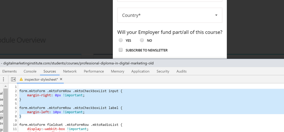
For good measure, here's a few styles that you could use to align the checkbox element with the radio buttons to get that to line up a bit nicer. Basically just eliminating the add'l margin on the input element and reducing the margin-left on the label to 10px to match the radios. If you were to update the spacing b/t radio inputs and labels, you'd also want to adjust the margin-left:10px on the checkbox labels.
form.mktoForm .mktoFormRow .mktoCheckboxList input {
margin-right: 0px !important;
}
form.mktoForm .mktoFormRow .mktoCheckboxList label {
margin-left: 10px !important;
}- Mark as New
- Bookmark
- Subscribe
- Mute
- Subscribe to RSS Feed
- Permalink
- Report Inappropriate Content
Im not seeing the navbar drop down when I scroll. I poked around the site a bit and found a few forms but none of them had radio buttons on them. Do you have a live example of this to share, it'd be easiest to be able to evaluate it in the browser's dev tools.
I think the best approach here might be to add the radio button field into a fieldset (if you're not using them otherwise w/ your form) and create a different set of CSS for fields inside a fieldset that'd place them beside eachother. I think you'll need the fieldset b/c it doesn't look like the rest of your form rows are flex'd (display:flex;) and that's the best tool for the job here.
NOTE: While you don't necessarily need to place the field into a fieldset, it helps to provide a division between "all normal fields" and "special fields" so that you can sometimes have radios stacked (outside a fieldset) and sometime have them stacked (inside a fieldset) without needing to choose between one or the other. Without the fieldset, you'd just write a rule for "all radio lists" - it'd have to be very specific, and while it'd work wouldn't be as scalable of a solution.
If you were to flex the parent element of the radio list (the div.mktoFieldWrap), it'll make the children elements run left-to-right (inline) rather than top-to-bottom (block). From there, you can adjust the widths of the radio and label to fit them evenly into two columns or just add some spacing around the inputs to let the width of the content (labels) determine the spacing.
Alternately, you might be able to accomplish this with fixed-widths and floats without needing to adjust the form (put the radio into a fieldset) but it's not as complete of a solution.
In any case, I'd be happy to help test some CSS if it's possible to get a live version of a form to tinker with on a staging site or something like that (or really any Marketo form on the site w/ radio buttons might work as an example). Let me know if Im missing something on the link you shared maybe?
Thanks,
Dave
- Mark as New
- Bookmark
- Subscribe
- Mute
- Subscribe to RSS Feed
- Permalink
- Report Inappropriate Content
Hi guys,
just checking if you could see the form?
- Mark as New
- Bookmark
- Subscribe
- Mute
- Subscribe to RSS Feed
- Permalink
- Report Inappropriate Content
Thanks Dave,
Try this link - https://digitalmarketinginstitute.com/students/courses/professional-diploma-in-digital-marketing-old
- Mark as New
- Bookmark
- Subscribe
- Mute
- Subscribe to RSS Feed
- Permalink
- Report Inappropriate Content
Hi Dave,
https://digitalmarketinginstitute.com/students/courses/professional-diploma-in-digital-marketing-old
I have tried your fieldset idea which is grand and at this stage at the moment. Any CSS ideas to make it so they are side by side.
- Mark as New
- Bookmark
- Subscribe
- Mute
- Subscribe to RSS Feed
- Permalink
- Report Inappropriate Content
Link is dead.
Also, please remove the attachment and add it as an inline image (in the post editor). Not all users can see attachments, which makes them very confusing.
- Copyright © 2025 Adobe. All rights reserved.
- Privacy
- Community Guidelines
- Terms of use
- Do not sell my personal information
Adchoices


