Add helper text to each picklist value in Marketo forms
- Subscribe to RSS Feed
- Mark Topic as New
- Mark Topic as Read
- Float this Topic for Current User
- Bookmark
- Subscribe
- Printer Friendly Page
- Mark as New
- Bookmark
- Subscribe
- Mute
- Subscribe to RSS Feed
- Permalink
- Report Inappropriate Content
I have a form with a picklist filed with the field type set to "select". When someone drops down the field and scrolls over different the picklist values, I would like a helper text to appear giving a description of each picklist value so they can select the value that makes the most sense to them. Is this possible?
Solved! Go to Solution.
- Mark as New
- Bookmark
- Subscribe
- Mute
- Subscribe to RSS Feed
- Permalink
- Report Inappropriate Content
You can set the standard title attribute on any <option>.
However, the UX is pretty... shall we say, light... on desktop:
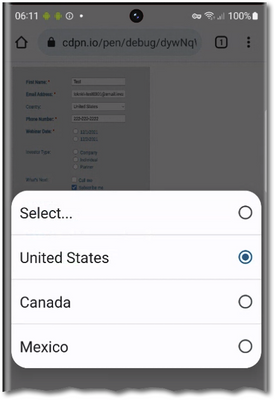
And on mobile, where choosing/scrolling is within the system modal <select> (i.e. rendered by the browser on top of your page) you wouldn’t see the value at all:
I agree with Jo that your helper text should just be part of the option text (not the server value). This is the only thing that will ever be cross-browser.
- Mark as New
- Bookmark
- Subscribe
- Mute
- Subscribe to RSS Feed
- Permalink
- Report Inappropriate Content
@arpitha_kunjur, your desired approach has a few issues that I can see:
- It is pretty non standard. It's not what users expect, and that's always a challenge.
- What about mobile? There really isn't a hover state there.
Why can't you make your picklist values clear? Remember, just because you store 'bob' in the database doesn't stop you from displaying 'Robert the Bruce' in the picklist.
What is the use case you are trying to solve? One alternative MAY be to display more detailed text under the picklist after a person has chosen a value. I still am not a fan of that however.
Cheers
Jo
- Copyright © 2025 Adobe. All rights reserved.
- Privacy
- Community Guidelines
- Terms of use
- Do not sell my personal information
Adchoices

