Your Achievements
Next /
Sign inSign in to Community to gain points, level up, and earn exciting badges like the new Applaud 5 BadgeLearn more!
View All BadgesSign in to view all badges
Want less space between tree items in the new design? Read on...
Topic Options
- Subscribe to RSS Feed
- Mark Topic as New
- Mark Topic as Read
- Float this Topic for Current User
- Bookmark
- Subscribe
- Printer Friendly Page
Anonymous
Not applicable
08-11-2014
02:32 PM
- Mark as New
- Bookmark
- Subscribe
- Mute
- Subscribe to RSS Feed
- Permalink
- Report Inappropriate Content
08-11-2014
02:32 PM
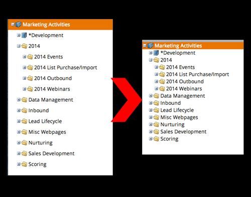
Like many of you, I'm "getting used to" the new Marketo layout. My biggest gripe is that there is low information density in the new design; we are used to seeing much more on the screen than we currently do.
If you would like your tree to look like this, then read on:
These instructions are for Google Chrome. There is probably a similar extension for Firefox as well. NOTE: Marketo may change their DOM at any time, so this could stop working...and could also have unintended results. Use with caution, and I accept no responsibility for any damage/issues/etc.
- Download the Stylebot extension for Google Chrome.
- When you log in to Marketo and are on the dashboard, click the Stylebot icon (see image here) and click "Open Stylebot"
- At the bottom of the window, click "Edit CSS" and then paste the following code:
.mkt-carbolt .x-tree-node .x-tree-node-el {
padding: 0;
}
And voila! This will remove the spacing between the tree items and let you get more info on your screen at once. If you want a little bit of space, try putting 1px or 2px instead of 0 in the code above.
Marketo, please make this an option and give us our ability to see our stuff back 🙂
And voila! This will remove the spacing between the tree items and let you get more info on your screen at once. If you want a little bit of space, try putting 1px or 2px instead of 0 in the code above.
Marketo, please make this an option and give us our ability to see our stuff back 🙂
8 REPLIES 8
Anonymous
Not applicable
10-06-2014
07:45 AM
- Mark as New
- Bookmark
- Subscribe
- Mute
- Subscribe to RSS Feed
- Permalink
- Report Inappropriate Content
10-06-2014
07:45 AM
Great, thank you so much for this!
- Mark as New
- Bookmark
- Subscribe
- Mute
- Subscribe to RSS Feed
- Permalink
- Report Inappropriate Content
08-13-2014
06:53 AM
OMG. My life is complete.
Anonymous
Not applicable
08-12-2014
09:04 PM
- Mark as New
- Bookmark
- Subscribe
- Mute
- Subscribe to RSS Feed
- Permalink
- Report Inappropriate Content
08-12-2014
09:04 PM
Hah, nice hack Jason! I just use Ctrl + "-" together to zoom out...
Anonymous
Not applicable
08-12-2014
09:03 AM
- Mark as New
- Bookmark
- Subscribe
- Mute
- Subscribe to RSS Feed
- Permalink
- Report Inappropriate Content
08-12-2014
09:03 AM
If they change their code, I'll try to keep this post updated with the latest fix...until they finally fix it 🙂
Anonymous
Not applicable
08-12-2014
08:17 AM
- Mark as New
- Bookmark
- Subscribe
- Mute
- Subscribe to RSS Feed
- Permalink
- Report Inappropriate Content
08-12-2014
08:17 AM
Thanks Jason! This leads me to believe that Marketo could also incorporate this into the settings as well...hopefully they will respond to my idea. :)
(Or fingers crossed they don't change anything to stop this fix from working.)
Anonymous
Not applicable
08-11-2014
03:03 PM
- Mark as New
- Bookmark
- Subscribe
- Mute
- Subscribe to RSS Feed
- Permalink
- Report Inappropriate Content
08-11-2014
03:03 PM
Use with caution...but I'm glad it worked for you 🙂
- Mark as New
- Bookmark
- Subscribe
- Mute
- Subscribe to RSS Feed
- Permalink
- Report Inappropriate Content
08-11-2014
02:47 PM
Thanks Jason! That worked for me!
Anonymous
Not applicable
08-11-2014
02:42 PM
- Mark as New
- Bookmark
- Subscribe
- Mute
- Subscribe to RSS Feed
- Permalink
- Report Inappropriate Content
08-11-2014
02:42 PM
For showing a little more text, use this code:
.mkt-carbolt .x-tree-node .x-tree-node-el {
padding: 0;
zoom: .8
}
- Copyright © 2025 Adobe. All rights reserved.
- Privacy
- Community Guidelines
- Terms of use
- Do not sell my personal information
Adchoices
