Visibility Rules Field Label Text is Over-Riding Field Label Rich Text
- Subscribe to RSS Feed
- Mark Topic as New
- Mark Topic as Read
- Float this Topic for Current User
- Bookmark
- Subscribe
- Printer Friendly Page
- Mark as New
- Bookmark
- Subscribe
- Mute
- Subscribe to RSS Feed
- Permalink
- Report Inappropriate Content
Hi all,
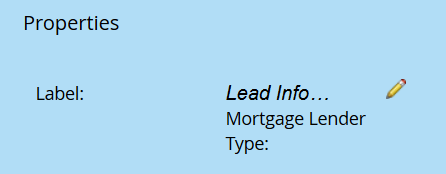
In the form editor, I'm noticing that for any field where Visibility Rules is enabled, the visibility rule's field label text will override the standard field label rich text.
Here is screenshot of standard field label text (clicking on pencil opens up the rich text editor):
This is what label is supposed to look like on form:
Below is screenshot of visibility rule with Field Label text highlighted in yellow (it overrides any styling made in standard field label above):
This is what the field label looks like on the approved form:
1.) Is there any way to work around this?
2.) Is there a way to add individual sub-headers to a form (without adding to the field labels themselves)?
Additional Question
3.) It seems that Visibility Rules option is only compatible with a single column form, since having more than one column seems to create obscure blank spaces between the fields that are always visible. Has anybody else experienced this?
Thanks,
Tom
Solved! Go to Solution.
- Labels:
-
Email Marketing
- Mark as New
- Bookmark
- Subscribe
- Mute
- Subscribe to RSS Feed
- Permalink
- Report Inappropriate Content
1.) Is there any way to work around this?
2.) Is there a way to add individual sub-headers to a form (without adding to the field labels themselves)?
Additional Question
3.) It seems that Visibility Rules option is only compatible with a single column form, since having more than one column seems to create obscure blank spaces between the fields that are always visible. Has anybody else experienced this?
1) Yes, but I wouldn't bother because
2) you can add Rich Text areas anywhere you want.
3) You can work around this with careful CSS.
- Copyright © 2025 Adobe. All rights reserved.
- Privacy
- Community Guidelines
- Terms of use
- Do not sell my personal information
Adchoices


