Re: Styling the dropdown field
- Subscribe to RSS Feed
- Mark Topic as New
- Mark Topic as Read
- Float this Topic for Current User
- Bookmark
- Subscribe
- Printer Friendly Page
- Mark as New
- Bookmark
- Subscribe
- Mute
- Subscribe to RSS Feed
- Permalink
- Report Inappropriate Content
Hello everyone,
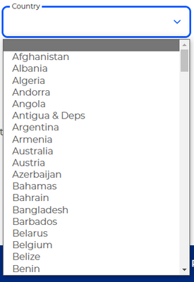
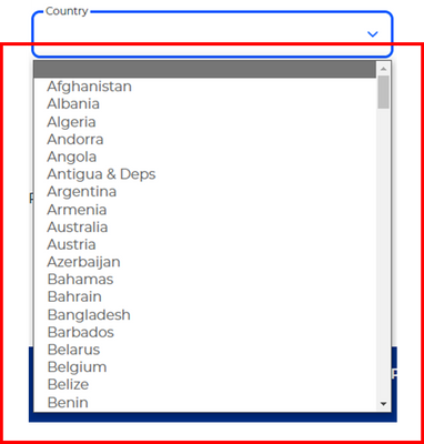
Our forms are being embedded on our page. Now we are wanting to change the style of the marketo dropdown field to follow out Brand design scheme. We have partially been successful, as we were able to change the field. The issue that we are facing right now is when the dropdown field is in an open state, the container around the <option> tags look different. We have tried many ways to change this, is there any suggestions how to tackle this issue?
Below are images viewed on a desktop and on Edge:
Solved! Go to Solution.
- Labels:
-
Embed Forms
- Mark as New
- Bookmark
- Subscribe
- Mute
- Subscribe to RSS Feed
- Permalink
- Report Inappropriate Content
Well, that isn’t an HTML <select>!
It’s a custom set of <div>s created from the HTML <select> (which is then hidden) using your site’s custom JS. So naturally it has a lot more styleability. Although it also doesn’t function exactly like a real Select (it lacks typeahead, for example).
- Mark as New
- Bookmark
- Subscribe
- Mute
- Subscribe to RSS Feed
- Permalink
- Report Inappropriate Content
it's not possible to manipulate the <select> tag fully, is there a system configuration that we can do in Adobe Marketo's Form settings to change that <select> tag to a <div> tag?
Certainly not! <div> elements aren’t form inputs, and Marketo uses real inputs, as all forms libraries should.
Other elements — leaving aside future form-associated custom elements, which aren’t supported in all browsers yet — aren’t part of the form.
Obviously you could inject a fake form element and link it to a hidden real input, which is how “enhanced“ form widgets work. You can’t replace the real input with a fake input.
- Mark as New
- Bookmark
- Subscribe
- Mute
- Subscribe to RSS Feed
- Permalink
- Report Inappropriate Content
Please link to your page so we can inspect your code. Can't troubleshoot a screenshot.
- Mark as New
- Bookmark
- Subscribe
- Mute
- Subscribe to RSS Feed
- Permalink
- Report Inappropriate Content
- Mark as New
- Bookmark
- Subscribe
- Mute
- Subscribe to RSS Feed
- Permalink
- Report Inappropriate Content
Not sure what you mean by "different"? Is it that the options go bottom-up? That's because of the height of the page, the browser chooses the best direction automatically.
The custom fieldset-style look of the <select> label vs. the <input type="text"> labels looks to be the same.

Or are you referring to the fact that your JS leaves the top option's inner text empty when it's open? Please be specific about the discrepancy.
- Mark as New
- Bookmark
- Subscribe
- Mute
- Subscribe to RSS Feed
- Permalink
- Report Inappropriate Content
Hey @SanfordWhiteman
Could you please crop the footer of the image you've posted? We don't want our brand noted there. Thank you.
- Mark as New
- Bookmark
- Subscribe
- Mute
- Subscribe to RSS Feed
- Permalink
- Report Inappropriate Content
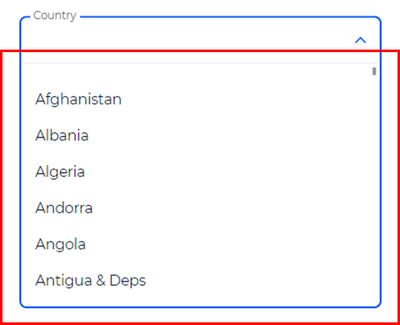
We want the dropdown field (open state) to look like this design scheme:
As you can see from the design scheme vs current, the container around the <option> tags in the design scheme is different. Is there a way to make the current dropdown field to look like our design scheme?
- Mark as New
- Bookmark
- Subscribe
- Mute
- Subscribe to RSS Feed
- Permalink
- Report Inappropriate Content
Where is the top screenshot from? Please link to the page where this is implemented.
- Mark as New
- Bookmark
- Subscribe
- Mute
- Subscribe to RSS Feed
- Permalink
- Report Inappropriate Content
- Mark as New
- Bookmark
- Subscribe
- Mute
- Subscribe to RSS Feed
- Permalink
- Report Inappropriate Content
Hi @FrizzyBrain
the thing is, that you use a nativ select field, which is quite good because it is supported by most of the browsers. The field you point on is a custom styled div field. Therefor it - most likely - uses custom JS.
What they do ist do hide the native select field. If you have a look using inspect you will see that it is "display:none" instead there seems to be a JS which adds an additional field with the styling you like.
The thing is - eventhough you can style the field and the dropdown you should take over the control over the position of the dropdown as - other wise - the border radius will sit on the wrong side. (dropdown shown on the top but dropdown shown above the field).
How this can be done is described here: https://www.w3schools.com/howto/tryit.asp?filename=tryhow_custom_select
Some hints about how to style a select field can be find here: https://moderncss.dev/custom-select-styles-with-pure-css/
Does this help?
BR Wolfram
- Mark as New
- Bookmark
- Subscribe
- Mute
- Subscribe to RSS Feed
- Permalink
- Report Inappropriate Content
Well, that isn’t an HTML <select>!
It’s a custom set of <div>s created from the HTML <select> (which is then hidden) using your site’s custom JS. So naturally it has a lot more styleability. Although it also doesn’t function exactly like a real Select (it lacks typeahead, for example).
- Mark as New
- Bookmark
- Subscribe
- Mute
- Subscribe to RSS Feed
- Permalink
- Report Inappropriate Content
Hey @SanfordWhiteman,
Yes, I know it's imitating a <select> dropdown field. It's using a <div> tag. What I want to know is, are we able to style a <select> tag like how they've styled the <div> tag? Is it possible? The issue we are facing is not being able to style the container around the <option> tags.
- Mark as New
- Bookmark
- Subscribe
- Mute
- Subscribe to RSS Feed
- Permalink
- Report Inappropriate Content
No, a real <select> cannot be made to look exactly like that fake <select>. Using the correct semantic element means you have more limited styling ability.
- Mark as New
- Bookmark
- Subscribe
- Mute
- Subscribe to RSS Feed
- Permalink
- Report Inappropriate Content
Hey @SanfordWhiteman, if it's not possible to manipulate the <select> tag fully, is there a system configuration that we can do in Adobe Marketo's Form settings to change that <select> tag to a <div> tag? No css/js manipulation required. Just a system configuration or Form configuration.
Thank you for your time.
- Mark as New
- Bookmark
- Subscribe
- Mute
- Subscribe to RSS Feed
- Permalink
- Report Inappropriate Content
it's not possible to manipulate the <select> tag fully, is there a system configuration that we can do in Adobe Marketo's Form settings to change that <select> tag to a <div> tag?
Certainly not! <div> elements aren’t form inputs, and Marketo uses real inputs, as all forms libraries should.
Other elements — leaving aside future form-associated custom elements, which aren’t supported in all browsers yet — aren’t part of the form.
Obviously you could inject a fake form element and link it to a hidden real input, which is how “enhanced“ form widgets work. You can’t replace the real input with a fake input.
- Copyright © 2025 Adobe. All rights reserved.
- Privacy
- Community Guidelines
- Terms of use
- Do not sell my personal information
Adchoices

