Re: Responsive fonts email rendering/Email DPI
- Subscribe to RSS Feed
- Mark Topic as New
- Mark Topic as Read
- Float this Topic for Current User
- Bookmark
- Subscribe
- Printer Friendly Page
- Mark as New
- Bookmark
- Subscribe
- Mute
- Subscribe to RSS Feed
- Permalink
- Report Inappropriate Content
Hello,
I have been working in Marketo for about 3 years now and I have recently discovered that the responsive emails I create are not rendering properly in some Apple iOS devices. I am essentially trying to make a font that is one size on desktop (12px) but when it gets to a mobile size I have it set to increase to 18px via media query. This seems to show correctly on some android devices when testing but on Apple iOS devices I get mixed results. After some thorough testing I was able to conclude that on some iOS devices the scale (DPI) seems to be different from device to device. So after I was able to conclude that it's likely not an issue with my code, meta etc; I tested the email through a different ESP/marketing software and all of the discrepancies between iOS devices were not apparent anymore. I sent a ticket to Marketo support with more or less proof that root of my issues start with Marketo, but they say it's NOT an issue with their product.
Has anyone else experienced these rendering issues when trying to change size of font per breakpoint/media query?
Thanks!
- Labels:
-
Email Marketing
- Mark as New
- Bookmark
- Subscribe
- Mute
- Subscribe to RSS Feed
- Permalink
- Report Inappropriate Content
I am testing something and need more time with this thread.
- Mark as New
- Bookmark
- Subscribe
- Mute
- Subscribe to RSS Feed
- Permalink
- Report Inappropriate Content
Hi Ryan,
Most of the IOS devices support the media queries.
Could you please provide the details of the IOS devices version in which you are facing these font issues?
Regards,
Akshay
- Mark as New
- Bookmark
- Subscribe
- Mute
- Subscribe to RSS Feed
- Permalink
- Report Inappropriate Content
Hi Ryan,
Unless you can reproduce a case where Marketo is altering your code, I would agree with the support team that it would not be a Marketo product issue. One thing to consider is that many email clients do not support media queries (and in some cases will yank them out entirely) before placing the email in the recipient's inbox. Much of the styling approach taken on the general web does not apply to emails and you really need an email specialist to construct a good template for you. Generally, best practice is to include media queries and CSS rules as well as complete inline styling of the HTML elements.
general tips
Responsive Email | Email Design Reference
client support matrix
Email Client CSS Support | Email Design Reference
These aren't perfectly accurate but it should show you there is tons of variance between clients regarding how they handle styling. Outlook specifically is extremely difficult to handle (especially older versions).
Justin
- Mark as New
- Bookmark
- Subscribe
- Mute
- Subscribe to RSS Feed
- Permalink
- Report Inappropriate Content
Hi Justin,
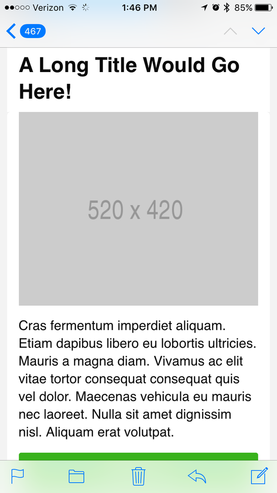
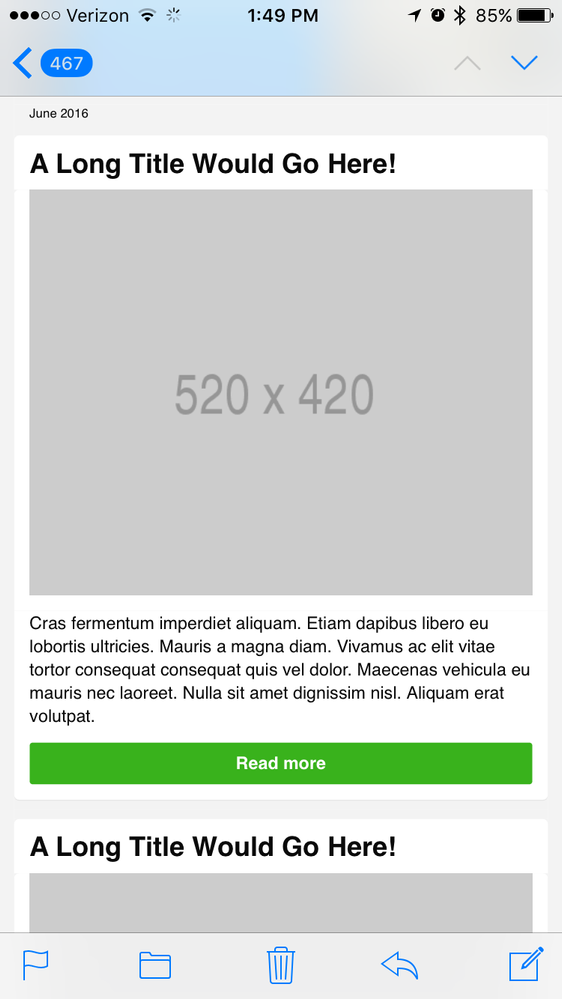
Thank you for the reply. I actually am an email specialist and use some advanced technology to create our responsive email templates. So let me back up. Attached are two screen shots; They are both being viewed on iPhone 6 Apple mail; One is sent through marketo (labeled) and one is sent through Bronto (labeled). As you can see the font size rendering is different. The way it is being shown in the Bronto screen shot is the way I expect it to be displayed. Furthermore I tested a Marketo provided responsive email template in which we experienced the same behavior. Could you please advise me on steps to take to solve this? I would also like to point out that myself and team did very extensive troubleshooting and testing on my code and other factors that could point me to the issue at hand so we could determine that it wasn't some mistake on our end.
- Mark as New
- Bookmark
- Subscribe
- Mute
- Subscribe to RSS Feed
- Permalink
- Report Inappropriate Content
I assume we both agree that the only thing that controls the look-and-feel is the code, correct? There's nothing specific about Marketo vs. Bronto as a product. It's just what raw code is coming out the pipe. So, the best way to troubleshoot is to take your full email code in Marketo before you send it (click "Edit Code" at the top) and throw it in a text editor. Then take the raw code you received in your test email and do a diff in the text editor. Tell me what changed and then we can assist you.
Without seeing a specific example of what code is changing it's hard to help.
Justin
- Mark as New
- Bookmark
- Subscribe
- Mute
- Subscribe to RSS Feed
- Permalink
- Report Inappropriate Content
Justin, I am unsure as how to view code via Apple mail on iPhone. Do you know of a way to do this?
- Mark as New
- Bookmark
- Subscribe
- Mute
- Subscribe to RSS Feed
- Permalink
- Report Inappropriate Content
You don't need to view the HTML on the device. The same raw HTML source will be available in a desktop client.
- Copyright © 2025 Adobe. All rights reserved.
- Privacy
- Community Guidelines
- Terms of use
- Do not sell my personal information
Adchoices

