Problem with making forms & form button responsive
- Subscribe to RSS Feed
- Mark Topic as New
- Mark Topic as Read
- Float this Topic for Current User
- Bookmark
- Subscribe
- Printer Friendly Page
- Mark as New
- Bookmark
- Subscribe
- Mute
- Subscribe to RSS Feed
- Permalink
- Report Inappropriate Content
Hi all,
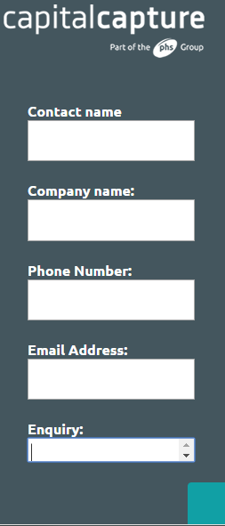
Would really appreciate some advice on this, I have uploaded a bootstap landing page to Marketo, and embedded a Marketo form within it.
I am having two problems,
1) I am struggling to make the Enquiry text area longer on mobile devices
2) I cant get the button to line up centrally on a mobile device
Here is a link to the landing page:
resources.phs.co.uk/medical-record-storage.html
Any suggestions?
Thanks
David
- Mark as New
- Bookmark
- Subscribe
- Mute
- Subscribe to RSS Feed
- Permalink
- Report Inappropriate Content
Answer 1
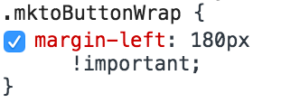
In your code you have
.mktoButtonWrap { margin-left: 180px !important; }
That's what's pushing the button to the right, change to
.mktoButtonWrap { margin-left: 0 !important; }
Hopefully you can tweak it from there.
Answer 2
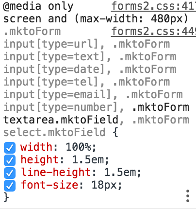
In your code you have
@media only screen and (max-width: 480px) .mktoForm input[type=url], .mktoForm input[type=text], .mktoForm input[type=date], .mktoForm input[type=tel], .mktoForm input[type=email], .mktoForm input[type=number], .mktoForm textarea.mktoField, .mktoForm select.mktoField { width: 100%; height: 1.5em; line-height: 1.5em; font-size: 18px; }
height: 1.5em; is blocking the height, maybe change to height: auto;
- Copyright © 2025 Adobe. All rights reserved.
- Privacy
- Community Guidelines
- Terms of use
- Do not sell my personal information
Adchoices


