Mobile Form Styling Issues
- Subscribe to RSS Feed
- Mark Topic as New
- Mark Topic as Read
- Float this Topic for Current User
- Bookmark
- Subscribe
- Printer Friendly Page
- Mark as New
- Bookmark
- Subscribe
- Mute
- Subscribe to RSS Feed
- Permalink
- Report Inappropriate Content
Hi there,
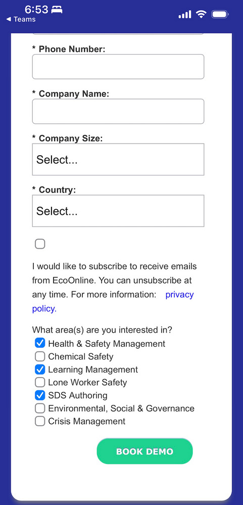
I seem to be having issues with a couple of elements in the mobile styling of my form. For some reason, the 'consent' checkbox moves above the text on mobile and I can't seem to centre the button on mobile. Here is a screenshot of what I'm viewing. Any tips would be appreciated
Solved! Go to Solution.
- Mark as New
- Bookmark
- Subscribe
- Mute
- Subscribe to RSS Feed
- Permalink
- Report Inappropriate Content
- When you use a Rich Text instead of an actual label (as you’re doing with the iConsent field) that creates a 2-column layout which is purposely wrapped to 1-col on mobile. You should use the actual label feature, not a separate RT field that kind of looks like a label.
- For the button, you need to re-blockify the row on mobile and center the wrapper:
@media only screen and (max-width: 480px) {
  .mktoForm .mktoButtonRow {
    display: block;
    text-align: center;
  }
}
- Mark as New
- Bookmark
- Subscribe
- Mute
- Subscribe to RSS Feed
- Permalink
- Report Inappropriate Content
Try using the "checkboxes" field type instead of the "checkbox" field type. The difference between the two is that the "checkboxes" field type has a "Display Value" (text to the right of the input) AND a label (text above/left of the input, depending on the form settings for Label Position).
If you change the field from checkbox to checkboxes, you can move the "Label" text into the "Values" section under "Display Value" and it'll show up to the right of the checkbox rather than above/left of the input.
Additional Info: https://nation.marketo.com/t5/product-blogs/form-styling-how-to-position-checkbox-labels-to-the-righ...
Otherwise you can use CSS to move the label for the checkbox field to the right of the input but it's not a very durable solution compared to using the native "checkboxes" field type.
Alternately, you could also wrap the RT and checkbox input in a field wrap and use some CSS to target the fields inside of a fieldwrap to display the way you'd like them to on desktop/mobile, but this would probably be my last resort compared to the other two approaches.
- Mark as New
- Bookmark
- Subscribe
- Mute
- Subscribe to RSS Feed
- Permalink
- Report Inappropriate Content
- Mark as New
- Bookmark
- Subscribe
- Mute
- Subscribe to RSS Feed
- Permalink
- Report Inappropriate Content
- Mark as New
- Bookmark
- Subscribe
- Mute
- Subscribe to RSS Feed
- Permalink
- Report Inappropriate Content
- Mark as New
- Bookmark
- Subscribe
- Mute
- Subscribe to RSS Feed
- Permalink
- Report Inappropriate Content
- When you use a Rich Text instead of an actual label (as you’re doing with the iConsent field) that creates a 2-column layout which is purposely wrapped to 1-col on mobile. You should use the actual label feature, not a separate RT field that kind of looks like a label.
- For the button, you need to re-blockify the row on mobile and center the wrapper:
@media only screen and (max-width: 480px) {
  .mktoForm .mktoButtonRow {
    display: block;
    text-align: center;
  }
}
- Mark as New
- Bookmark
- Subscribe
- Mute
- Subscribe to RSS Feed
- Permalink
- Report Inappropriate Content
Hey @SanfordWhiteman thanks for looking in to this. I think the reason why the Demand Gen manager built the form using RT rather than a label is because using a label made the checkbox appear above the text on desktop and mobile, so we're kind of between a rock and a hard place.
- Mark as New
- Bookmark
- Subscribe
- Mute
- Subscribe to RSS Feed
- Permalink
- Report Inappropriate Content
Try using the "checkboxes" field type instead of the "checkbox" field type. The difference between the two is that the "checkboxes" field type has a "Display Value" (text to the right of the input) AND a label (text above/left of the input, depending on the form settings for Label Position).
If you change the field from checkbox to checkboxes, you can move the "Label" text into the "Values" section under "Display Value" and it'll show up to the right of the checkbox rather than above/left of the input.
Additional Info: https://nation.marketo.com/t5/product-blogs/form-styling-how-to-position-checkbox-labels-to-the-righ...
Otherwise you can use CSS to move the label for the checkbox field to the right of the input but it's not a very durable solution compared to using the native "checkboxes" field type.
Alternately, you could also wrap the RT and checkbox input in a field wrap and use some CSS to target the fields inside of a fieldwrap to display the way you'd like them to on desktop/mobile, but this would probably be my last resort compared to the other two approaches.
- Copyright © 2025 Adobe. All rights reserved.
- Privacy
- Community Guidelines
- Terms of use
- Do not sell my personal information
Adchoices
