Re: Marketo Landing Page
- Subscribe to RSS Feed
- Mark Topic as New
- Mark Topic as Read
- Float this Topic for Current User
- Bookmark
- Subscribe
- Printer Friendly Page
- Mark as New
- Bookmark
- Subscribe
- Mute
- Subscribe to RSS Feed
- Permalink
- Report Inappropriate Content
Hello Marketo Team,
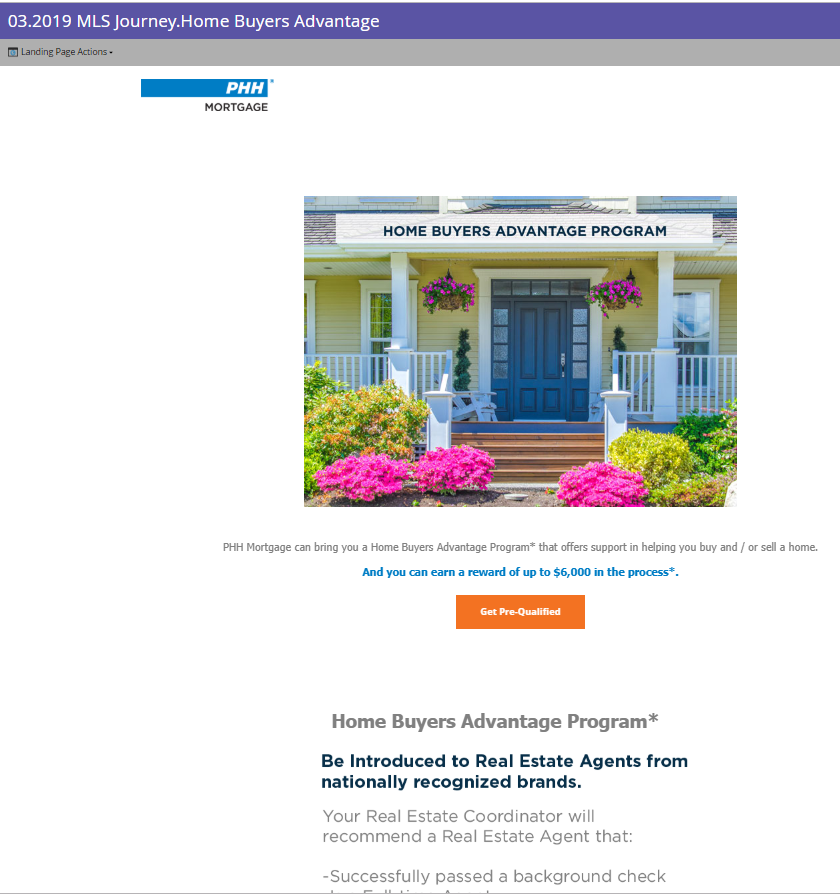
I need to remove this white space in between "logo" and the header image / banner image.
DO you need HTML code pasted here? Which part of the code will you need?
Thanks,
Solved! Go to Solution.
- Mark as New
- Bookmark
- Subscribe
- Mute
- Subscribe to RSS Feed
- Permalink
- Report Inappropriate Content
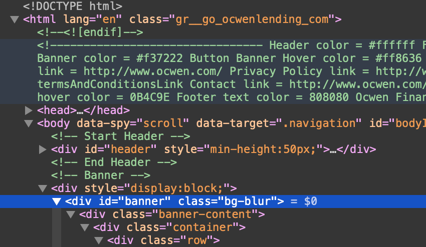
You need to add it to the <div> highlighted in blue. Line 289.
Consultant | Etumos
- Mark as New
- Bookmark
- Subscribe
- Mute
- Subscribe to RSS Feed
- Permalink
- Report Inappropriate Content
The link you provided is now redirecting to your homepage. Can you reapprove the landing page?
Consultant | Etumos
- Mark as New
- Bookmark
- Subscribe
- Mute
- Subscribe to RSS Feed
- Permalink
- Report Inappropriate Content
Sure, approved now...
go.ocwenlending.com/MLS.html
- Mark as New
- Bookmark
- Subscribe
- Mute
- Subscribe to RSS Feed
- Permalink
- Report Inappropriate Content
You need to add it to the <div> highlighted in blue. Line 289.
Consultant | Etumos
- Mark as New
- Bookmark
- Subscribe
- Mute
- Subscribe to RSS Feed
- Permalink
- Report Inappropriate Content
As soon as I changed the HTML code ...and had added this...style="padding-bottom: 20px;" ..>
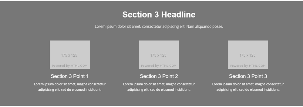
The layout of this section was horizontal and all three sections were like this:
but it changed to this.
- Mark as New
- Bookmark
- Subscribe
- Mute
- Subscribe to RSS Feed
- Permalink
- Report Inappropriate Content
The reason those 3 sections are stacking is because you have a typo where you are referencing the bootstrap.css file.
The file referenced here should be "bootstrap.css". You currently are referencing "bootstrap]". See the end of the href in the blue highlighted section.
Consultant | Etumos
- Mark as New
- Bookmark
- Subscribe
- Mute
- Subscribe to RSS Feed
- Permalink
- Report Inappropriate Content
Corey you are amazing!!!!!!! I liked how to helped me each step!!!
- Mark as New
- Bookmark
- Subscribe
- Mute
- Subscribe to RSS Feed
- Permalink
- Report Inappropriate Content
Happy to help!
Consultant | Etumos
- Mark as New
- Bookmark
- Subscribe
- Mute
- Subscribe to RSS Feed
- Permalink
- Report Inappropriate Content
I'm not seeing that you added style="padding-bottom:20px;" to the <div> with id=banner. Can you reapprove the landing page? Adding the style to the correct <div> should not have affected the section you have a screenshot of above.
Consultant | Etumos
- Mark as New
- Bookmark
- Subscribe
- Mute
- Subscribe to RSS Feed
- Permalink
- Report Inappropriate Content
Nope I can't find any padding... in this landing page / or the guided landing page...Can you see the page now.
Not urgent but would need to fix this by tomorrow.
go.ocwenlending.com/MLS.html /external-link.jspa?url=http%3A%2F%2Fgo.ocwenlending.com%2FMLS.html
Thanks,
- Mark as New
- Bookmark
- Subscribe
- Mute
- Subscribe to RSS Feed
- Permalink
- Report Inappropriate Content
Hi Corey, this is the link only.
I don’t know why layout looks weird…
https://app-sj24.marketo.com/lpeditor/devicePreview?p=1263&t=gVi9IrWRf8w,&m=238-LUA-748
- Mark as New
- Bookmark
- Subscribe
- Mute
- Subscribe to RSS Feed
- Permalink
- Report Inappropriate Content
Without having a link to the page you screenshot above (with the purple Banner Section), I can't tell for sure what is causing the space below the button. However, it looks like you may have some padding on the Banner Section, so reducing the padding should reduce the white space.
Consultant | Etumos
- Mark as New
- Bookmark
- Subscribe
- Mute
- Subscribe to RSS Feed
- Permalink
- Report Inappropriate Content
This landing page has sections....so this is between the
Banner
Button
and then section 2 starts....
So i don't know why there is so much space?
- Mark as New
- Bookmark
- Subscribe
- Mute
- Subscribe to RSS Feed
- Permalink
- Report Inappropriate Content
Can you send a link to the actual page you are looking at? The page you sent earlier looks slightly different than the screenshots you are providing.
Consultant | Etumos
- Mark as New
- Bookmark
- Subscribe
- Mute
- Subscribe to RSS Feed
- Permalink
- Report Inappropriate Content
DO you need HTML code pasted here? Which part of the code will you need?
Just post a link to the landing page
- Mark as New
- Bookmark
- Subscribe
- Mute
- Subscribe to RSS Feed
- Permalink
- Report Inappropriate Content
Jay Jiang here is the link to the landing page:
PAGE
- Mark as New
- Bookmark
- Subscribe
- Mute
- Subscribe to RSS Feed
- Permalink
- Report Inappropriate Content
You should ask your web dev for help.
- Copyright © 2025 Adobe. All rights reserved.
- Privacy
- Community Guidelines
- Terms of use
- Do not sell my personal information
Adchoices


