Re: Marketo form for Wistia
- Subscribe to RSS Feed
- Mark Topic as New
- Mark Topic as Read
- Float this Topic for Current User
- Bookmark
- Subscribe
- Printer Friendly Page
- Mark as New
- Bookmark
- Subscribe
- Mute
- Subscribe to RSS Feed
- Permalink
- Report Inappropriate Content
Hello, all of our marketo forms do not look that nice when selected for a wistia video. Does anyone have some simple CSS to make forms look nice inside a wistia video? Or how do you get them to look nice and clean without the scroll bars etc? I reached out to wistia too but just curious if anyone has already done this?
- Labels:
-
Integrations
- Mark as New
- Bookmark
- Subscribe
- Mute
- Subscribe to RSS Feed
- Permalink
- Report Inappropriate Content
Hey Nick-
This one was new to me (Wistia forms), thanks for bringing it to the community it was a good challenge. I dug in a little on the links you shared and noticed that Wistia is adding some styles that look like they're intended to be a reset but are causing some issues with the display of some elements in your Marketo form. Also, I noticed that writing the CSS in the inspector required me to prefix the normal Marketo form classes with the ".wistiaMarketoFormWrapper" class [*note: check out line 41 in the CSS at the bottom to see this in play w/ the Marketo form styles].
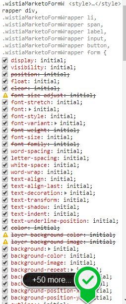
Here's a look at the Wistia styles (note they target divs [row, column, fieldwrap], spans [button wrap], input, button and form... so basically most of the elements in your form are getting set to 'initial'. Im sure in some context this is helpful, but it also means that styles written "normally" for Marketo aren't landing in the render (i.e. .mktoForm input[type=text] {background-color:red; })
so, let's get to work around all that noise:
Step One: prefix stuff w/ the Wistia parent container's class, then do your "normal" Marketo CSS.
If we were building on the previous example, we'd add the bolded part below:
.wistiaMarketoFormWrapper .mktoForm input[type=text] {background-color:red; }
Step Two: Setup a fieldset to create a 2-column layout for "some, but not all fields"
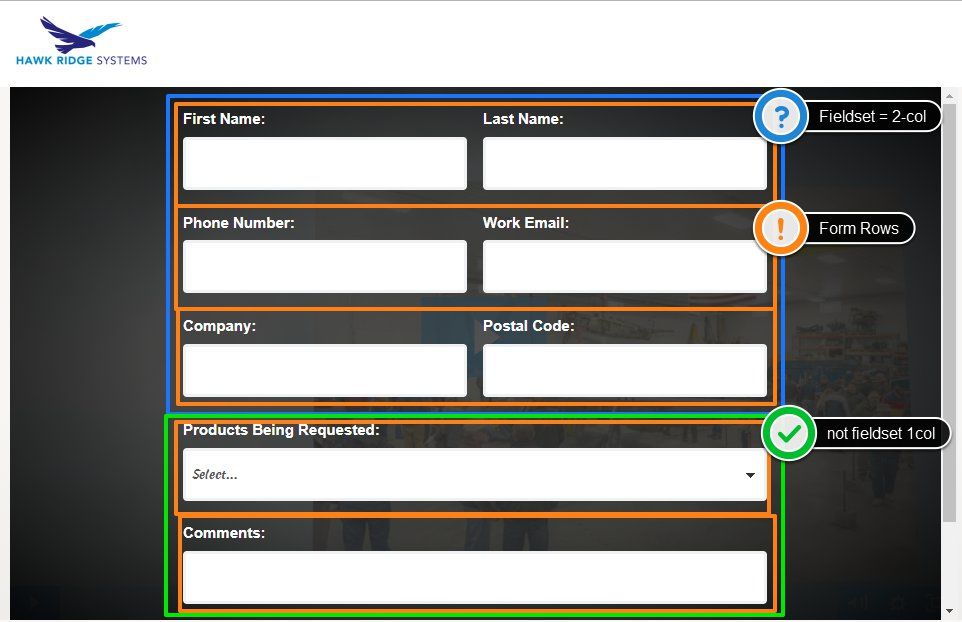
I had a look at the form on your website and noticed that you've got a combo of 1-column and 2-column form fields. I've setup some styles that would work to accomplish this, but they'll require you to put the first 6 inputs into 3 rows (2x3) and all of them inside a fieldset element. In the form editor, you can create a new fieldset (like adding rich text), then drag your inputs into the fieldset. You'll want to make sure to drag First Name and Last Name into the same row (next to each other) - same goes for the other 2 pairs. The reason you'll be adding them into a fieldset is so that we can delineate the column sizes between 100% and 50% based on them being (or not being) inside a fieldset element. With this setup, anything you place into a fieldset will end up 2-column, so be aware of that if you change the form in the future. The last two rows (Products Being Requested and Coments:) are not inside a fieldset so they'll retain the 100% width. Here's what that looks like with a little color to highlight the different pieces.
Here's the CSS I wrote in the inspector, I'm thinking you could copy paste this to the end of the Custom CSS in your Form and it might snap in place. There are some styles at the top to modify the Wistia container as well (make it a bit wider and switch the box-sizing so stuff doesn't clip)
/* override box-sizing */
#wistia_grid_48_wrapper * {
box-sizing:border-box !important;
}
/* expand Wistia form box 50% > 80% */
.wistiaMarketoFormWrapper {
width:80%;
}
/* make 2-column rows inside a FIELDSET */
.mktoFormCol {
max-width:50% !important;
}
/* override mkto fieldset CSS (zero spacing)*/
fieldset {
padding:0px !important;
margin:0px !important;
border:0px !important;
}
/* hide fieldset label */
fieldset legend {
display:none !important;
}
/* style labels */
.wistiaMarketoFormWrapper .mktoForm label.mktoLabel {
color: #ffffff !important;
display: block;
font-weight: 700 !important;
margin: 0 0 5px;
font-size: 15px;
line-height: 20px;
font-family: 'Montserrat', Helvetica, Arial, sans-serif !important;
padding-top: 0 !important;
width: 100% !important;
}
/* style inputs */
.wistiaMarketoFormWrapper .mktoForm input[type=url],
.wistiaMarketoFormWrapper .mktoForm input[type=text],
.wistiaMarketoFormWrapper .mktoForm input[type=date],
.wistiaMarketoFormWrapper .mktoForm input[type=tel],
.wistiaMarketoFormWrapper .mktoForm input[type=email],
.wistiaMarketoFormWrapper .mktoForm input[type=number],
.wistiaMarketoFormWrapper .mktoForm textarea.mktoField,
.wistiaMarketoFormWrapper .mktoForm select.mktoField {
background: #ffffff;
border: 0.2rem solid #f0f1f2;
color: #555555 !important;
font-family: 'Hind', Helvetica, Arial, sans-serif;
display: block;
font-size: 15px;
height: 53px !important;
line-height: 20px !important;
outline: none;
padding: 4px 6px !important;
border-radius: 4px;
box-shadow: none;
transition: border linear 0.2s, box-shadow linear 0.2s;
-webkit-appearance: none;
display: inline-block;
width: 100% !important;
}
/* center button */
.wistiaMarketoFormWrapper .mktoForm .mktoButtonWrap .mktoButton {
float:none !important;
}
Plug that in and let me know if you get the same results?
- Mark as New
- Bookmark
- Subscribe
- Mute
- Subscribe to RSS Feed
- Permalink
- Report Inappropriate Content
Need help to update the CSS for the form in Wistia here - fast.wistia.net/embed/channel/qcz7i7rnt6
I tried the CSS shared here but it is not working. I'm not so versed with CSS 😞
1. I would like to set up the fieldset to create a 2-column layout
2. The the checkboxes to appear in line with the text
- Mark as New
- Bookmark
- Subscribe
- Mute
- Subscribe to RSS Feed
- Permalink
- Report Inappropriate Content
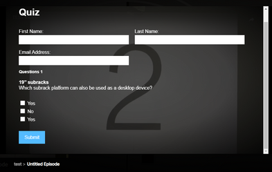
I've put together a snippet of code below that you can paste into the bottom of the "Custom CSS" on your form in Marketo. There's a screenshot of what Im seeing in the desktop view when I put these styles into play in the inspector. Please let me know if you run into any issue with the display - Im pretty sure this CSS will stick once it's actually on the page but testing it out on the form is the only way to be sure.
Here's a look at what Im seeing on my end:

... and here's the CSS you could add into the CUSTOM CSS on the form itself.
.wistiaMarketoFormWrapper {
    margin: 0px auto 0px auto;
    margin-bottom: 25px;
    width: 90%;
    min-width: 180px;
    max-width: 90% !important;
    overflow:hidden;
}

.wistiaMarketoFormWrapper .mktoForm .mktoFormCol {
    width:100% !important;
}

/* fieldset nested elements */
@media screen and (min-width:480px) {
    .wistiaMarketoFormWrapper .mktoForm fieldset .mktoFormCol {
        max-width:50%;
        padding:0 10px;
        box-sizing:border-box !important;
    }

    .wistiaMarketoFormWrapper .mktoForm fieldset {
        padding:0px !important;
         border:none !important;
         margin:0 -10px !important;
    }
}

.wistiaMarketoFormWrapper .mktoForm .mktoHtmlText.mktoHasWidth {
    width: 100% !important;
    display: block !important;
}

.wistiaMarketoFormWrapper .mktoForm .mktoFieldWrap {
    width:100% !important;
    display: block !important;
}
.wistiaMarketoFormWrapper .mktoForm .mktoCheckboxList {
    width:100% !important;
    display: block !important;
}

.wistiaMarketoFormWrapper .mktoForm input[type=checkbox]{
    float: left !important;
    width: 1em !important;
    height: 1em !important;
}

.wistiaMarketoFormWrapper .mktoForm .mktoCheckboxList label {
    display:block !important;
    float:none !important;
    margin-top: 0px;
    margin-bottom: 8px;
}
To put this into play, you'll want to open your form in Marketo, go to pg. 2 (click 2 in left column) and click the little purple gear in the top right. This'll display two options, choose the "Edit Custom CSS" option and it should show you a dialog box w/ the top line being "/* Add your custom CSS below */" -- it looks like you've got a few lines of CSS in there already, maybe add this below the existing stuff.
After that you'll want to approve the form and then wait up to five minutes for this update to come thru on the site (since the form is embeded).
Let me know if this works for you or if there's anything else I can help iron out.
Thanks,
Dave
- Mark as New
- Bookmark
- Subscribe
- Mute
- Subscribe to RSS Feed
- Permalink
- Report Inappropriate Content
@Dave_Roberts Thank you so much for a quick reply and the solution.
The code works and I was able to tweak it for an extended use case.
- Mark as New
- Bookmark
- Subscribe
- Mute
- Subscribe to RSS Feed
- Permalink
- Report Inappropriate Content
Thanks for tagging me on this, I'll have a look at this and see what I can do to help out here.
- Mark as New
- Bookmark
- Subscribe
- Mute
- Subscribe to RSS Feed
- Permalink
- Report Inappropriate Content
Or does everyone just use the wistia turnstyle form and just put them on a list in marketo and do actions that way?
- Mark as New
- Bookmark
- Subscribe
- Mute
- Subscribe to RSS Feed
- Permalink
- Report Inappropriate Content
I don't like Turnstile b/c it only lets me collect First + Last + Email as fields.
I tried using the Marketo form feature, but it looks like it only passes the lead info in via API, but doesn't pass in the viewing activity at all. Have you encountered this at all?
- Mark as New
- Bookmark
- Subscribe
- Mute
- Subscribe to RSS Feed
- Permalink
- Report Inappropriate Content
Hi Sam,
Marketo forms should collect and record all viewing activity as well and the native integration works out of the box. However, one of the reasons for missing data can be the missing E-v1 script. See this page for more info: https://wistia.com/support/integrations/marketo#marketo-integration-troubleshooting
Hope it helps.
Best;m
- Mark as New
- Bookmark
- Subscribe
- Mute
- Subscribe to RSS Feed
- Permalink
- Report Inappropriate Content
So, is there any info on how to properly set up marketo forms for wistia? I found all of the instruction on how to set up the conector and etc. but nothing on how to make the forms look nice and work within wistia
- Mark as New
- Bookmark
- Subscribe
- Mute
- Subscribe to RSS Feed
- Permalink
- Report Inappropriate Content
There's no single rule. Wistia isn't actually doing anything special, they're just constraining your form to the video dimensions. So you have to build your form to look nice and flex within the video element.
- Mark as New
- Bookmark
- Subscribe
- Mute
- Subscribe to RSS Feed
- Permalink
- Report Inappropriate Content
Ok, thanks. Are you not able to do progressive profilling or prefill inside wistia videos?
- Mark as New
- Bookmark
- Subscribe
- Mute
- Subscribe to RSS Feed
- Permalink
- Report Inappropriate Content
Pre-Fill doesn't work on a non-Marketo page (regardless of within Wistia or not) but other than that the features should be the same as a regular form.
- Mark as New
- Bookmark
- Subscribe
- Mute
- Subscribe to RSS Feed
- Permalink
- Report Inappropriate Content
Hi Nick, I can help you if you can share the page url where it's being used.
Sant Singh Rathaur
- Mark as New
- Bookmark
- Subscribe
- Mute
- Subscribe to RSS Feed
- Permalink
- Report Inappropriate Content
Cool, thanks. Here is one example: Validate your designs with SIMULIA Abaqus for real-world environment
This is what they normally look like not in wistia: Contact SOLIDWORKS, CAMWorks & 3D Printing Leader
- Mark as New
- Bookmark
- Subscribe
- Mute
- Subscribe to RSS Feed
- Permalink
- Report Inappropriate Content
Hi Nick Weirens, When I tried opening this page It returns with http 502 error.
Sant Singh Rathaur
- Mark as New
- Bookmark
- Subscribe
- Mute
- Subscribe to RSS Feed
- Permalink
- Report Inappropriate Content
Hello Sant, sorry, we had some major server issues. Everything is now fixed. Here is an example: AirCorps Slideshow Video - hawkridgesys
This is what they normally look like not in wistia: Contact SOLIDWORKS, CAMWorks & 3D Printing Leader
- Mark as New
- Bookmark
- Subscribe
- Mute
- Subscribe to RSS Feed
- Permalink
- Report Inappropriate Content
Do you have examples? URLs?
Best to ask someone on your web team.
- Copyright © 2025 Adobe. All rights reserved.
- Privacy
- Community Guidelines
- Terms of use
- Do not sell my personal information
Adchoices

