Your Achievements
Next /
Sign inSign in to Community to gain points, level up, and earn exciting badges like the new Applaud 5 BadgeLearn more!
View All BadgesSign in to view all badges
SOLVED
Re: Landing Page Editor Problems
Go to solution
Topic Options
- Subscribe to RSS Feed
- Mark Topic as New
- Mark Topic as Read
- Float this Topic for Current User
- Bookmark
- Subscribe
- Printer Friendly Page
Anonymous
Not applicable
07-04-2013
01:43 PM
- Mark as New
- Bookmark
- Subscribe
- Mute
- Subscribe to RSS Feed
- Permalink
- Report Inappropriate Content
07-04-2013
01:43 PM
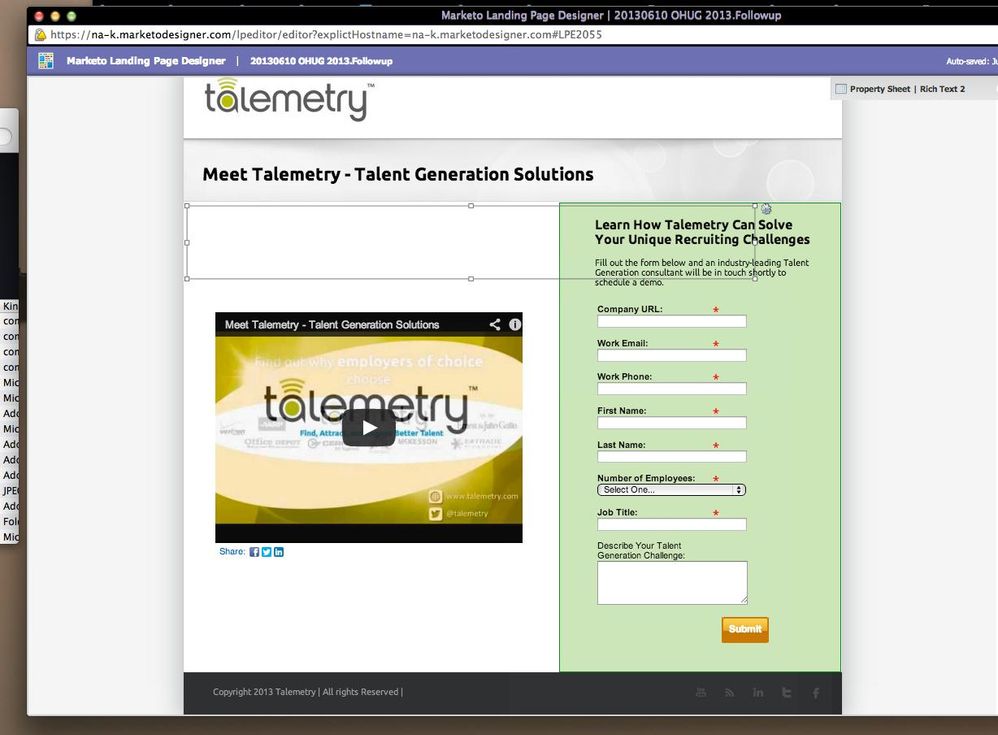
Recently I've noticed that when you're adding elements to a landing page, the grey boxes that are supposed to enclose the element are way off, making it a bit challenging to edit the size/location of elements.
The picture below shows what I'm referring to. The element selected is the "Meet Talemetry - Talent Generation Solutions" rich text element, but the position box is way below where the actual text is.
Is anyone else experiencing this issue? Will it impact how the page renders on different browsers?
Thanks!

Solved! Go to Solution.
Labels:
- Labels:
-
Lead Management
1 ACCEPTED SOLUTION
- Mark as New
- Bookmark
- Subscribe
- Mute
- Subscribe to RSS Feed
- Permalink
- Report Inappropriate Content
07-04-2013
08:27 PM
Hi Amanda,
I haven't had the same problem.
Out of curiosity, have you tried doing this in a different browser?
Warm regards,
Nora
I haven't had the same problem.
Out of curiosity, have you tried doing this in a different browser?
Warm regards,
Nora
3 REPLIES 3
Anonymous
Not applicable
07-08-2013
10:19 AM
- Mark as New
- Bookmark
- Subscribe
- Mute
- Subscribe to RSS Feed
- Permalink
- Report Inappropriate Content
07-08-2013
10:19 AM
Thank you both for your responses. I tried the editor in Safari and it's working fine.
Would be nice if it worked in Chrome too but at least I can finish my page now!!
cheers,
Amanda
Would be nice if it worked in Chrome too but at least I can finish my page now!!
cheers,
Amanda
- Mark as New
- Bookmark
- Subscribe
- Mute
- Subscribe to RSS Feed
- Permalink
- Report Inappropriate Content
07-05-2013
01:13 PM
Hi Amanda,
The landing page editor tries to render the page as close to the published landing page as possible. There are advanced use-cases that use Javascript and CSS that cause it to break as you described.
In your case I do not see any such code that could be causing it. Could you tell us which browser you are using.
regards,
DJ
- Mark as New
- Bookmark
- Subscribe
- Mute
- Subscribe to RSS Feed
- Permalink
- Report Inappropriate Content
07-04-2013
08:27 PM
Hi Amanda,
I haven't had the same problem.
Out of curiosity, have you tried doing this in a different browser?
Warm regards,
Nora
I haven't had the same problem.
Out of curiosity, have you tried doing this in a different browser?
Warm regards,
Nora
- Copyright © 2025 Adobe. All rights reserved.
- Privacy
- Community Guidelines
- Terms of use
- Do not sell my personal information
Adchoices