Re: Label not aligned with checkbox 2.0 form
- Subscribe to RSS Feed
- Mark Topic as New
- Mark Topic as Read
- Float this Topic for Current User
- Bookmark
- Subscribe
- Printer Friendly Page
- Mark as New
- Bookmark
- Subscribe
- Mute
- Subscribe to RSS Feed
- Permalink
- Report Inappropriate Content
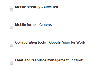
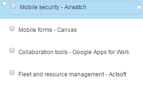
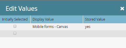
I am using the Marketo 5A guided landing page with a form in the footer section. I have no custom CSS associated with the form. I want to understand why the check boxes are not aligned with the display label. I looked at the CSS in the landing page code, but I don't see what is causing the issue. Can I put some custom CSS in the form to correct this? The form does not behave this way when I use a different LP template. The field type is "Check boxes" and I'm using the display value associated with the checkbox.
Solved! Go to Solution.
- Mark as New
- Bookmark
- Subscribe
- Mute
- Subscribe to RSS Feed
- Permalink
- Report Inappropriate Content
You're overriding min-height for <INPUT> in a local stylesheet (see the selector #f input).
You can undo this for checkboxes:
#f input[type="checkbox"] {
min-height: 0;
}
But I suspect whoever put this together wasn't thinking about checkboxes as <INPUT> elements, so there will likely be other things to overcome.
- Mark as New
- Bookmark
- Subscribe
- Mute
- Subscribe to RSS Feed
- Permalink
- Report Inappropriate Content
You need to provide a link to a URL and the browser version + OS in which you are seeing this problem. We can't troubleshoot screenshots!
- Mark as New
- Bookmark
- Subscribe
- Mute
- Subscribe to RSS Feed
- Permalink
- Report Inappropriate Content
landing page: Login | Marketo and
form Login | Marketo.
I am seeing this in Firefox 47.0.1, Chrome 51.0.2704.106 and IE11.
- Mark as New
- Bookmark
- Subscribe
- Mute
- Subscribe to RSS Feed
- Permalink
- Report Inappropriate Content
Those are private URLs in your instance. Need something I can access.
- Mark as New
- Bookmark
- Subscribe
- Mute
- Subscribe to RSS Feed
- Permalink
- Report Inappropriate Content
Ok. We did publish the page this morning.
https://BusinessSolutions.sprint.com/Healthcare-Webinars.html
- Mark as New
- Bookmark
- Subscribe
- Mute
- Subscribe to RSS Feed
- Permalink
- Report Inappropriate Content
You're overriding min-height for <INPUT> in a local stylesheet (see the selector #f input).
You can undo this for checkboxes:
#f input[type="checkbox"] {
min-height: 0;
}
But I suspect whoever put this together wasn't thinking about checkboxes as <INPUT> elements, so there will likely be other things to overcome.
- Mark as New
- Bookmark
- Subscribe
- Mute
- Subscribe to RSS Feed
- Permalink
- Report Inappropriate Content
Thank you so much. This is a Marketo guided landing page that I downloaded into our instance. We placed our analytics and brand fonts on it but that is the only change made.
- Mark as New
- Bookmark
- Subscribe
- Mute
- Subscribe to RSS Feed
- Permalink
- Report Inappropriate Content
The "whoever" might not be you but the point stands. ![]() That block of CSS is too general IMO. <INPUT>s like radios and checkboxes typically need more delicate care.
That block of CSS is too general IMO. <INPUT>s like radios and checkboxes typically need more delicate care.
- Mark as New
- Bookmark
- Subscribe
- Mute
- Subscribe to RSS Feed
- Permalink
- Report Inappropriate Content
hmmm.. i tried but could not reproduce this. Have you tried looking at the font size, field width and label alignment?
- Mark as New
- Bookmark
- Subscribe
- Mute
- Subscribe to RSS Feed
- Permalink
- Report Inappropriate Content
The CSS limits the form to 350 so I've made sure my fields are no wider than 350. I can't find the font for the form in the CSS but it displays much larger than what I have on the form (13). I cannot find the label alignment in the CSS, but I could tell by the behavior of the landing page that the CSS likes 1 field per line. So I wondered if the issue stems from the field having both a label and a box.
- Copyright © 2025 Adobe. All rights reserved.
- Privacy
- Community Guidelines
- Terms of use
- Do not sell my personal information
Adchoices


