- Marketing Nation
- :
- Products
- :
- Product Discussions
- :
- Re: How to vertically align label and asterisk in ...
Re: How to vertically align label and asterisk in forms
- Subscribe to RSS Feed
- Mark Topic as New
- Mark Topic as Read
- Float this Topic for Current User
- Bookmark
- Subscribe
- Printer Friendly Page
- Mark as New
- Bookmark
- Subscribe
- Mute
- Subscribe to RSS Feed
- Permalink
- Report Inappropriate Content
How to vertically align label and asterisk in forms
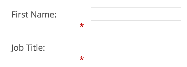
If you look at the attached image the the label, asterisk and dropdown are all vertically aligned. This is not true for the input labels.
How can I achieve all 3 elements to be vertically aligned ?
Thanks!
- Mark as New
- Bookmark
- Subscribe
- Mute
- Subscribe to RSS Feed
- Permalink
- Report Inappropriate Content
Re: How to vertically align label and asterisk in forms
Hi Danny,
You can edit the CSS of a form to override the styling given by MKTO. Take a look here; Edit the CSS of a Form Theme - Marketo Docs - Product Docs
Using the added tag !important will override the default styling.
Let me know if you can get that working.
- Mark as New
- Bookmark
- Subscribe
- Mute
- Subscribe to RSS Feed
- Permalink
- Report Inappropriate Content
Re: How to vertically align label and asterisk in forms
Hi Stijn,
Thank you for the quick reply.
I have been adding the custom CSS using the websites stylesheet and have been using !important. If you click on the link below you'll see the form i'm working on and adding the following to the styesheet simply won't work.
.mktoForm .mktoRequiredField label.mktoLabel {
vertical-align: middle !important;
}
If I could isolate the text label itself maybe I could play with the margins but can't since they are all grouped together.
Any ideas what I can do to have all elements vertically aligned ?
- Mark as New
- Bookmark
- Subscribe
- Mute
- Subscribe to RSS Feed
- Permalink
- Report Inappropriate Content
Re: How to vertically align label and asterisk in forms
Hi Danny,
It might be some fiddling around, but have you tried playing with the margin-top aspect?
- Mark as New
- Bookmark
- Subscribe
- Mute
- Subscribe to RSS Feed
- Permalink
- Report Inappropriate Content
Re: How to vertically align label and asterisk in forms
I have fiddled with it. I have tried top-margin .. but the text label and asterisk are grouped together so they would both be impacted by this.
- Mark as New
- Bookmark
- Subscribe
- Mute
- Subscribe to RSS Feed
- Permalink
- Report Inappropriate Content
Re: How to vertically align label and asterisk in forms
Hi Danny,
Try this:
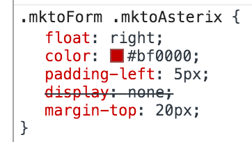
.mktoForm .mktoAsterix { margin-top:20px; }
I'm just doing it in the browser, but see the desired result.
- Mark as New
- Bookmark
- Subscribe
- Mute
- Subscribe to RSS Feed
- Permalink
- Report Inappropriate Content
Re: How to vertically align label and asterisk in forms
Expanding on that. For the label it's
.mktoForm .mktoLabel { margin-top:20px; }
Changing the label will also move the asterix so fiddle around and find the right values for you.
- Mark as New
- Bookmark
- Subscribe
- Mute
- Subscribe to RSS Feed
- Permalink
- Report Inappropriate Content
Re: How to vertically align label and asterisk in forms
Hi,
The top-margin worked but the values that accomplished the task were:
.mktoForm .mktoLabel { margin-top:-3px !important; }
.mktoForm .mktoAsterix { margin-top:3px !important; }
Thanks for your help ![]()
On Tue, Nov 10, 2015 at 6:05 AM, Stijn Heijthuijsen <
- Mark as New
- Bookmark
- Subscribe
- Mute
- Subscribe to RSS Feed
- Permalink
- Report Inappropriate Content
Re: How to vertically align label and asterisk in forms
Happy to help ![]()
Make sure you check this across all major browsers


.png)