How can I make a landing page banner mobile responsive?
- Subscribe to RSS Feed
- Mark Topic as New
- Mark Topic as Read
- Float this Topic for Current User
- Bookmark
- Subscribe
- Printer Friendly Page
- Mark as New
- Bookmark
- Subscribe
- Mute
- Subscribe to RSS Feed
- Permalink
- Report Inappropriate Content
Hello,
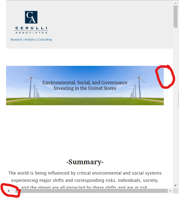
we have been having issues with the banner not resizing correctly on mobile for Marketo landing pages. Here is an example:
U.S. ESG 2019
Anyone have insights into this?
- Mark as New
- Bookmark
- Subscribe
- Mute
- Subscribe to RSS Feed
- Permalink
- Report Inappropriate Content
While there is a bootstrap class you can use here for images (.img-responsive) -- and it looks like you've already got that in play on this page -- I usually go about this another way so that I don't have to keep adding a class to every image I put on the page.
The issue we're seeing here is that when you add an image to your LP (or change/update an image) Marketo will automatically add the height="" and width="" attributes inline to the image element.
<img
src="https://info.cerulli.com/rs/960-BBE-213/images/US%20ESG%20Banner%201200x300.jpg"
width="1200"
height="301"
constrain="true"
imagepreview="false"
class="img-responsive">As a best-practice you'll want to remove that height and width whenever you change the image. It's really annoying b/c it always happens and there's not a way to deactivate this functionality, instead you've got to take a few extra steps to delete the height and width once you change the URL of the image in the pop-up image editor. This step isn't necessary if you're using classes to control the height and width, but it does create a need for some CSS to do just that.
The class you've got on there "img-responsive" is telling the images to be:
1) at most 100% wide [max-width:100%;]
2) proportionate in height [height: auto;]
3) displayed like a block rather than an inline element [display:block]
To short-cut the need to add this onto each of your images, I usually just add some CSS that applies to ALL images instead of a class that needs to get added to each. Here's what that looks like:
/* make all images responsive */
img {
max-width:100%;
height:auto;
display:block;
}---------------------------
EXTRA CREDIT:
I noticed when looking at the page that there was some room to horizontally scroll the page to the right. I had a quick look to see if I could find anything sticking out into the right margin and didn't find anything, but this is usually some combination of the rows/columns in bootstraps extending beyond the viewport (rows have a -15px margin left/right for example).
Here's a screenshot where you can see the extra space to the right and where I've scrolled over to point this out.
To get rid of this bottom scroll bar, you can hide the overflow on the x-axis (horizontal) by adding a little more CSS to your stylesheet / template. Here's what that'd look like:
/* hide bottom scrollbar (horizontal) */
body {
overflow-x: hidden;
}Cheers,
Dave
- Mark as New
- Bookmark
- Subscribe
- Mute
- Subscribe to RSS Feed
- Permalink
- Report Inappropriate Content
I can see that you are using bootstrap framework to make your page responsive. So better to use the bootstrap classes to make the image responsive rather adding your own CSS. You can find more details here on how to make image responsive using bootstrap:
- Mark as New
- Bookmark
- Subscribe
- Mute
- Subscribe to RSS Feed
- Permalink
- Report Inappropriate Content
Here are few tips:
1. Make sure your image is large enough: an image which is a minimum of 1980px wide and of a depth of at least 900px
2. Keep the subject or focus in the middle of your banner.
3. Try not to include text in your image.
4. Using separate images and settings for mobile and desktop
5. After you’ve chosen and implemented a responsive image solution, testing the performance of your website is absolutely necessary to making sure that the solution is working well.
- Mark as New
- Bookmark
- Subscribe
- Mute
- Subscribe to RSS Feed
- Permalink
- Report Inappropriate Content
You're going to need to provide more specifics about what exactly isn't working correctly and where. When I looked at the page in the Chrome emulator the image scaled as I expected it to on mobile.
- Copyright © 2025 Adobe. All rights reserved.
- Privacy
- Community Guidelines
- Terms of use
- Do not sell my personal information
Adchoices
