Re: Help need - Banners size Landing Page + Email
- Subscribe to RSS Feed
- Mark Topic as New
- Mark Topic as Read
- Float this Topic for Current User
- Bookmark
- Subscribe
- Printer Friendly Page
- Mark as New
- Bookmark
- Subscribe
- Mute
- Subscribe to RSS Feed
- Permalink
- Report Inappropriate Content
Hi every one,
What the hell ! I spent too much time to find a f... solution on banners size.
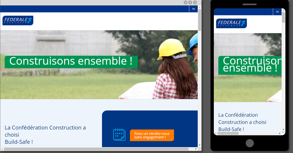
I'd like to know the specific size for banner on landing page and email. Of cours it must be ok on mobile device and desktop ![]()
I work on guided template, and even I try to respect the "guided rules", I get horrible pages from desktop to mobile.
I'm not a best in coding or HTML , but I would like achieve my target ![]()
HELP ME PLEASE !
Some pictures
- Mark as New
- Bookmark
- Subscribe
- Mute
- Subscribe to RSS Feed
- Permalink
- Report Inappropriate Content
Hy every body,
Thank you for your help and advices. I found a personnal solution for the website.
Happy to see so much people helping others on this website.
Ignace
- Mark as New
- Bookmark
- Subscribe
- Mute
- Subscribe to RSS Feed
- Permalink
- Report Inappropriate Content
Hey Ignace-
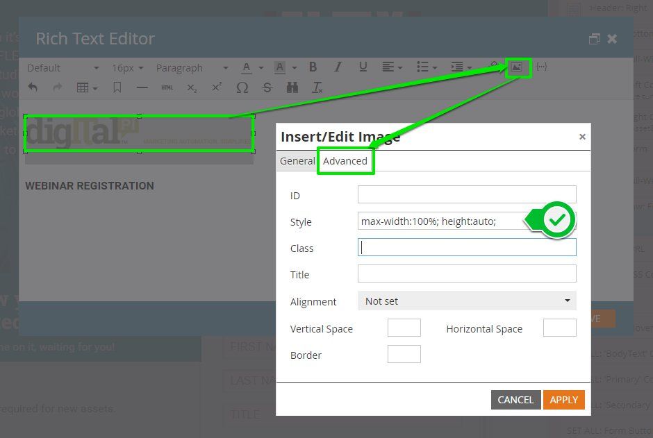
It looks like you'll need to add style="max-width:100%; height:auto;" to your images to get them to respect the width of their container. It looks like what you are running into here might be that when you use the file explorer (the little folder w/ the magnifying glass next to the URL in the Image Editor) to grab an image from your Images/Files folder, Marketo will automatically strip any classes and styles that are set on that image and also set the dimensions boxes to match the native size of the image. In "code-speak" these dimensions tell the browser that the image should be a "fixed" height and width. Obviously, for mobile this makes it too wide for the screen.
My favorite solution for this is to add a line of CSS to my template that'll style any image I add into the template and make sure that it scales in proportion with the container that it's placed into. Here's what that would look like:
img {max-width:100%; height:auto;}
Alternately, you can add this individually to "each image" using the image editor. When you click on the image icon in the Rich Text Editor, you'll pop-up a new menu that's got the Image's URL and dimensions. If you look to the top of this pop-up there is a tab labeled "Advanced". This has a style [______] input that you can use to add some CSS to the image element. If you were to go this route, you'd add max-width:100%; height:auto; into the style input and that should help your images scale down for mobile.
Hope this was helpful, let me know if it worked out for you or if there's anything else I could help out with to get you up and running here.
- Mark as New
- Bookmark
- Subscribe
- Mute
- Subscribe to RSS Feed
- Permalink
- Report Inappropriate Content
Hi Ignace,
In addition to Sahil's request to share the code for email/url for landing page, if you can be more specific about what you want to change (i.e., provide a description or mock up of how it should look vs how it does look), community will be better able to help with your issue.
I also suspect it's more a problem of code than it is of image sizes specifically.
- Mark as New
- Bookmark
- Subscribe
- Mute
- Subscribe to RSS Feed
- Permalink
- Report Inappropriate Content
Hi Ignace,
This is always a challenge for setting up the banners images for desktop and mobile versions.
The second screenshot is looking ok. Do you want the engineer's image look into the mobile versions(First screenshot)? We can highlight the specific area for the background images for mobile devices in landing pages.
The banner image should be 600px width for email templates and it should extend to 100% in the landing pages. We need to implement the hacks for the landing pages so it looks fine in large desktops and mobile devices.
Can you please share the browser URL of the landing page so I can look into this?
Thanks,
- Copyright © 2025 Adobe. All rights reserved.
- Privacy
- Community Guidelines
- Terms of use
- Do not sell my personal information
Adchoices


