Help: 2 forms on a page breakage
- Subscribe to RSS Feed
- Mark Topic as New
- Mark Topic as Read
- Float this Topic for Current User
- Bookmark
- Subscribe
- Printer Friendly Page
- Mark as New
- Bookmark
- Subscribe
- Mute
- Subscribe to RSS Feed
- Permalink
- Report Inappropriate Content
I am trying to put 2 forms on 1 page (externally embedded).
The first form: inline/horizontal (all fields and button on same row)
The second form: a normal, vertical form
The problem I am having, is that either form looks beautiful by itself when place on a page, but whenever I add another form, it breaks the other – the inline/horizontal form is forcing the button on the vertical form to skew to the right.
I have placed both forms on this test page: unagpo.com/testing/ (both forms viewable only on desktop)
I know this is because both forms use the same CSS... but what is the easiest way to get around this?
Screenshot of issue, and mockup of desired outcome attached.
Solved! Go to Solution.
- Mark as New
- Bookmark
- Subscribe
- Mute
- Subscribe to RSS Feed
- Permalink
- Report Inappropriate Content
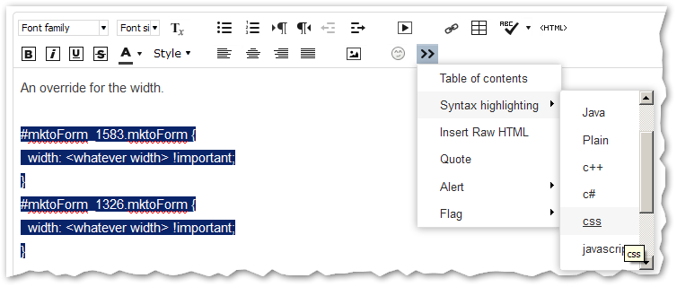
An override for the width.
#mktoForm_1583.mktoForm {
width: <whatever width> !important;
}
#mktoForm_1326.mktoForm {
width: <whatever width> !important;
}
Please use syntax highlighting when pasting blocks of code. Code as regular text isn't usable, and I won't try to read it.
- Mark as New
- Bookmark
- Subscribe
- Mute
- Subscribe to RSS Feed
- Permalink
- Report Inappropriate Content
I know this is because both forms use the same CSS... but what is the easiest way to get around this?
Target your CSS to only one form ID:
#mktoForm_1583.mktoForm {
/* these styles only apply to form 1583 */
}
Styles aren't the only strange thing with multiple forms, but this is hopefully your only prob to solve.
- Mark as New
- Bookmark
- Subscribe
- Mute
- Subscribe to RSS Feed
- Permalink
- Report Inappropriate Content
Well, the rule alone won't do anything (there are no styles in it!). I'm indicating how you style one form without affecting the other(s) on the same page.
On your page the problem is the rule that sets
.mktoForm { width: auto !important; }
for all .mktoForm elements. So you need to override that with different widths for each form.
- Mark as New
- Bookmark
- Subscribe
- Mute
- Subscribe to RSS Feed
- Permalink
- Report Inappropriate Content
Here is CSS for the top/horizontal form:
#mktoForm_1583.mktoForm {
/* these styles only apply to form 1583 */
}
.mktoForm input[type=text],
.mktoForm input[type=url],
.mktoForm input[type=email],
.mktoForm input[type=tel],
.mktoForm input[type=number],
.mktoForm input[type=date],
.mktoForm select.mktoField,
.mktoForm textarea.mktoField{
-webkit-appearance: none;
background-color:#fff;
line-height:1.5em;
width:100%;
color:#a7acae;
border:0px;
box-shadow:inset 0px 0px 0px 0px #fff;
min-height:38px;
float: left;
height:0 !important;
}
.mktoForm input[type=text]:focus,
.mktoForm input[type=url]:focus,
.mktoForm input[type=email]:focus,
.mktoForm input[type=tel]:focus,
.mktoForm input[type=number]:focus,
.mktoForm input[type=date]:focus,
.mktoForm select.mktoField:focus,
.mktoForm textarea.mktoField:focus{
outline:none;
width:100%;
color:#;
float: left;
height:0 !important;
min-height:38px;
}
.mktoForm textarea.mktoField{
resize: none;
}
.mktoForm .mktoButtonWrap .mktoButton {
border:2px !important;
}
.mktoForm .mktoButtonWrap .mktoButton:hover {
border:2px !important;
}
.mktoButtonWrap {
margin-left:0px !important;
}
.mktoForm .mktoOffset {
float: left;
height:0 !important;
width:20px;
padding-right: 3px !important;
padding-left: 3px !important;
}
.mktoForm.mktoLayoutAbove .mktoRequiredField .mktoAsterix {
float: left;
padding-left: 0;
padding-right: 0px;
visibility: hidden;
}
forms2.css:120
.mktoForm .mktoRequiredField .mktoAsterix {
display: block;
height: 0px;
visibility: hidden;
}
.mktoForm .mktoAsterix {
color: #efefef;
display: block;
height: 0px;
visibility: hidden;
}
forms2.css:71
.mktoForm .mktoAsterix {
float: right;
color: #efefef;
padding-left: 0px;
height: 0px;
display: block;
visibility: hidden;
}
/* remove width constraint to allow for float */
.mktoForm {
width: auto !important
}
/* align row */
.mktoFormRow {
float: left !important;
}
/* remove offset */
.mktoOffset {
width: auto !important;
}
/* remove gutter margin */
.mktoGutter {
width:0px !important;
}
/* button style */
.mktoButton {
height: 38px !important;
width: 165px !important;
margin-top: 0px !important;
}
- Mark as New
- Bookmark
- Subscribe
- Mute
- Subscribe to RSS Feed
- Permalink
- Report Inappropriate Content
An override for the width.
#mktoForm_1583.mktoForm {
width: <whatever width> !important;
}
#mktoForm_1326.mktoForm {
width: <whatever width> !important;
}
Please use syntax highlighting when pasting blocks of code. Code as regular text isn't usable, and I won't try to read it.
- Mark as New
- Bookmark
- Subscribe
- Mute
- Subscribe to RSS Feed
- Permalink
- Report Inappropriate Content
It worked. Thank you Sanford!
- Mark as New
- Bookmark
- Subscribe
- Mute
- Subscribe to RSS Feed
- Permalink
- Report Inappropriate Content
Cool. Thanks for adding the highlight. This will get other people in the mood.
- Copyright © 2025 Adobe. All rights reserved.
- Privacy
- Community Guidelines
- Terms of use
- Do not sell my personal information
Adchoices
