Your Achievements
Next /
Sign inSign in to Community to gain points, level up, and earn exciting badges like the new Applaud 5 BadgeLearn more!
View All BadgesSign in to view all badges
SOLVED
Forms 2.0 - format submit button
Go to solution
Topic Options
- Subscribe to RSS Feed
- Mark Topic as New
- Mark Topic as Read
- Float this Topic for Current User
- Bookmark
- Subscribe
- Printer Friendly Page
Anonymous
Not applicable
02-03-2014
04:57 PM
- Mark as New
- Bookmark
- Subscribe
- Mute
- Subscribe to RSS Feed
- Permalink
- Report Inappropriate Content
02-03-2014
04:57 PM
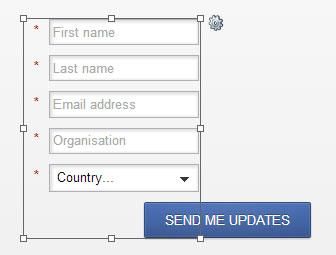
Anyone else having issues with buttons in forms 2.0? I can't figure out how to control where it appears on the page. It doesn't seem to align with anything.
This is how it comes up when I add to a landing page:

I've tried moving the labels to "above" instead of "left" but nothing changed.
This is how it comes up when I add to a landing page:

I've tried moving the labels to "above" instead of "left" but nothing changed.
Solved! Go to Solution.
Labels:
- Labels:
-
Lead Management
1 ACCEPTED SOLUTION
Anonymous
Not applicable
02-03-2014
08:08 PM
- Mark as New
- Bookmark
- Subscribe
- Mute
- Subscribe to RSS Feed
- Permalink
- Report Inappropriate Content
02-03-2014
08:08 PM
Just got off the phone with Marketo support. Turns out the way to fix it is to click and drag the button! Works perfectly.
5 REPLIES 5
Anonymous
Not applicable
02-20-2014
05:30 AM
- Mark as New
- Bookmark
- Subscribe
- Mute
- Subscribe to RSS Feed
- Permalink
- Report Inappropriate Content
02-20-2014
05:30 AM
Glad to see there is a solution, but I'm sorry ... In what world is that intuitive or user friendly? This is just like renaming things in Marketo. There is no visual cue letting the user know it's anything more than a static element.
Anonymous
Not applicable
02-17-2014
01:15 PM
- Mark as New
- Bookmark
- Subscribe
- Mute
- Subscribe to RSS Feed
- Permalink
- Report Inappropriate Content
02-17-2014
01:15 PM
What if you don't want the Submit button to be below the form, ie - a single field with the Submit button to the right? Not being able to move the submit button out of it's row seems like an arbitrary and unnecessary limitation.
- Mark as New
- Bookmark
- Subscribe
- Mute
- Subscribe to RSS Feed
- Permalink
- Report Inappropriate Content
02-06-2014
07:35 AM
So glad I saw this post! 🙂 I was having the same problem.
Anonymous
Not applicable
02-03-2014
08:08 PM
- Mark as New
- Bookmark
- Subscribe
- Mute
- Subscribe to RSS Feed
- Permalink
- Report Inappropriate Content
02-03-2014
08:08 PM
Just got off the phone with Marketo support. Turns out the way to fix it is to click and drag the button! Works perfectly.
- Mark as New
- Bookmark
- Subscribe
- Mute
- Subscribe to RSS Feed
- Permalink
- Report Inappropriate Content
02-03-2014
06:24 PM
Did you modify the CSS or javascript on the Form or on the page? There's probably a conflict.
Although...it might be that your field lengths are too short?
Although...it might be that your field lengths are too short?
- Copyright © 2025 Adobe. All rights reserved.
- Privacy
- Community Guidelines
- Terms of use
- Do not sell my personal information
Adchoices