Your Achievements
Next /
Sign inSign in to Community to gain points, level up, and earn exciting badges like the new Applaud 5 BadgeLearn more!
View All BadgesSign in to view all badges
SOLVED
Forms 2.0 CSS/style issues
Go to solution
Topic Options
- Subscribe to RSS Feed
- Mark Topic as New
- Mark Topic as Read
- Float this Topic for Current User
- Bookmark
- Subscribe
- Printer Friendly Page
Anonymous
Not applicable
07-18-2014
11:02 AM
- Mark as New
- Bookmark
- Subscribe
- Mute
- Subscribe to RSS Feed
- Permalink
- Report Inappropriate Content
07-18-2014
11:02 AM
Hi Marketo community, I am having issues manipulating the form button styling in the 2.0 editor. In 1.0 I could drop an HTML block onto a landing page, which contained scripts that allowed me to change the appearance and position of the form button on the landing page level.
I know you are supposed to be able to do most of this natively in the 2.0 editor now, but I seem to be experiencing a lot of bugs when trying to apply changes via the WYSIWYG. For example, in the screenshot here I updated the font type for the form in form settings. It updated the font in the form fields, but not on the button. Is it possible to make the button I choose bigger or smaller? Also in regards to the buttons, if I select a custom color for one of the button styles, the hover color becomes the original button color and there does not appear to be a way to change the hover color. This creates serious issues in our ability to create forms that use branded colors and fonts.
I am hoping someone has some pre-canned CSS for the form editor that would allow for better control over some of these areas in the forms. Thanks for your feedback, rockstars!
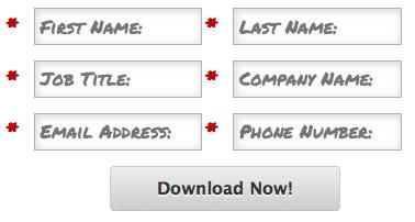

Solved! Go to Solution.
Labels:
- Labels:
-
Lead Management
1 ACCEPTED SOLUTION
Anonymous
Not applicable
07-18-2014
11:49 AM
- Mark as New
- Bookmark
- Subscribe
- Mute
- Subscribe to RSS Feed
- Permalink
- Report Inappropriate Content
07-18-2014
11:49 AM
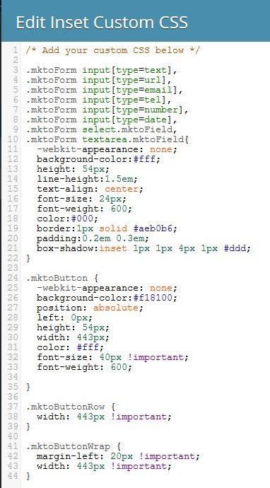
To change the button font and other aspects you will need to change the CSS using the button classes in the form editor. I had to make similar changes recently. Go to form settings then click on the gear and select Edit Custom CSS. In there you will find a blank box where you can add the button classes and change them however you need to. I have provided some screen shots of what I wrote it. I used the developer function in my browser to pull most of the classes. Hope this helps you.

12 REPLIES 12
Anonymous
Not applicable
02-27-2015
07:04 AM
- Mark as New
- Bookmark
- Subscribe
- Mute
- Subscribe to RSS Feed
- Permalink
- Report Inappropriate Content
02-27-2015
07:04 AM
You are in luck most of the changes made to the original are not CSS but built in to the capability. I'll break them out with screen shots where needed.
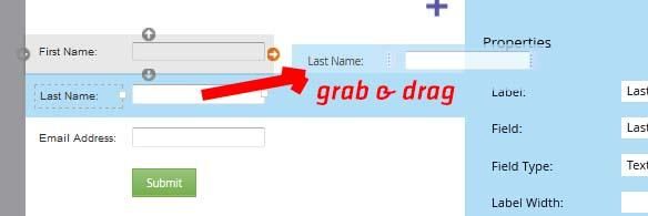
For the Side-by-side fields you will simply drag one field up and to the right of another field until the arrow on the static field turns orange. (screen shot below)
Field label inside the field instead of outside of the field (screen shot below bullets)
Click on the field and in the properties panel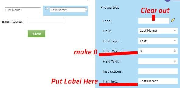
To make required just check the required check box on each field you want to be required. The astrik is standard.
To change the font and font size of the labels in the fields (screen shots below bullets)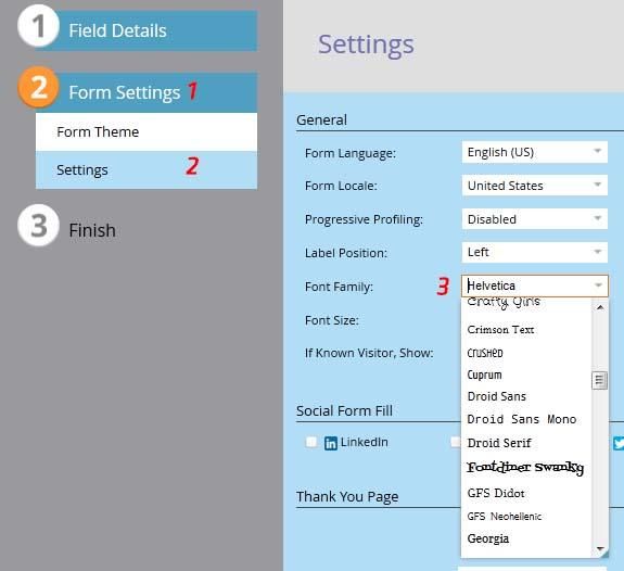
example of field width change
The drop shadow in the fields (no screen shots)
For the Side-by-side fields you will simply drag one field up and to the right of another field until the arrow on the static field turns orange. (screen shot below)

Field label inside the field instead of outside of the field (screen shot below bullets)
Click on the field and in the properties panel
- Cut the label out of the label field & paste it into the hint text field
- Change the label width to zero (0) or small number if you want additional spacing between fields

To make required just check the required check box on each field you want to be required. The astrik is standard.
To change the font and font size of the labels in the fields (screen shots below bullets)
- Click on form settings
- Click on settings
- Change the font and font size of your choice
- Please Note that depending on the font you choose and the size of the font you may have to go back to the field details and change the field width of the field individually (you could change it universally in the css but since the labels may or may not be the same length so it may be more of a pain than a help to do it universally)

example of field width change

The drop shadow in the fields (no screen shots)
- Click on Form Settings
- Click on Form Theme (should be default)
- Uset the arrows to click through themes until you find one that has a shadow that you like
- Mark as New
- Bookmark
- Subscribe
- Mute
- Subscribe to RSS Feed
- Permalink
- Report Inappropriate Content
03-16-2016
01:05 PM
Is there a way to put the Button on the same row as the field? I'm working on a Blog subscription form with just an email address field, and would ideally want to put them both on the same row.
I see that there's a .mktoButtonRow and a .mktoFormRow, but not sure how to manipulate the two to get what I want.
Alex Schutte
- Mark as New
- Bookmark
- Subscribe
- Mute
- Subscribe to RSS Feed
- Permalink
- Report Inappropriate Content
03-21-2017
05:40 AM
Hi Alex,
Did you ever figure out how to do this? I am trying to do the same and am not having much luck
- Mark as New
- Bookmark
- Subscribe
- Mute
- Subscribe to RSS Feed
- Permalink
- Report Inappropriate Content
03-21-2017
05:44 AM
Unfortunately I did not ![]()
Alex Schutte
- Mark as New
- Bookmark
- Subscribe
- Mute
- Subscribe to RSS Feed
- Permalink
- Report Inappropriate Content
03-24-2017
08:46 AM
Hi Alex,
Courtney Grimes helped me get this working on this post. Hope it helps you too!
Anonymous
Not applicable
02-26-2015
03:22 PM
- Mark as New
- Bookmark
- Subscribe
- Mute
- Subscribe to RSS Feed
- Permalink
- Report Inappropriate Content
02-26-2015
03:22 PM
All of the above. I would really like the text in the fields for sure.
Anonymous
Not applicable
02-26-2015
12:38 PM
- Mark as New
- Bookmark
- Subscribe
- Mute
- Subscribe to RSS Feed
- Permalink
- Report Inappropriate Content
02-26-2015
12:38 PM
Are you wanting the layout or the button or the text in the fields or all of the above?
Anonymous
Not applicable
02-26-2015
12:00 PM
- Mark as New
- Bookmark
- Subscribe
- Mute
- Subscribe to RSS Feed
- Permalink
- Report Inappropriate Content
02-26-2015
12:00 PM
Nate, Shannon, what does the CSS look like to get closer to the sample that Nate orignially posted? I am looking to create a similar look.
Thanks
Thanks
Anonymous
Not applicable
07-21-2014
12:13 PM
- Mark as New
- Bookmark
- Subscribe
- Mute
- Subscribe to RSS Feed
- Permalink
- Report Inappropriate Content
07-21-2014
12:13 PM
Yes they are useable for any form that you create in Marketo. (not sure how well the code will come through I have poor luck in getting code snippets in to the conversations.)
.mktoForm input[type=text],
.mktoForm input[type=url],
.mktoForm input[type=email],
.mktoForm input[type=tel],
.mktoForm input[type=number],
.mktoForm input[type=date],
.mktoForm select.mktoField,
.mktoForm textarea.mktoField{
-webkit-appearance: none;
background-color:#fff;
height: 54px;
line-height:1.5em;
text-align: center;
font-size: 24px;
font-weight: 600;
color:#000;
border:1px solid #aeb0b6;
padding:0.2em 0.3em;
box-shadow:inset 1px 1px 4px 1px #ddd;
}
.mktoButton {
-webkit-appearance: none;
background-color:#f18100;
position: absolute;
left: 0px;
height: 54px;
width: 443px;
color: #fff;
font-size: 40px !important;
font-weight: 600;
}
.mktoButtonRow {
width: 443px !important;
}
.mktoButtonWrap {
margin-left: 20px !important;
width: 443px !important;
}
Anonymous
Not applicable
07-21-2014
11:59 AM
- Mark as New
- Bookmark
- Subscribe
- Mute
- Subscribe to RSS Feed
- Permalink
- Report Inappropriate Content
07-21-2014
11:59 AM
Hi Shannan, thanks for that intel, makes sense. Would you be able to share that CSS snippet? It looks like those asset classes would apply to any marketo form via the editor?
Anonymous
Not applicable
07-18-2014
11:56 AM
- Mark as New
- Bookmark
- Subscribe
- Mute
- Subscribe to RSS Feed
- Permalink
- Report Inappropriate Content
07-18-2014
11:56 AM
one more thing the !important part of the code is well important to add to certain lines if the override isn't taking immediately.
Anonymous
Not applicable
07-18-2014
11:49 AM
- Mark as New
- Bookmark
- Subscribe
- Mute
- Subscribe to RSS Feed
- Permalink
- Report Inappropriate Content
07-18-2014
11:49 AM
To change the button font and other aspects you will need to change the CSS using the button classes in the form editor. I had to make similar changes recently. Go to form settings then click on the gear and select Edit Custom CSS. In there you will find a blank box where you can add the button classes and change them however you need to. I have provided some screen shots of what I wrote it. I used the developer function in my browser to pull most of the classes. Hope this helps you.


- Copyright © 2025 Adobe. All rights reserved.
- Privacy
- Community Guidelines
- Terms of use
- Do not sell my personal information
Adchoices