Re: Form Styling: Need field to span multiple rows in second column
- Subscribe to RSS Feed
- Mark Topic as New
- Mark Topic as Read
- Float this Topic for Current User
- Bookmark
- Subscribe
- Printer Friendly Page
- Mark as New
- Bookmark
- Subscribe
- Mute
- Subscribe to RSS Feed
- Permalink
- Report Inappropriate Content
Hello,
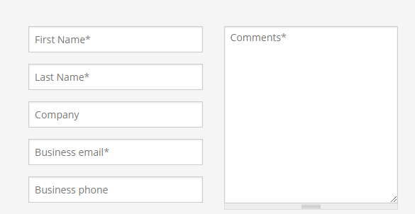
I've been combing through threads and haven't managed to find this scenario. I'm trying to create an embed form to replace this form:
Contact M-Files for Enterprise Information Management (EIM) Solutions
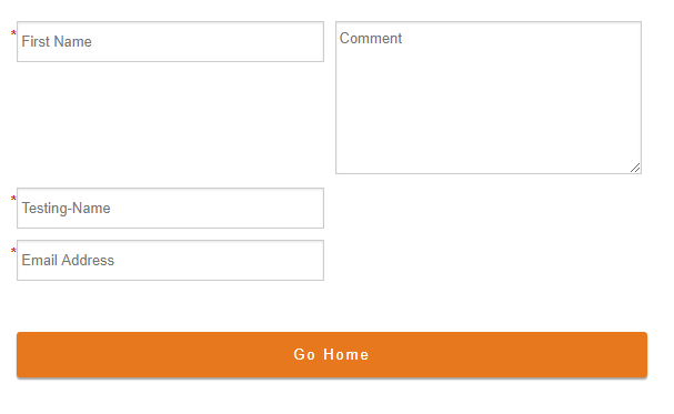
And I've gotten this far:
m-files.com/en/marketo-test-form
Is this style possible with Marketo's forms? Did I miss this thread somewhere?
Thanks!
Solved! Go to Solution.
- Labels:
-
Products
- Mark as New
- Bookmark
- Subscribe
- Mute
- Subscribe to RSS Feed
- Permalink
- Report Inappropriate Content
Hey Michelle-
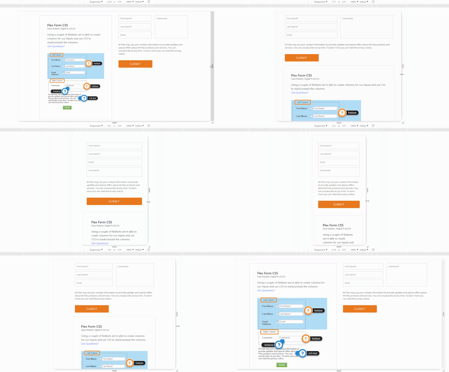
I've setup a basic template to house an example of the form here: FLEX Form CSS - Digital Pi
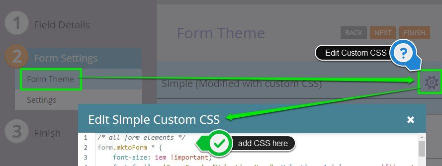
The CSS for this form is included below, you should be able to copy/paste this into the Custom CSS on your form to put it into play on your end.
It'd probably be best to clone your live form and apply these changes to the clone to test before you implement it. You can also copy/paste the existing Custom CSS into a word doc or simple text editor to save as a backup.
Here's a quick look at where to find the Custom CSS on your form:
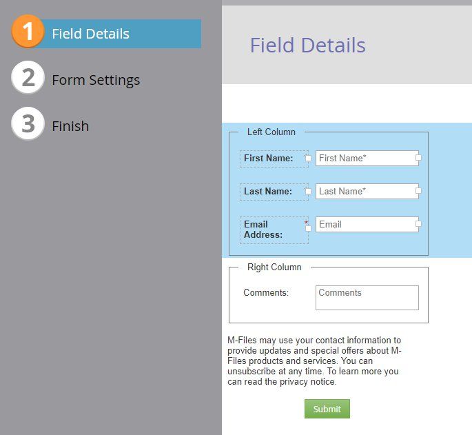
You'll also need to do a little work in the Field Details tab to create the fieldsets and place your fields into them. I've included a shot below of what the setup looks like on my end (and there's also an annotated copy of this on the live example linked above). You can create a new fieldset the same way you'd add a new field/rich text to the form and then drag-and-drop the fields into the middle of the fieldset. I've labeled each fieldset in the editor so it makes a little more sense to anyone coming along in the future who isn't as familiar with the setup. These labels (legends) are hidden in the live view, so they can be used to hold comments/info as you see fit.
*NOTE: For the sake of keeping this inline with this example, this form IS NOT styled to accommodate other inputs like a checkbox or radio (anything that doesn't currently exist on the form). Those will need a more specific set of styles, maybe something to tackle or add-on down the road. I've tested on Chrome, Firefox, IE 11 and Safari (mobile and desktop) to be sure this'll work out without a hitch, please let me know if you come across anything that's acting weird.
/* all form elements */
form.mktoForm * {
font-size: 1em !important;
font-family: 'Open Sans', "Helvetica Neue", Helvetica, Arial, sans-serif!important;
-webkit-box-sizing: border-box;
box-sizing: border-box;
}
/* color outline and border for active elements */
form.mktoForm * {outline-color: #e7781e !important;}
form.mktoForm *:focus {border-color: #e7781e !important;}
/* full-width (fluid) elements */
form.mktoForm,
form.mktoForm .mktoButtonRow,
form.mktoForm fieldset .mktoFormRow,
form.mktoForm fieldset .mktoFormCol,
form.mktoForm fieldset .mktoFieldWrap,
form.mktoForm fieldset .mktoFormRow input,
form.mktoForm fieldset .mktoFormRow select,
form.mktoForm fieldset .mktoFormRow textarea {
width: 100% !important;
}
}
/* fixed width element reset */
form.mktoForm .mktoHasWidth {
width: auto !important;
}
/* hide these elements (spacers, legend, labels) */
.mktoOffset,
.mktoGutter,
form.mktoForm fieldset legend,
form.mktoForm label.mktoLabel {
display: none !important;
}
/* ----------------------------------- */
/* ==========[Form Elements]========== */
/* ----------------------------------- */
/* fieldset (all) */
form.mktoForm fieldset {
width: 100% !important;
padding: 0px !important;
margin: 0px !important;
border: none !important;
}
/* inputs, textarea, select */
.mktoForm input[type=url],
.mktoForm input[type=text],
.mktoForm input[type=date],
.mktoForm input[type=tel],
.mktoForm input[type=email],
.mktoForm input[type=number],
.mktoForm textarea.mktoField,
.mktoForm select.mktoField {
height: auto !important;
line-height: inherit !important;
font-size: inherit !important;
-webkit-appearance: none!important;
background-color: #fff;
background: #fff;
color: #333!important;
border: 1px solid #ccc;
-webkit-box-shadow: 0 1px 2px rgba(0, 0, 0, 0.1) inset;
box-shadow: 0 1px 2px rgba(0, 0, 0, 0.1) inset;
border-radius: 0px!important;
padding: 10px!important;
-webkit-box-shadow: none!important;
box-shadow: none!important;
-webkit-transition: all 250ms ease-out!important;
-o-transition: all 250ms ease-out!important;
transition: all 250ms ease-out!important;
width: 100%!important;
}
/* invalid fields */
.mktoForm input.mktoField.mktoInvalid, .mktoForm select.mktoField.mktoInvalid, .mktoForm textarea.mktoField.mktoInvalid, .mktoForm div.mktoLogicalField.mktoInvalid {
border: 1px solid #c00;
}
/* rich text */
form.mktoForm .mktoHtmlText {
padding: 0.5rem 0px 1.25rem 0px !important;
width: 100% !important;
text-align: left !important;
font-family: "Open Sans", "Helvetica", Helvetica, Arial, sans-serif;
font-size: 16px;
}
/* button */
form.mktoForm .mktoButtonWrap {
margin-left: 0px !important;
}
form.mktoForm .mktoButtonWrap .mktoButton {
background-image: -webkit-gradient(linear, left top, left bottom, from(#e7781e), to(#e7781e))!important;
background-image: -webkit-linear-gradient(top, #e7781e, #e7781e)!important;
background-image: -o-linear-gradient(top, #e7781e, #e7781e)!important;
background-image: linear-gradient(to bottom, #e7781e, #e7781e)!important;
border: 1px solid #e7781e!important;
border-radius: 4px!important;
background-color: #e7781e!important;
padding: 10px!important;
width: 100% !important;
text-transform: uppercase!important;
font-family: 'Open Sans', "Helvetica Neue", Helvetica, Arial, sans-serif !important;
font-size: 16px !important;
font-weight: 300 !important;
letter-spacing: 2px !important;
color: #ffffff !important;
min-height: 35px !important;
margin: 0 auto !important;
}
/* ------------------------------------ */
/* ==========[Responsive CSS]========== */
/* ------------------------------------ */
/* for landscape mobile and up */
@media screen and (min-width:576px) {
/* unstack form */
form.mktoForm {
display: -webkit-box !important;
display: -ms-flexbox !important;
display: flex !important;
-ms-flex-wrap: wrap;
flex-wrap: wrap;
}
/* Row 1 & 2 (filedset rows) to columns */
form.mktoForm>.mktoFormRow:nth-of-type(1),
form.mktoForm>.mktoFormRow:nth-of-type(2) {
width: 50% !important;
float: left !important;
clear: none !important;
}
/* column padding */
form.mktoForm fieldset .mktoFormCol .mktoFieldWrap {
padding: 0 10px !important;
}
/* fieldset (all) */
form.mktoForm .mktoFormRow fieldset {
-webkit-box-flex: 1;
-ms-flex-positive: 1;
flex-grow: 1;
height: 100%;
}
/* 2nd Column - fieldset 2 */
form.mktoForm .mktoFormRow:nth-of-type(2) fieldset .mktoFormRow,
form.mktoForm .mktoFormRow:nth-of-type(2) fieldset .mktoFormRow .mktoFormCol,
form.mktoForm .mktoFormRow:nth-of-type(2) fieldset .mktoFormRow .mktoFormCol .mktoFieldWrap {
display: -webkit-box !important;
display: -ms-flexbox !important;
display: flex !important;
height: 100% !important;
}
/* textarea | SPECIFIC ELEMENT CSS: grow textarea in 2nd column */
form.mktoForm textarea.mktoField {
margin-bottom: 10px;
height: calc(100% - 10px);
}
/* rich text */
form.mktoForm .mktoHtmlText {
font-weight: 400 !important;
padding: 1.25rem 10px !important;
}
/* button */
form.mktoForm .mktoButtonRow {
clear: both;
}
form.mktoForm .mktoButtonWrap {
margin-left: 10px !important;
}
form.mktoForm .mktoButtonWrap .mktoButton {
min-width: 210px !important;
width: auto !important;
}
}
Quick Walkthru:
1. Clone Form, backup current CSS, apply new CSS - You can copy/paste the CSS above into the Custom CSS on your new form once that's setup.
2. Create a test LP to host the embedded form in your CMS - Maybe you can just clone this landing page and add the embded code for your new form into the page for testing/review. *Note: If you're already using a test page for this, you can just use the new embed code in place of the old code - the idea is that you'll want to test this in a staging environment instead of on the live page.
3. Apply styles to live form - Once everything looks good / is tested, you can simply copy/paste the CSS above in place of the existing CSS on your form and approve the form to see the updates on your live page.
Let me know if you run into anything you've got questions on, and I hope this ends up helping you accomplish what you were after.
High Five! and Happy Friday ![]()
p.s. this should still work if you were to add more fields to the left column, just in case
- Mark as New
- Bookmark
- Subscribe
- Mute
- Subscribe to RSS Feed
- Permalink
- Report Inappropriate Content
Your code has helped me tremendously! Thank you! Can you tell me what part of the code controls the spacing between the form fields when I have more than one in a row?
- Mark as New
- Bookmark
- Subscribe
- Mute
- Subscribe to RSS Feed
- Permalink
- Report Inappropriate Content
/* column padding */
form.mktoForm fieldset .mktoFormCol .mktoFieldWrap {
padding: 0 10px !important;
} You'll find this on line 139 in the most recent (bottom) set of code in this thread.
This rule reads something like:
Find the form element, then find all the fieldsets inside that, then find all the columns inside those fieldsets, and then find the field wrappers inside those columns (fieldsets go around inputs you add in the form editor) {
add 0 padding to the top and bottom and 10px of padding to the left and right side of those field wrappers
}
The "padding: 0 10px !important" is shorthand CSS for:
padding top and bottom = 0 and padding left and right = 10px.
The !important tag is there so that it'll override the Marketo-native CSS that loads after these custom styles.
You should be able to adjust the 10px value to add more space around each of the fields which'll make for bigger gutters between the columns.
- Mark as New
- Bookmark
- Subscribe
- Mute
- Subscribe to RSS Feed
- Permalink
- Report Inappropriate Content
Hey Michelle,
Just wanted to follow up and see if you had any questions / were able to get this into play? Let me know if you've got any questions or if there is anything that'd be helpful to explain in greater detail.
Thanks,
Dave
- Mark as New
- Bookmark
- Subscribe
- Mute
- Subscribe to RSS Feed
- Permalink
- Report Inappropriate Content
Hey Dave!
First of all, I am so sorry for taking so long to test this. Projects this year have been back to back. However, I have put this up on a test page and only had to make a simple tweak to the column width and it looks really great! Esp in mobile.
m-files.com/en/marketo-test-form
Thank you so much for your generous help! Very much appreciated!
Michelle
- Mark as New
- Bookmark
- Subscribe
- Mute
- Subscribe to RSS Feed
- Permalink
- Report Inappropriate Content
Hey Michelle-
I've setup a basic template to house an example of the form here: FLEX Form CSS - Digital Pi
The CSS for this form is included below, you should be able to copy/paste this into the Custom CSS on your form to put it into play on your end.
It'd probably be best to clone your live form and apply these changes to the clone to test before you implement it. You can also copy/paste the existing Custom CSS into a word doc or simple text editor to save as a backup.
Here's a quick look at where to find the Custom CSS on your form:
You'll also need to do a little work in the Field Details tab to create the fieldsets and place your fields into them. I've included a shot below of what the setup looks like on my end (and there's also an annotated copy of this on the live example linked above). You can create a new fieldset the same way you'd add a new field/rich text to the form and then drag-and-drop the fields into the middle of the fieldset. I've labeled each fieldset in the editor so it makes a little more sense to anyone coming along in the future who isn't as familiar with the setup. These labels (legends) are hidden in the live view, so they can be used to hold comments/info as you see fit.
*NOTE: For the sake of keeping this inline with this example, this form IS NOT styled to accommodate other inputs like a checkbox or radio (anything that doesn't currently exist on the form). Those will need a more specific set of styles, maybe something to tackle or add-on down the road. I've tested on Chrome, Firefox, IE 11 and Safari (mobile and desktop) to be sure this'll work out without a hitch, please let me know if you come across anything that's acting weird.
/* all form elements */
form.mktoForm * {
font-size: 1em !important;
font-family: 'Open Sans', "Helvetica Neue", Helvetica, Arial, sans-serif!important;
-webkit-box-sizing: border-box;
box-sizing: border-box;
}
/* color outline and border for active elements */
form.mktoForm * {outline-color: #e7781e !important;}
form.mktoForm *:focus {border-color: #e7781e !important;}
/* full-width (fluid) elements */
form.mktoForm,
form.mktoForm .mktoButtonRow,
form.mktoForm fieldset .mktoFormRow,
form.mktoForm fieldset .mktoFormCol,
form.mktoForm fieldset .mktoFieldWrap,
form.mktoForm fieldset .mktoFormRow input,
form.mktoForm fieldset .mktoFormRow select,
form.mktoForm fieldset .mktoFormRow textarea {
width: 100% !important;
}
}
/* fixed width element reset */
form.mktoForm .mktoHasWidth {
width: auto !important;
}
/* hide these elements (spacers, legend, labels) */
.mktoOffset,
.mktoGutter,
form.mktoForm fieldset legend,
form.mktoForm label.mktoLabel {
display: none !important;
}
/* ----------------------------------- */
/* ==========[Form Elements]========== */
/* ----------------------------------- */
/* fieldset (all) */
form.mktoForm fieldset {
width: 100% !important;
padding: 0px !important;
margin: 0px !important;
border: none !important;
}
/* inputs, textarea, select */
.mktoForm input[type=url],
.mktoForm input[type=text],
.mktoForm input[type=date],
.mktoForm input[type=tel],
.mktoForm input[type=email],
.mktoForm input[type=number],
.mktoForm textarea.mktoField,
.mktoForm select.mktoField {
height: auto !important;
line-height: inherit !important;
font-size: inherit !important;
-webkit-appearance: none!important;
background-color: #fff;
background: #fff;
color: #333!important;
border: 1px solid #ccc;
-webkit-box-shadow: 0 1px 2px rgba(0, 0, 0, 0.1) inset;
box-shadow: 0 1px 2px rgba(0, 0, 0, 0.1) inset;
border-radius: 0px!important;
padding: 10px!important;
-webkit-box-shadow: none!important;
box-shadow: none!important;
-webkit-transition: all 250ms ease-out!important;
-o-transition: all 250ms ease-out!important;
transition: all 250ms ease-out!important;
width: 100%!important;
}
/* invalid fields */
.mktoForm input.mktoField.mktoInvalid, .mktoForm select.mktoField.mktoInvalid, .mktoForm textarea.mktoField.mktoInvalid, .mktoForm div.mktoLogicalField.mktoInvalid {
border: 1px solid #c00;
}
/* rich text */
form.mktoForm .mktoHtmlText {
padding: 0.5rem 0px 1.25rem 0px !important;
width: 100% !important;
text-align: left !important;
font-family: "Open Sans", "Helvetica", Helvetica, Arial, sans-serif;
font-size: 16px;
}
/* button */
form.mktoForm .mktoButtonWrap {
margin-left: 0px !important;
}
form.mktoForm .mktoButtonWrap .mktoButton {
background-image: -webkit-gradient(linear, left top, left bottom, from(#e7781e), to(#e7781e))!important;
background-image: -webkit-linear-gradient(top, #e7781e, #e7781e)!important;
background-image: -o-linear-gradient(top, #e7781e, #e7781e)!important;
background-image: linear-gradient(to bottom, #e7781e, #e7781e)!important;
border: 1px solid #e7781e!important;
border-radius: 4px!important;
background-color: #e7781e!important;
padding: 10px!important;
width: 100% !important;
text-transform: uppercase!important;
font-family: 'Open Sans', "Helvetica Neue", Helvetica, Arial, sans-serif !important;
font-size: 16px !important;
font-weight: 300 !important;
letter-spacing: 2px !important;
color: #ffffff !important;
min-height: 35px !important;
margin: 0 auto !important;
}
/* ------------------------------------ */
/* ==========[Responsive CSS]========== */
/* ------------------------------------ */
/* for landscape mobile and up */
@media screen and (min-width:576px) {
/* unstack form */
form.mktoForm {
display: -webkit-box !important;
display: -ms-flexbox !important;
display: flex !important;
-ms-flex-wrap: wrap;
flex-wrap: wrap;
}
/* Row 1 & 2 (filedset rows) to columns */
form.mktoForm>.mktoFormRow:nth-of-type(1),
form.mktoForm>.mktoFormRow:nth-of-type(2) {
width: 50% !important;
float: left !important;
clear: none !important;
}
/* column padding */
form.mktoForm fieldset .mktoFormCol .mktoFieldWrap {
padding: 0 10px !important;
}
/* fieldset (all) */
form.mktoForm .mktoFormRow fieldset {
-webkit-box-flex: 1;
-ms-flex-positive: 1;
flex-grow: 1;
height: 100%;
}
/* 2nd Column - fieldset 2 */
form.mktoForm .mktoFormRow:nth-of-type(2) fieldset .mktoFormRow,
form.mktoForm .mktoFormRow:nth-of-type(2) fieldset .mktoFormRow .mktoFormCol,
form.mktoForm .mktoFormRow:nth-of-type(2) fieldset .mktoFormRow .mktoFormCol .mktoFieldWrap {
display: -webkit-box !important;
display: -ms-flexbox !important;
display: flex !important;
height: 100% !important;
}
/* textarea | SPECIFIC ELEMENT CSS: grow textarea in 2nd column */
form.mktoForm textarea.mktoField {
margin-bottom: 10px;
height: calc(100% - 10px);
}
/* rich text */
form.mktoForm .mktoHtmlText {
font-weight: 400 !important;
padding: 1.25rem 10px !important;
}
/* button */
form.mktoForm .mktoButtonRow {
clear: both;
}
form.mktoForm .mktoButtonWrap {
margin-left: 10px !important;
}
form.mktoForm .mktoButtonWrap .mktoButton {
min-width: 210px !important;
width: auto !important;
}
}
Quick Walkthru:
1. Clone Form, backup current CSS, apply new CSS - You can copy/paste the CSS above into the Custom CSS on your new form once that's setup.
2. Create a test LP to host the embedded form in your CMS - Maybe you can just clone this landing page and add the embded code for your new form into the page for testing/review. *Note: If you're already using a test page for this, you can just use the new embed code in place of the old code - the idea is that you'll want to test this in a staging environment instead of on the live page.
3. Apply styles to live form - Once everything looks good / is tested, you can simply copy/paste the CSS above in place of the existing CSS on your form and approve the form to see the updates on your live page.
Let me know if you run into anything you've got questions on, and I hope this ends up helping you accomplish what you were after.
High Five! and Happy Friday ![]()
p.s. this should still work if you were to add more fields to the left column, just in case
- Mark as New
- Bookmark
- Subscribe
- Mute
- Subscribe to RSS Feed
- Permalink
- Report Inappropriate Content
Which form did you start with?
How did you get the labels inside the fields? Did you use css?
Thanks!
- Mark as New
- Bookmark
- Subscribe
- Mute
- Subscribe to RSS Feed
- Permalink
- Report Inappropriate Content
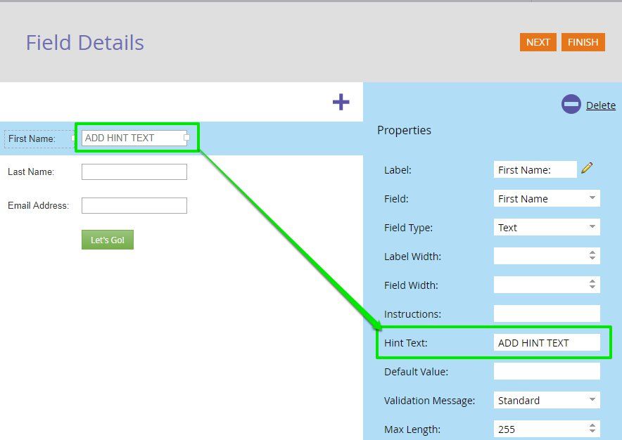
Hey Megan, you can move text inside the fields using the HINT TEXT input in the form editor
- Mark as New
- Bookmark
- Subscribe
- Mute
- Subscribe to RSS Feed
- Permalink
- Report Inappropriate Content
We ended up hiring a partner company named Perkuto to help us build a couple forms and then we cloned those key forms.
- Mark as New
- Bookmark
- Subscribe
- Mute
- Subscribe to RSS Feed
- Permalink
- Report Inappropriate Content
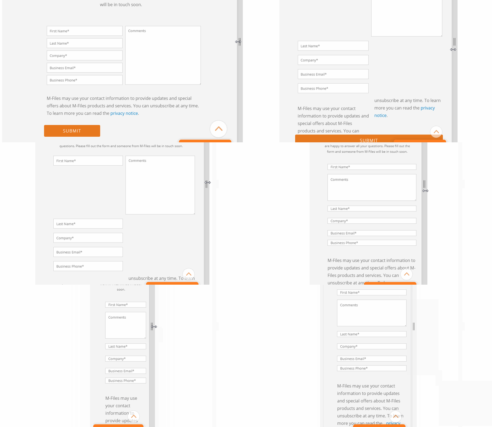
Hey Michelle, I had a look at the form here: Contact M-Files for Enterprise Information Management (EIM) Solutions and it looks like there might be a better way to set this up so that your textarea doesn't jump into the middle of the form for mobile. I think instead of using the 2-column approach you'll need to use 2 fieldsets and some custom CSS to turn the fieldsets into columns (100% wide for mobile, 50% wide for tablet+). I'd be happy to tinker around and post an improved solution if this is something that'd be helpful to you? It looks like there are still a few issues with the responsive form styles for tablet and mobile with the stacking of the fields:
Im pretty sure this can be worked out so that A) your fields do not shrink (vertically) on mobile B) your Comments box doesn't create a big gap on tablet C) the Comments box moves below the Phone field in mobile. I haven't seen a thread about a 2-col form setup like this (where the 2nd column grows in height) but I think it'd be a really good example to share with the community so Im down to take a crack at it this week/weekend and maybe post a set of CSS styles that you could use instead. Is this form the final version you'll be using live on your site or is there another version of this somewhere else that's already cleaned up?
- Mark as New
- Bookmark
- Subscribe
- Mute
- Subscribe to RSS Feed
- Permalink
- Report Inappropriate Content
Hey Dave, If you want to take a stab at it that would be awesome! I have a test page where I can load a different version of the form/CSS. What you're seeing is the final version we have for now.
Thanks!
- Mark as New
- Bookmark
- Subscribe
- Mute
- Subscribe to RSS Feed
- Permalink
- Report Inappropriate Content
Hey Michelle,
I've got a little work to do on this still, but was able to get started on this yesterday. I've got a test page setup here: http://na-ab24.marketo.com/lp/980-YPY-938/testing-lp.html that Im using to host the form as I update it. I've still got some work to do to line up the button row and text section beneath the columns, but the underlying architecture is more or less there now if you wanted to take a sneak peek at it. I'll post a more documented reply once I've got it all dialed in and Im gonna do my best to bring in your branding/styles so this can be as plug-and-play as possible once we're ready to test it out.
Just wanted to let you know that I've got a jump on this and will be back in touch once I've got something more polished to share.
- Mark as New
- Bookmark
- Subscribe
- Mute
- Subscribe to RSS Feed
- Permalink
- Report Inappropriate Content
This looks awesome so far!
- Mark as New
- Bookmark
- Subscribe
- Mute
- Subscribe to RSS Feed
- Permalink
- Report Inappropriate Content
Megan, please open a new thread with your question and an example URL w/your form. The answer above can't be used cross-browser so you will need a better fix.
- Mark as New
- Bookmark
- Subscribe
- Mute
- Subscribe to RSS Feed
- Permalink
- Report Inappropriate Content
This was solved by adding the following CSS in case anyone runs into this in the future:
.mktoForm textarea.mktoField {
position: absolute!important;
resize: vertical !important;
}
Then add this media query so it aligns in mobile
@media only screen and (max-width: 480px) {
.mktoForm textarea.mktoField {
resize: vertical !important;
position: inherit!important;
}
}
- Mark as New
- Bookmark
- Subscribe
- Mute
- Subscribe to RSS Feed
- Permalink
- Report Inappropriate Content
CSS resize isn't supported in IE, Edge, or iOS Safari. So that feature is definitely not what you lean on for this.
- Mark as New
- Bookmark
- Subscribe
- Mute
- Subscribe to RSS Feed
- Permalink
- Report Inappropriate Content
I'm guessing this isn't possible? Should I try a Marketo focused design firm for help with the CSS?
- Mark as New
- Bookmark
- Subscribe
- Mute
- Subscribe to RSS Feed
- Permalink
- Report Inappropriate Content
Please provide the URL of a page with your form so we can touch it up.
- Mark as New
- Bookmark
- Subscribe
- Mute
- Subscribe to RSS Feed
- Permalink
- Report Inappropriate Content
Thanks Sanford! This is the one with my test embed form I'm working with: m-files.com/en/marketo-test-form
- Copyright © 2025 Adobe. All rights reserved.
- Privacy
- Community Guidelines
- Terms of use
- Do not sell my personal information
Adchoices
