Re: Form's look and feel
- Subscribe to RSS Feed
- Mark Topic as New
- Mark Topic as Read
- Float this Topic for Current User
- Bookmark
- Subscribe
- Printer Friendly Page
- Mark as New
- Bookmark
- Subscribe
- Mute
- Subscribe to RSS Feed
- Permalink
- Report Inappropriate Content
Hi,
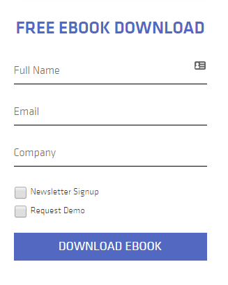
I'd like to set up my Marketo form like this 
Solved! Go to Solution.
- Mark as New
- Bookmark
- Subscribe
- Mute
- Subscribe to RSS Feed
- Permalink
- Report Inappropriate Content
Hi Kanako,
You do not need CSS to add Full name, email and company. This is eacily done setting a "Hint text" for the fields and removing the label.
To get checkbox on left and label on the right, use a "Checkboxes" field type, remove the label and add the label as a display value and True as a stored value.
For the rest, this is typically something CSS can do for you ![]()
-Greg
- Mark as New
- Bookmark
- Subscribe
- Mute
- Subscribe to RSS Feed
- Permalink
- Report Inappropriate Content
+1 Greg, this is pretty simple CSS enhancement... for a fluent designer. Don't know what that icon of an "index card" is supposed to do, though.
- Mark as New
- Bookmark
- Subscribe
- Mute
- Subscribe to RSS Feed
- Permalink
- Report Inappropriate Content
Hi Kanako,
You do not need CSS to add Full name, email and company. This is eacily done setting a "Hint text" for the fields and removing the label.
To get checkbox on left and label on the right, use a "Checkboxes" field type, remove the label and add the label as a display value and True as a stored value.
For the rest, this is typically something CSS can do for you ![]()
-Greg
- Mark as New
- Bookmark
- Subscribe
- Mute
- Subscribe to RSS Feed
- Permalink
- Report Inappropriate Content
Thank you Greg, I thought I had to write some CSS, but it was actually available as default. Your comment saved my time and resources ![]()
For Full Name part, I'm aware that Marketo doesn't have it. The image is from somebody else's webpage we are mimicking ![]()
- Mark as New
- Bookmark
- Subscribe
- Mute
- Subscribe to RSS Feed
- Permalink
- Report Inappropriate Content
And also, remember that there is no full name field in standard in Marketo and that it is not such a good idea not to capture first and last names separately, because it may be difficult to separate them later on (which would be needed for your CRM)
-Greg
- Copyright © 2025 Adobe. All rights reserved.
- Privacy
- Community Guidelines
- Terms of use
- Do not sell my personal information
Adchoices