Form Issues :(
- Subscribe to RSS Feed
- Mark Topic as New
- Mark Topic as Read
- Float this Topic for Current User
- Bookmark
- Subscribe
- Printer Friendly Page
- Mark as New
- Bookmark
- Subscribe
- Mute
- Subscribe to RSS Feed
- Permalink
- Report Inappropriate Content
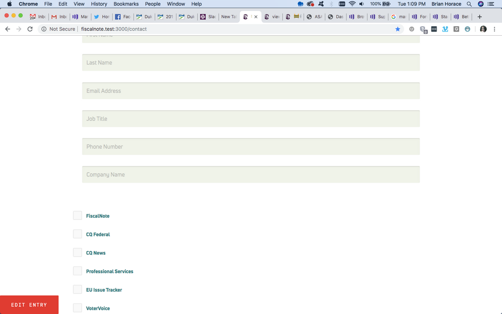
I am working on a form from Marketo on my actual site and the form consists of text fields followed by some check-boxes, is there a way to make these side by side?? Including an attachment. I cannot include the link because it's in a development area that cant be accessed anywhere but in our office but I'm using form 4 or 7 if that helps. No other edits have been made aside from cosmetically.
- Labels:
-
Integrations
-
Web Personalization
- Mark as New
- Bookmark
- Subscribe
- Mute
- Subscribe to RSS Feed
- Permalink
- Report Inappropriate Content
Hey Brian,
Sorry to leave you hanging on this for a while, I've finally gotten a chance to go in and set something up to share as an example.
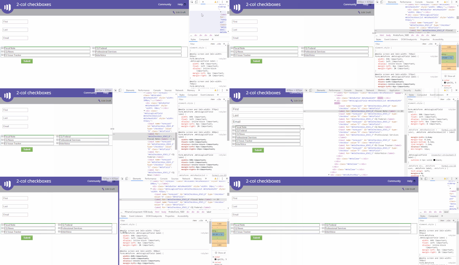
I've included a screen cap below of what you should be seeing as the browser window goes from desktop-to-mobile and back. I've added some outlines around the checkboxes field as well as each of the labels inside so you could kinda "see" them a little better.
--------------------------------------------------------------------------------------------------------------------------------------------------------------
Here's a look at the CSS that I've added into the Custom CSS on the form via the form editor and a few notes:
The top portion of this modifies a few form elements -- you may need to adjust some of the styles here to get this to mesh with however you've got your responsive (fluid) styles setup now for your form fields. This is only written for the checkbox field. If/when you can share your CSS and Form (live preview) I can probably help shore up anything outstanding here that doesn't fit with what you've got already.
The bottom portion of the CSS is a repeating set of rules for the checkbox inputs and labels at various breakpoints. The idea here is that we've got the mobile styles at the top (mobile-first) and then change the CSS as we head toward a larger display (tablet,desktop).
** This is setup using the "Labels Left" option (default) in the form Settings tab. If you're using "Labels Above" the CSS would need to change a bit.
/* Add your custom CSS below */
/* Make form elements full-width and fluid (100%) */
form.mktoForm, .mktoFormRow, .mktoFormCol, .mktoFieldWrap, .mktoLogicalField {
width:100% !important;
}
/* Hide labels -- use LABELS LEFT only! */
label.mktoLabel {display:none !important;}
/* Put odd # inputs (1,3,5...) on a new line */
form.mktoForm .mktoLogicalField input:nth-of-type(odd) {
clear:both;
}
form.mktoForm .mktoCheckboxList {
padding:0px !important;
}
form.mktoForm .mktoLogicalField input {
width:20px !important;
}
form.mktoForm .mktoLogicalField label {
width:90% !important;
float:left !important;
display: inline-block !important;
margin-left:0px !important;
margin-right:0 !important;
}
@media screen and (min-width:480px) {
form.mktoForm .mktoLogicalField input {
width:20px !important;
}
form.mktoForm .mktoLogicalField label {
width:42% !important;
float:left !important;
display: inline-block !important;
margin-left:0px !important;
margin-right:15px !important;
}
}
@media screen and (min-width:576px) {
form.mktoForm .mktoLogicalField input {
width:20px !important;
}
form.mktoForm .mktoLogicalField label {
width:44% !important;
float:left !important;
display: inline-block !important;
margin-left:0px !important;
margin-right:2% !important;
}
}
@media screen and (min-width:768px) {
form.mktoForm .mktoLogicalField input {
width:20px !important;
}
form.mktoForm .mktoLogicalField label {
width:45% !important;
float:left !important;
display: inline-block !important;
margin-left:0px !important;
margin-right:2% !important;
}
}
@media screen and (min-width:991px) {
form.mktoForm .mktoLogicalField input {
width:20px !important;
}
form.mktoForm .mktoLogicalField label {
width:46% !important;
float:left !important;
display: inline-block !important;
margin-left:0px !important;
margin-right:1% !important;
}
}You should be able to pop this CSS into the very bottom of your Custom CSS to give it a whirl. Let me know if you've got any questions or if you run into any issues.
-Dave
- Mark as New
- Bookmark
- Subscribe
- Mute
- Subscribe to RSS Feed
- Permalink
- Report Inappropriate Content
Hi Brian Horace,
Inline CSS should be implemented in the form.
PFA for the reference where you have to give the styling for the form.
Thanks
Akshay
- Mark as New
- Bookmark
- Subscribe
- Mute
- Subscribe to RSS Feed
- Permalink
- Report Inappropriate Content
You may consider using a separate text field (not boolean) for each checkbox. Besides being able to control the positioning (such as arranging the checkboxes in two columns), you will also be able to record the answer as Yes/No and distinguish that from people who did not fill the form and have thus blank value. This allows people not only to select, but also to de-select a preference. It also helps you if you want to display the selections on a confirmation page or in email.
Pavel
- Mark as New
- Bookmark
- Subscribe
- Mute
- Subscribe to RSS Feed
- Permalink
- Report Inappropriate Content
Hey Brian-
Check out the thread here: Fluid Responsive Marketo Form CSS - Courtney added a link to a CSS file that'll help support multi-column layouts. You should be able to drag-n-drop your columns next to each other in the editor and then the CSS should do the rest to get those to show up the same as in the editor.
For what it's worth, you might be further ahead trying the "Plain" (7 of 7) theme for the form, it'll add the least styling on the Marketo-end and make a little less work in getting it to gel with your website CSS.
- Mark as New
- Bookmark
- Subscribe
- Mute
- Subscribe to RSS Feed
- Permalink
- Report Inappropriate Content
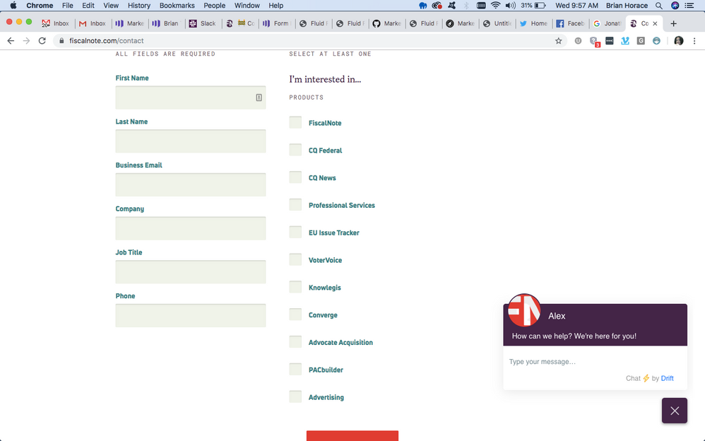
This is essentially what I'm trying to accomplish
- Mark as New
- Bookmark
- Subscribe
- Mute
- Subscribe to RSS Feed
- Permalink
- Report Inappropriate Content
are you after 2 columns just for the list of checkboxes or did you want the checkboxes next to the text fields?
you can make styling columns easier by adding fields to fieldsets. with a front end developer they should have no trouble writing up some css for you.
- Mark as New
- Bookmark
- Subscribe
- Mute
- Subscribe to RSS Feed
- Permalink
- Report Inappropriate Content
Pls remove the attachment and paste the image inline. Not all Community users can see attachments, making them very confusing. And include your URL.
- Copyright © 2025 Adobe. All rights reserved.
- Privacy
- Community Guidelines
- Terms of use
- Do not sell my personal information
Adchoices


