Re: Email Program Dashboard: Difference between green and grey open and click rates?
- Subscribe to RSS Feed
- Mark Topic as New
- Mark Topic as Read
- Float this Topic for Current User
- Bookmark
- Subscribe
- Printer Friendly Page
- Mark as New
- Bookmark
- Subscribe
- Mute
- Subscribe to RSS Feed
- Permalink
- Report Inappropriate Content
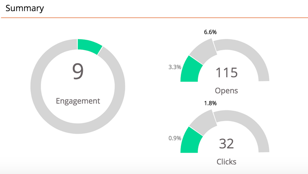
When looking at an email program dashboard, what do the 3.3% and the 6.6% mean for opens? What is the difference between these two numbers? I guess really what I want to know, is where is this grey 6.6% coming from, and what does it mean?
I'm sure there is a simple answer, I'm just having trouble finding it. Thanks all!
- Mark as New
- Bookmark
- Subscribe
- Mute
- Subscribe to RSS Feed
- Permalink
- Report Inappropriate Content
I'm not sure what this could be, but I have a question for you, Lauren. When you created this post, did you just send out the email? If so, try looking at the email dashboard again to see whether 1) the light gray piece is no longer there and 2) the engagement score went up. I am thinking that there were still individuals in pending status that hadn't received the email. I may be completely off, but this is just a thought.
- Mark as New
- Bookmark
- Subscribe
- Mute
- Subscribe to RSS Feed
- Permalink
- Report Inappropriate Content
Adding onto my reply from before, but the information I posed is something to consider. I do think, however, the following from the documentation that Gabriel gives provides feedback on that.
Here's what the page shows below if you are looking at the unsubscribe rate (which matches your scenario).

- Mark as New
- Bookmark
- Subscribe
- Mute
- Subscribe to RSS Feed
- Permalink
- Report Inappropriate Content
Hey Lauren,
It is just because the green percentage in your example is small, so the dashboard enlarges a portion of the graph to be able to show you a visual. The second number (6.6%) is added for scale.
You can read a bit about more about this in product docs for Email Program Dashboard,
Hope that helps!
-Gabe
- Copyright © 2025 Adobe. All rights reserved.
- Privacy
- Community Guidelines
- Terms of use
- Do not sell my personal information
Adchoices

