Does anyone use Predictive Content?
- Subscribe to RSS Feed
- Mark Topic as New
- Mark Topic as Read
- Float this Topic for Current User
- Bookmark
- Subscribe
- Printer Friendly Page
- Mark as New
- Bookmark
- Subscribe
- Mute
- Subscribe to RSS Feed
- Permalink
- Report Inappropriate Content
I'm looking to see if anyone has used Marketo's Predictive Content. What are you overall opinion of the product? Is it useful? How did you set it up? Any specific problem areas?
- Labels:
-
ContentAI
-
Integrations
-
Products
- Mark as New
- Bookmark
- Subscribe
- Mute
- Subscribe to RSS Feed
- Permalink
- Report Inappropriate Content
Okay -- I stand corrected, Predictive Content and Content AI are NOT the same thing -- they are, but they aren't. It seems like they're basically migrating people from Predictive to ContentAI (it just happened that my renewal was at the same exact time as the switch, so it seemed seamless to me). ContentAI Analytics was added to all existing Predictive customers as a trial through April, and is included in any renewals that then become ContentAI. The only thing I'm not sure about is what happens if your renewal is after April -- it seems like you'll lose the dashboard. From a sales side, I foresee some more options coming from Marketo to keep that from happening...
Sorry that doesn't really clear it all up - but that's all I've been able to uncover. Enjoy!
- Mark as New
- Bookmark
- Subscribe
- Mute
- Subscribe to RSS Feed
- Permalink
- Report Inappropriate Content
I attended the Content-AI webinar this afternoon. Unfortunately, they ended the call 40 minutes early and skipped right over the questions I had posted in the chat window. JD Nelson - maybe you can help answer:
- Aside from some enhanced analytics, how does Content-AI compare to the former "Predictive Content" offering?
- From what I understand, "conversions" apply to content that is engaged with when filling out a gated content form. Are we able to attribute engagement with non-gated content - like a direct click on a PDF link - as a conversion?
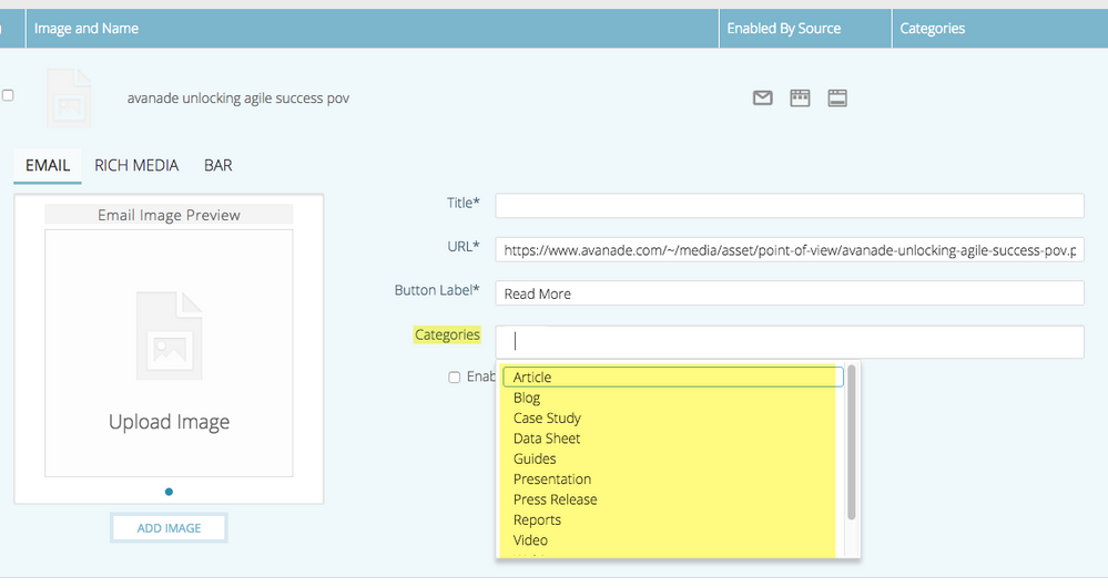
- They mentioned how you can tag your content appropriately so that it appears for specific segments (like specific industry content). Yet, i cannot find anywhere in the interface on where you can include additional tagging beyond the content type - am I missing something? In other words, where do I tag a piece of content as "Banking"-related? This is all I see:
- Mark as New
- Bookmark
- Subscribe
- Mute
- Subscribe to RSS Feed
- Permalink
- Report Inappropriate Content
ContentAI is to Predictive what Person was to Lead -- they are the same thing, just new name. AI-bandwagon?
In Content-AI Analytics, Conversions do not include un-gated content -- I believe this is the only panel of that page that un-gated content is not a part of.
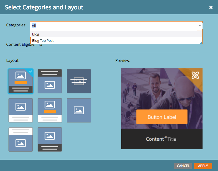
You can tag your content most appropriately in an email. When you "enable [an image] contentAI" the popup let's you pick style/design and category -- this is where you would narrow down your categories:
If you can see, below the picklist, it also shows how many pieces of content are eligible for that combination of categories. For instance, if you have, and picked, "blog post" and "innovation" and "healthcare" it would then show how many you have (so you can narrow down or expand as needed) -- remember you always need ~10 pieces of content eligible for ContentAI to work best.
The caveat, here, is when you do it on a website -- you don't really have that ability to segment (out of the box) to show the categories -- now that you have me thinking about it, I'm curious if you could segment a predictive section based on a web-campaign to insert the code -- that could be VERY interesting!
- Mark as New
- Bookmark
- Subscribe
- Mute
- Subscribe to RSS Feed
- Permalink
- Report Inappropriate Content
Thanks JD!
ContentAI is to Predictive what Person was to Lead -- they are the same thing, just new name.
Except for some of the analytics, I believe. Earlier this month, we received this from our account exec (where I complained we were already paying in the six figures and now being "nickle and dimed". Our subscription ends in September):
You can tag your content most appropriately in an email. If you can see, below the picklist, it also shows how many pieces of content are eligible for that combination of categories. For instance, if you have, and picked, "blog post" and "innovation" and "healthcare" it would then show how many you have.
I still don't see where you can tag content (similar to tagging programs). For example, where do I tag a piece of content as "Healthcare"?
In Content-AI Analytics, Conversions do not include un-gated content
That's too bad. If it included ALL content, this would really give us (and Marketo) a better understanding of what content is resonating with specific users.
- Mark as New
- Bookmark
- Subscribe
- Mute
- Subscribe to RSS Feed
- Permalink
- Report Inappropriate Content
I too am confused by the note about getting Analytics for a limited time. I thought it was part of the product that we purchased when we added it to our renewal in August. And, in the webinar, the presenter specifically said Analytics was included with Content AI. I asked my Customer Success Manager about it, and she basically told me to attend them webinar. ![]()
- Mark as New
- Bookmark
- Subscribe
- Mute
- Subscribe to RSS Feed
- Permalink
- Report Inappropriate Content
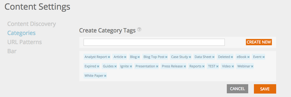
I still don't see where you can tag content (similar to tagging programs). For example, where do I tag a piece of content as "Healthcare"?
You can set your categories under Content Settings (click your name in the top right of the screen):
- Mark as New
- Bookmark
- Subscribe
- Mute
- Subscribe to RSS Feed
- Permalink
- Report Inappropriate Content
The first issue is the how Marketo scrapes the content for Predictive Content, it will only scrape the main domain, if you have sub domains then you need to get Marketo Support to add those sub domains, which in some cases is limited to 4 domains and sub domains. Once the url’s are scraped, on occasion it also scrapes url’s with parameters, so you see multiple instances of url’s (but the analytics does usually only point to the main url, the other will just say 0), from an admin/housekeeping point of view I manually delete these duplicates.
A nice feature is that you have to manually add a url for use in Predictive Content, i.e. Marketo won’t just randomly add content for you.
Once the add an item for use in Predictive Content, you then go into another tab and make you edits, currently I’m using the Rich Media styled feature, my number 1 bug here is that Titles are restricted to 50 character max, but this is not documented anywhere and I’ve only worked this out as you get a random error if you try and approve. The thumbnail is a fixed size, so if it doesn’t fit within your website styling, you have to write CSS to override the styling, as it’s a ‘one size fits all’. The Rich Media styled Predictive Content has only 3 templates to choose from, again if it doesn’t work for you, CSS styling is needed to remove to tweak the styling. I understand customisation is part of our day to day jobs but rather than adding your own styling, you have to hack the code Marketo provides and this has to be done once it’s live as styling is not provided in Predictive Content.
The above comments are what I see and use within my instance and currently only use Rich Media.
- Mark as New
- Bookmark
- Subscribe
- Mute
- Subscribe to RSS Feed
- Permalink
- Report Inappropriate Content
I use it. it's come along way, already, in just the last few quarterly updates. But most importantly the Analytics screen that they enabled in December is fantastic. Among other metrics, it has a very easy 2-week trending content section that basically gives me a quick checklist of content I should add to predictive.
Some issues I have with it are mostly on the display side, not the functionality. For instance, all the 'ads' are created as images based on input; therefore they are not very dynamic and can sometimes come across as blurry or just not crisp enough. They provide 7 or 8 layouts to choose from, but really it's just 3 with some variations. If you need something else you have to embed it in the image yourself or rely a bit on your display preferences (whether Rich Media or Email) to get what you want. I've said it before, but it's really sad that my biggest stumbling block with ContentAI is getting the right image layout designed to use with it -- it's just small enough where you want more space, but any bigger and it runs the risk of cannibalizing your other content (for me, in email, it's a secondary CTA)
All that being said, I am on the list of ContentAI & RTP--as a whole--for customer reference calls. I do enjoy it and I do think it will continue to improve and the earlier we are involved the better.
Our setup includes a 2-image section at the bottom of many of our emails (the fact that it rotates content and predicts what people are more apt to click on without me having to design or worry about it is awesome -- I don't worry that people see the same thing every time). We also embedded it on our website as a 'recommended for you' section on our blog and a few key pages throughout our site. It's been great, again, for the flexibility.
- Mark as New
- Bookmark
- Subscribe
- Mute
- Subscribe to RSS Feed
- Permalink
- Report Inappropriate Content
Hi JD Nelson!
We are currently setting up ContentAI and I am looking for some tips and tricks/strategy on how to best utilize this tool. Is there a way we can connect?
Thanks Marit.
- Mark as New
- Bookmark
- Subscribe
- Mute
- Subscribe to RSS Feed
- Permalink
- Report Inappropriate Content
feel free to DM me
- Mark as New
- Bookmark
- Subscribe
- Mute
- Subscribe to RSS Feed
- Permalink
- Report Inappropriate Content
It was added to our renewal last year - I suspect there's not a very large % of Marketo customers using it due to very little discussion that takes place on the community. We incorporated the js code on our website and use it primarily for the analytics it provides. And yes, it is a bit clunky and could use some refinement.
As you probably know, PC has migrated/rebranded to Content-AI - and those customers who have PC in their contract are being forced to upgrade their subscription if they want to take advantage of the enhanced analytics that Content-AI provides over what PC included. We never used the actual dynamic/predictive content in our emails and web pages.
Ironically, there's a webinar tomorrow at 1pm ET "Introducing Content-AI: The future of one-to-one engagement"
- Mark as New
- Bookmark
- Subscribe
- Mute
- Subscribe to RSS Feed
- Permalink
- Report Inappropriate Content
I use it out of the box with some CSS customisations for the design, so far in around 3 months I've had a 5% increase on additional form fills. It's a very clunky platform and is a 'one size fits all' product, even Marketo hacks the code on marketo.com to make it work. I have to say from what they Demo it as, it's a million miles to what each company needs to make it work for them. Happy to give you a run down if you need to know more.
- Mark as New
- Bookmark
- Subscribe
- Mute
- Subscribe to RSS Feed
- Permalink
- Report Inappropriate Content
Hi Frank, can you share how you were able to override the css?
- Mark as New
- Bookmark
- Subscribe
- Mute
- Subscribe to RSS Feed
- Permalink
- Report Inappropriate Content
The best example of the code you should use can be seen here: Lead Management Solution - Marketo, items under "RESOURCES YOU MIGHT LIKE" is Predictive Content, if you right click and inspect the code in Google Chrome, you see a block of code:
<style class="rtp-class" type="text/css">
.RTP_RCMD2 {
}
.RTP_RCMD2 [data-rtp-id="rtp_rcmd2_tpl_1"] {
margin: 0 auto;
max-width: 830px;
padding: 5px;
text-align: center;
font-family: 'Lucida Grande', 'Lucida Sans Unicode', Arial, Helvetica, sans-serif;
font-size: 12px;
}
.RTP_RCMD2 [data-rtp-id="rtp_rcmd2_tpl_1"] .rtp_rcmd2_item {
width: 33%;
float: left;
}
.RTP_RCMD2 [data-rtp-id="rtp_rcmd2_tpl_1"] .rtp_rcmd2_item_inner {
width: 235px;
margin: 0 auto;
background-color: #EBEBEB;
}
.RTP_RCMD2 [data-rtp-id="rtp_rcmd2_tpl_1"] .rtp_rcmd2_item_inner_first {
float: left;
}
.RTP_RCMD2 [data-rtp-id="rtp_rcmd2_tpl_1"] .rtp_rcmd2_item_inner_last {
float: right;
}
.RTP_RCMD2 [data-rtp-id="rtp_rcmd2_tpl_1"] .rtp_rcmd2_img_container {
height: 175px;
overflow: hidden;
}
.RTP_RCMD2 [data-rtp-id="rtp_rcmd2_tpl_1"] .rtp_rcmd2_img_container img {
max-width: 100%;
max-height: 100%;
}
.RTP_RCMD2 [data-rtp-id="rtp_rcmd2_tpl_1"] .rtp_rcmd2_content_container {
padding: 10px
}
.RTP_RCMD2 [data-rtp-id="rtp_rcmd2_tpl_1"] .rtp_rcmd2_label_container {
height: 80px;
overflow: hidden;
}
.RTP_RCMD2 [data-rtp-id="rtp_rcmd2_tpl_1"] .rtp_rcmd2_description_container {
height: 120px;
overflow: hidden;
margin-bottom: 15px;
color: #696969;
}
.RTP_RCMD2 [data-rtp-id="rtp_rcmd2_tpl_1"] .rtp_rcmd2_link_container {
height: 30px;
overflow: hidden;
padding-top: 5px;
margin-bottom: 10px;
}
.RTP_RCMD2 [data-rtp-id="rtp_rcmd2_tpl_1"] .rtp_rcmd2_link_container a {
padding: 5px 12px;
background-color: #5a54a4;
-webkit-border-radius: 15px;
-moz-border-radius: 15px;
border-radius: 15px;
color: #ffffff;
text-decoration : none;
}
.RTP_RCMD2 [data-rtp-id="rtp_rcmd2_tpl_1"] .rtp_rcmd2_label h4 {
font-size: 15px;
line-height: 120%;
margin: 10px;
display: block;
color: #5a54a4;
}
.RTP_RCMD2 .rtp_rcmd2_title {
font-size: 20px;
margin-bottom : 30px;
color : #696969;
width: 100%;
float: left;
max-width: 830px;
overflow : hidden;
}
.RTP_RCMD2 .rtp_rcmd2_link_hidden {
text-decoration : none;
}
@media (max-width: 750px) {
.RTP_RCMD2 [data-rtp-id="rtp_rcmd2_tpl_1"] .rtp_rcmd2_item {
clear: both;
width: auto;
margin-bottom: 15px;
float: none;
}
.RTP_RCMD2 [data-rtp-id="rtp_rcmd2_tpl_1"] .rtp_rcmd2_item_inner_first {
float: none;
}
.RTP_RCMD2 [data-rtp-id="rtp_rcmd2_tpl_1"] .rtp_rcmd2_item_inner_last {
float: none;
}
.RTP_RCMD2 .rtp_rcmd2_title {
text-align : center;
}
}
.rtp_rcmd2_title {
color: #000!important
}
.rtp_rcmd2_title {
font-size: 18px!important
}
.rtp_rcmd2_content_container {
background-color: #fff!important
}
div[data-rtp-widget-container] {
font-family: 'museo-sans', 'Lucida Grande', 'Lucida Sans Unicode', 'Nimbus Sans L', Arial, sans-serif!important
}
</style>
This is the code they are using to reformat Predictive Content, this code is for <div class="RTP_RCMD2" data-rtp-template-id="template1">. My code is similar to this but in line with the page web design.
Happy to help out more if you have a sample I can review.
- Mark as New
- Bookmark
- Subscribe
- Mute
- Subscribe to RSS Feed
- Permalink
- Report Inappropriate Content
Thanks Frank. Luckily enough, I had the time to experiment and figure out how to get this to work on my own. The trick is to place a plain style tag within the div that will hold the content, and just copy the class selectors as generated from the script originally, make your modifications, and use the !important rule to override the defaults.
- Mark as New
- Bookmark
- Subscribe
- Mute
- Subscribe to RSS Feed
- Permalink
- Report Inappropriate Content
Hey Frank, would like to hear more about challenges you faced.
- Copyright © 2025 Adobe. All rights reserved.
- Privacy
- Community Guidelines
- Terms of use
- Do not sell my personal information
Adchoices


