Displaying Forms
- Subscribe to RSS Feed
- Mark Topic as New
- Mark Topic as Read
- Float this Topic for Current User
- Bookmark
- Subscribe
- Printer Friendly Page
- Mark as New
- Bookmark
- Subscribe
- Mute
- Subscribe to RSS Feed
- Permalink
- Report Inappropriate Content
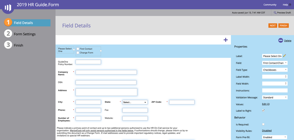
I've built a form in the form builder that has several fields in a line next to each other. Yet, when I pull that form into a landing page all of the fields are placed below each other, not as I have built it in the form builder. Is there a best practice for the landing page css to display the form as I have it built?
Solved! Go to Solution.
- Mark as New
- Bookmark
- Subscribe
- Mute
- Subscribe to RSS Feed
- Permalink
- Report Inappropriate Content
Sure, that will at least resolve the 3-up switching to 1-up (un-floating = 1-up, floating = 3-up).
- Mark as New
- Bookmark
- Subscribe
- Mute
- Subscribe to RSS Feed
- Permalink
- Report Inappropriate Content
For any question like this you need to provide a URL and visual cues (i.e. screenshots).
It's not possible to answer questions about form styling without real-life information.
- Mark as New
- Bookmark
- Subscribe
- Mute
- Subscribe to RSS Feed
- Permalink
- Report Inappropriate Content
Thanks Sanford. Here is a link to the screen shot of the form that I built in the form builder.
Awesome Screenshot
Here is a link to the landing page where the form is displayed. Notice the formatting changes.
GuideOne Insurance
- Mark as New
- Bookmark
- Subscribe
- Mute
- Subscribe to RSS Feed
- Permalink
- Report Inappropriate Content
What's happening is the 3-up layout in Form Editor is being overridden by other CSS on your page.
For one prominent example, check line #186:
- Mark as New
- Bookmark
- Subscribe
- Mute
- Subscribe to RSS Feed
- Permalink
- Report Inappropriate Content
Do you suggest I remove that element of the css to fix the issue?
- Mark as New
- Bookmark
- Subscribe
- Mute
- Subscribe to RSS Feed
- Permalink
- Report Inappropriate Content
Sure, that will at least resolve the 3-up switching to 1-up (un-floating = 1-up, floating = 3-up).
- Mark as New
- Bookmark
- Subscribe
- Mute
- Subscribe to RSS Feed
- Permalink
- Report Inappropriate Content
Thanks Sanford. That appears to have worked.
- Mark as New
- Bookmark
- Subscribe
- Mute
- Subscribe to RSS Feed
- Permalink
- Report Inappropriate Content
For the future, note that screenshots can be pasted directly into the editor. Makes things a lot easier to follow. I going to copy your s/s inline for other people reading:
- Copyright © 2025 Adobe. All rights reserved.
- Privacy
- Community Guidelines
- Terms of use
- Do not sell my personal information
Adchoices

