Re: Checkboxes on Forms 2.0 with text block underneath
- Subscribe to RSS Feed
- Mark Topic as New
- Mark Topic as Read
- Float this Topic for Current User
- Bookmark
- Subscribe
- Printer Friendly Page
- Mark as New
- Bookmark
- Subscribe
- Mute
- Subscribe to RSS Feed
- Permalink
- Report Inappropriate Content
First, why are there only Left and Above options for where you want the label position to go? I want my fields to the RIGHT of my checkbox options (not every single field).
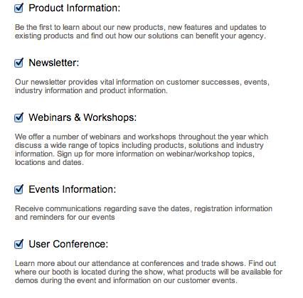
Second, I want to insert a text box under each subscription checkbox with a description. I am no CSS wizard so I'm not sure what kind of magic I can insert to make this happen. Anyone have some code i can copy/paste?
Third, I want to vent my frustration with Marketo links that don't work anymore. "An Error Occurred Processing Your Request" page is the bane of my Marketo Community existence.
- Labels:
-
Lead Management
- Mark as New
- Bookmark
- Subscribe
- Mute
- Subscribe to RSS Feed
- Permalink
- Report Inappropriate Content
Were you able to find a quick fix for this? Having the same issue, would like to have check boxes on the left side as well. Also noticed the check box inputs do not display correctly on mobile devices - looks like a blank input, which you can't do anything to.
- Mark as New
- Bookmark
- Subscribe
- Mute
- Subscribe to RSS Feed
- Permalink
- Report Inappropriate Content
Were you able to find a quick fix for this?
Follow my link above.
Were you able to find a quick fix for this? Having the same issue, would like to have check boxes on the left side as well. Also noticed the check box inputs do not display correctly on mobile devices - looks like a blank input, which you can't do anything to.
I don't see this at all. Did you try to restyle the form somehow? Have a screenshot?
- Mark as New
- Bookmark
- Subscribe
- Mute
- Subscribe to RSS Feed
- Permalink
- Report Inappropriate Content
- Mark as New
- Bookmark
- Subscribe
- Mute
- Subscribe to RSS Feed
- Permalink
- Report Inappropriate Content
Was there any resolution to your question? I tried the CSS Dory Viscogliosi provided and wasn't able to see a difference. I'd love it if there was an easy way to do this!
- Mark as New
- Bookmark
- Subscribe
- Mute
- Subscribe to RSS Feed
- Permalink
- Report Inappropriate Content
Are you looking for Michelle's first question or second?
- Mark as New
- Bookmark
- Subscribe
- Mute
- Subscribe to RSS Feed
- Permalink
- Report Inappropriate Content
Sanford Whiteman I'm looking at her second question about alignment of checkboxes. I would like to have my checkboxes on the left of my text to make it more clear since I have a lot of checkbox options (for an email preference center).
I took the code "label[for=fieldname] {
float:right!important;
margin-left: 10px!important;
width:316px!important;
}"
but it didn't change my checkboxes, I was hoping there was some other easy resolution.
- Mark as New
- Bookmark
- Subscribe
- Mute
- Subscribe to RSS Feed
- Permalink
- Report Inappropriate Content
Did you miss the action item to change the fieldname?
"Where fieldname is the Marketo field name (you can get this from field management)."
Also - when I did it, it needed the first line to include the .mktoform and put the fieldname in quotes.
.mktoForm label[for="fieldname"] {
- Mark as New
- Bookmark
- Subscribe
- Mute
- Subscribe to RSS Feed
- Permalink
- Report Inappropriate Content
Many ways to do it, but here's one: MktoForms2 :: Checkbox Alignment (nation.marketo.com/thread/4704)
(Sometimes you just need to change the DOM order of elements or you'll go crazy with CSS.)
- Mark as New
- Bookmark
- Subscribe
- Mute
- Subscribe to RSS Feed
- Permalink
- Report Inappropriate Content
We have the following code on our landing page template:
label[for=fieldname] {
	float:right!important;
	margin-left: 10px!important;
	width:316px!important;
}
Where fieldname is the Marketo field name (you can get this from field management). This results in the checkbox moving to the left, and the label being on the right.
- Mark as New
- Bookmark
- Subscribe
- Mute
- Subscribe to RSS Feed
- Permalink
- Report Inappropriate Content
Checkbox: 1 Checkbox
Checkboxes: Multiple Checkboxes
Maybe other users have an idea or code to implement what you want there.
Best regards
Steffen
- Mark as New
- Bookmark
- Subscribe
- Mute
- Subscribe to RSS Feed
- Permalink
- Report Inappropriate Content
Ideally I'd like it to look like this:

- Mark as New
- Bookmark
- Subscribe
- Mute
- Subscribe to RSS Feed
- Permalink
- Report Inappropriate Content
what should it look like?
Because I just had a look and this version is also possible using "Checkboxes", there is a field "Buttons on the left" or anything like that:

Best regards
Steffen
- Mark as New
- Bookmark
- Subscribe
- Mute
- Subscribe to RSS Feed
- Permalink
- Report Inappropriate Content
- Mark as New
- Bookmark
- Subscribe
- Mute
- Subscribe to RSS Feed
- Permalink
- Report Inappropriate Content
Hi Michelle,
1) Custom CSS
2) Just use Rich Text?
3) Yes it's a problem with some links, but when you report it I think they get fixed.
Best regards
Steffen
- Copyright © 2025 Adobe. All rights reserved.
- Privacy
- Community Guidelines
- Terms of use
- Do not sell my personal information
Adchoices
